react-items-carousel
Items Carousel Built with react-motion and styled-components.
Installing
$ npm install react-items-carousel --save
Example
import React from 'react';
import ItemsCarousel from 'react-items-carousel';
import range from 'lodash/range';
export default class Test extends React.Component {
componentWillMount() {
this.setState({
children: [],
activeItemIndex: 0,
});
setTimeout(() => {
this.setState({
children: createChildren(20),
})
}, 100);
}
createChildren = n => range(n).map(i => <div key={i} style={{ height: 200, background: '#333' }}>{i}</div>);
changeActiveItem = (activeItemIndex) => this.setState({ activeItemIndex });
render() {
const {
activeItemIndex,
children,
} = this.state;
return (
<ItemsCarousel
// Placeholder configurations
enablePlaceholder
numberOfPlaceholderItems={5}
minimumPlaceholderTime={1000}
placeholderItem={<div style={{ height: 200, background: '#900' }}>Placeholder</div>}
// Carousel configurations
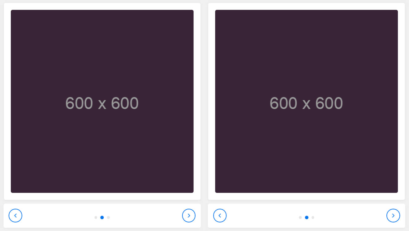
numberOfCards={3}
gutter={12}
showSlither={true}
firstAndLastGutter={true}
freeScrolling={false}
// Active item configurations
requestToChangeActive={this.changeActiveItem}
activeItemIndex={activeItemIndex}
activePosition={'center'}
chevronWidth={24}
rightChevron={'>'}
leftChevron={'<'}
outsideChevron={false}
>
{children}
</ItemsCarousel>
);
}
}
| Property | Type | Default | Description |
|---|---|---|---|
| children* | arrayOf (element) | Carousel react items. | |
| numberOfCards | number | 3 | Number of cards to show. |
| gutter | number | 0 | Space between carousel items. |
| showSlither | bool | false | If true a slither of next item will be showed. |
| firstAndLastGutter | bool | false | If true first item will have twice the |
| freeScrolling | bool | false | If true, free scrolling will be enabled. |
| enablePlaceholder | bool | false | Enable placeholder items while data loads |
| placeholderItem | element | Placeholder item. Ignored if enablePlaceholder is false. | |
| numberOfPlaceholderItems | number | Number of placeholder items. Ignored if enablePlaceholder is false. | |
| requestToChangeActive | func | This is called when we want to change the active item. Right now we will never call this unless a left or right chevrons are clicked. |
|
| activeItemIndex | number | 0 | This gives you the control to change the current active item. This is ignored if freeScrolling is true. |
| activePosition | enum ('left', 'center', 'right') | 'left' | The active item position. This is ignored if freeScrolling is true. |
| rightChevron | union ( element, string ) |
Right chevron element. If passed requestToChangeActive must be set. |
|
| leftChevron | union ( element, string ) |
Left chevron element. If passed requestToChangeActive must be set. |
|
| chevronWidth | number | Chevron width. | |
| outsideChevron | bool | If true the chevron will be outside the carousel. | |
| slidesToScroll | number | 1 | Number of slides to scroll when clicked on right or left chevron. |
| springConfig | shape {stiffness: numberdamping: numberprecision: number} |
React motion configurations. More about this here |