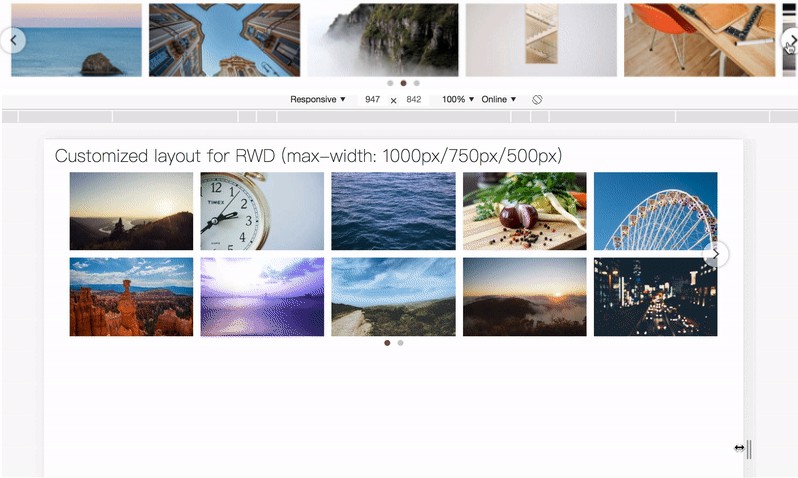
React Responsive Carousel
Powerful, lightweight and fully customizable carousel component for React apps.
Features
- Responsive
- Mobile friendly
- Swipe to slide
- Mouse emulating touch
- Server side rendering
- Keyboard navigation
- Custom animation duration
- Auto play
- Custom auto play interval
- Infinite loop
- Horizontal or Vertical directions
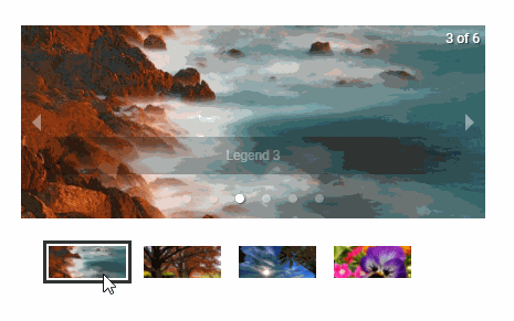
- Supports images, videos, text content or anything you want. Each direct child represents one slide!
- Supports any flux library (use
selectedItemprop to set from the app state, andonChangecallback to get the new position) - Show/hide anything (thumbs, indicators, arrows, status)
Installing as a package
npm install react-responsive-carousel --save
Usage
import React, { Component } from 'react';
import ReactDOM from 'react-dom';
import { Carousel } from 'react-responsive-carousel';

class DemoCarousel extends Component {
    render() {
        return (
            <Carousel>
                <div>
                    <img src="assets/1.jpeg" />
                    <p className="legend">Legend 1</p>
                </div>
                <div>
                    <img src="assets/2.jpeg" />
                    <p className="legend">Legend 2</p>
                </div>
                <div>
                    <img src="assets/3.jpeg" />
                    <p className="legend">Legend 3</p>
                </div>
            </Carousel>
        );
    }
});

ReactDOM.render(<DemoCarousel />, document.querySelector('.demo-carousel'));

// Don't forget to include the css in your page

// Using webpack
// import styles from 'react-responsive-carousel/lib/styles/carousel.min.css';

// Using html tag:
// <link rel="stylesheet" href="<NODE_MODULES_FOLDER>/react-responsive-carousel/lib/styles/carousel.min.css"/>
| Attributes | Type | Default | Description |
|---|---|---|---|
| showArrows | boolean |
true |
show prev and next arrows |
| showStatus | boolean |
true |
show index of the current item. i.e: (1/8) |
| showIndicators | boolean |
true |
show little dots at the bottom with links for changing the item |
| showThumbs | boolean |
true |
show thumbnails of the images |
| thumbWidth | number |
undefined |
optionally specify pixel width (as an integer) of a thumbnail (including any padding) to avoid calculating values (helps with server-side renders or page cache issues) |
| infiniteLoop | boolean |
false |
infinite loop sliding |
| selectedItem | number |
0 |
selects an item though props / defines the initial selected item |
| axis | string |
horizontal |
changes orientation - accepts horizontal and vertical |
| verticalSwipe | string |
standard |
changes vertical swipe scroll direction - accepts standard and natural |
| onChange | function |
- | Fired when changing positions |
| onClickItem | function |
- | Fired when an item is clicked |
| onClickThumb | function |
- | Fired when a thumb it clicked |
| width | string |
- | Allows to set a fixed width |
| useKeyboardArrows | boolean |
false |
Adds support to next and prev through keyboard arrows |
| autoPlay | boolean |
false |
Auto play |
| stopOnHover | boolean |
true |
Stop auto play while mouse is over the carousel |
| interval | number |
5000 |
Interval of auto play |
| transitionTime | number |
350 |
Duration of slide transitions (in miliseconds) |
| swipeScrollTolerance | number |
5 |
Allows scroll when the swipe movement occurs in a different direction than the carousel axis and within the tolerance - Increase for loose - Decrease for strict |
| swipeable | boolean |
true |
Enables swiping gestures |
| dynamicHeight | boolean |
false |
Adjusts the carousel height if required. -- Do not work with vertical axis -- |
| emulateTouch | boolean |
false |
Allows mouse to simulate swipe |
| statusFormatter | func |
(current, total) => ${current} of ${total} |
Allows custom formatting of the status indicator |
| centerMode | boolean |
false |
Enables centered view with partial prev/next slides. Only works with horizontal axis. |
| centerSlidePercentage | number |
80 |
optionally specify percentage width (as an integer) of the slides in centerMode |