React Animate Height
Lightweight React component for animating height using CSS transitions. Slide up/down the element, and animate it to any specific height. Content's opacity can be optionally animated as well (check animateOpacity prop bellow).
CSS classes are applied in specific animation states, check animationStateClasses prop.
Note about versions
For React >=16.3.0 (17 included) make sure you are using v2.x.
Read more about React lifecycle changes introduced with React 16.3.
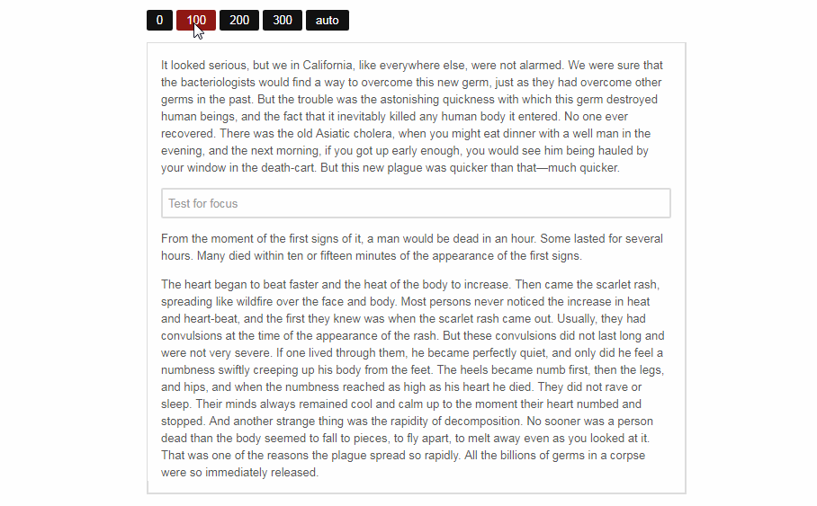
Demo
To build the examples locally, run:
npm install
npm start
Then open [`localhost:8080`](http://localhost:8080) in your browser of choice browser.
Quick start
Get it from npm
$ npm install --save react-animate-height
Import and use it in your React app.
import React, { Component } from 'react';
import AnimateHeight from 'react-animate-height';

export default class Example extends Component {
  state = {
    height: 0,
  };

  toggle = () => {
    const { height } = this.state;

    this.setState({
      height: height === 0 ? 'auto' : 0,
    });
  };

  render() {
    const { height } = this.state;

    return (
      <div>
        <button onClick={ this.toggle }>
          { height === 0 ? 'Open' : 'Close' }
        </button>

        <AnimateHeight
          duration={ 500 }
          height={ height } // see props documentation bellow
        >
          <h1>Your content goes here</h1>
          <p>Put as many React or HTML components here.</p>
        </AnimateHeight>
      </div>
    );
  }
}
Props
-
height: numeric or percentage value (ie.
'50%') or'auto', requiredWhen changed, element height will be animated to that height.
To slide up use0, for slide down use'auto' -
duration: integer, default:
250Duration of the animation in milliseconds
-
delay: integer, default:
0Animation delay in milliseconds
-
easing: string, default:
'ease'CSS easing function to be applied to the animation
-
className: string
CSS class to be applied to the element
Please note that you shouldn't apply properties that are messing with the layout (like
display,height...), as these might break height calculations -
style: object
CSS style object, it will be merged with inline styles of the component
Please note that you shouldn't apply properties that are messing with the layout (like
display,height...), as these might break height calculations -
contentClassName: string
CSS class to be applied to content wrapper element
Please note that you shouldn't apply properties that are messing with the layout (like
display,height...), as these might break height calculations -
animationStateClasses: object
Object containing CSS class names for animation states, default:
{
  animating:                  'rah-animating',
  animatingUp:                'rah-animating--up',
  animatingDown:              'rah-animating--down',
  static:                     'rah-static',
  animatingToHeightZero:      'rah-animating--to-height-zero',
  animatingToHeightAuto:      'rah-animating--to-height-auto',
  animatingToHeightSpecific:  'rah-animating--to-height-specific',
  staticHeightZero:           'rah-static--height-zero',
  staticHeightAuto:           'rah-static--height-auto',
  staticHeightSpecific:       'rah-static--height-specific',
}
Please note that this one will be merged with the default object and cached when component is created,
so changing it afterwards will have no effect. -
onAnimationStart: function
Callback which will be called when animation starts
-
onAnimationEnd: function
Callback which will be called when animation ends
-
applyInlineTransitions: boolean, default:
trueIf this flag is set to
falseonly CSS classes will be applied to the element and inline
transition styles will not be present. -
animateOpacity: boolean, default:
falseIf set to
truecontent will fade-in (and fade-out) while height is animated.
Additional props will be passed to the wrapper div, to make adding attrs like aria-* easier.