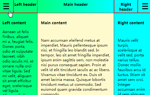
Responsive sidebars
This project is somewhat of a research experiment into the most convenient way of implementing responsive sidebars.
Priorities
- Simple design, easy to understand.
- Responsive design:
- In landscape mode the sidebars should push the main content aside.
- In portrait mode they should cover the main content.
- The sidebar trigger should not move when clicked;
this is annoying to the user. - The sidebar should be 'ready' when it slides into view,
and not rearrange its content while opening.
(This is visually distracting, but a very common implementation;
e.g. variable-width sidebars withwidth: 0when closed)
Design
The code is deliberately kept minimal to not distract from the
sidebar mechanics.
The main version uses flexbox, but there are other branches
exploring CSS grid and absolute positioning.
3 flex items are used for their adaptive features:
the sidebars #left and #right, and the main content #main.
This allows pushing the main content aside when the landscape sidebars open
(by transitioning the #left and #right widths).
However, since we want the sidebars to be fixed-width, so they do not
rearrange their content while opening, the actual sidebars are not these
variable-width flex items, but child divs with fixed widths.
As a result, the sidebars make use of 2 separate transitions:
- One to push the main content aside when the sidebars open in landscape mode,
by transitioning the#leftand#rightflex items' width from 0 to the
sidebar width. - Another to slide the (portrait and landscape) fixed-width sidebar child divs
in and out of view,
by transitioning theirtransform: translateX(-100%)property.