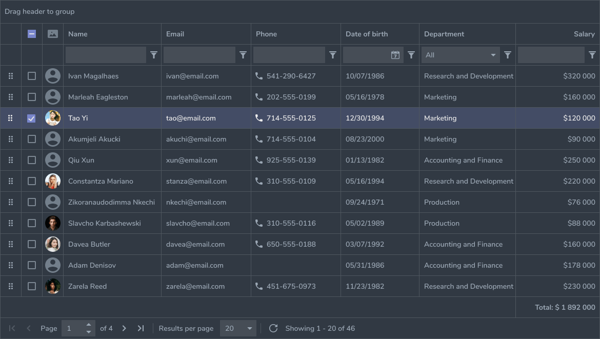
react-object-list
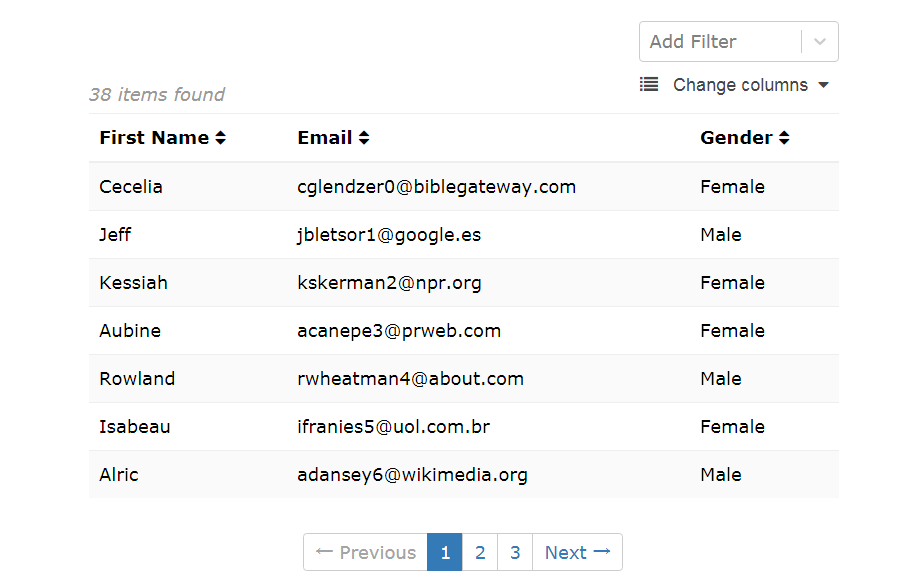
Component used to display an array of object based data in a sortable, filterable, paginated, list based view, powered by React.
Custom components can be passed in if they are designed to handle the same props as the default components. This functionality is available for the DataRenderer, Pagination and ErrorMessage and your component can simply be passed in through the props with one of the above keys.
Installation
Install the package:
yarn add react-object-list
Ensure you have all peer dependencies installed
yarn add classnames moment prop-types react-month-picker react-select
Include icons from FontAwesome 4:
import React from 'react'
import ReactDOM from 'react-dom'

import ObjectList from 'react-object-list'
import {FontAwesome} from 'react-object-list/icons'

var mount = document.querySelectorAll('div.browser-mount');
ReactDOM.render(
  <ObjectList
    icons={icons.FontAwesome(4)}
  />,
  mount[0]
);
or your own icons by specifying as so:
  <ObjectList
    icons={{
      OptionalFields: <i className="list" />,
      Favourites: <i className="heart" />,
      RemoveFavourite: <i className="trash" />,
      RemoveFilter: <i className="minus-circle" />,
      DropdownOpen: <i className="caret-down" />,
      DropdownClose: <i className="caret-up" />,
      SortAsc: <i className="caret-up" />,
      SortDesc: <i className="caret-down" />,
      Unsorted: <i className="sort" />,
      Loading: <i className="circle-notch spin" />,
      CheckboxChecked: <i className="check-square" />,
      CheckboxUnchecked: <i className="square" />,
    }}
  />
Unspecified icons will not show (excl. RemoveFavourite, SortAsc, SortDesc, CheckboxChecked, CheckboxUnchecked, RemoveFilter).