
Atomic Form Fields for React
Declarative & headless form fields build on top of jotai & form-atoms.
yarn add jotai form-atoms @form-atoms/field
Motivation
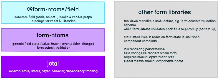
form-atoms is the ‘last-mile’ of your app’s form stack. It has layered, bottom-up architecture with clear separation of concerns.
We provide you with stable pre-fabricated UI fields, while you still can go one level down and take the advantage of form primitives to develop anything you need.
To contrast it with formik or react-hook-form, our form state thanks to jotai lives outside of the react tree, so you never lose it when the component unmounts.
Moreover, jotai’s external state unlike redux-form has compact API with ‘atom-local reducer’ and automatic dependency tracking leading to unmatched rendering performance.

What’s in the box?
The form-atoms library provides atomic form primitives capable of tracking input value, touch state, validation status and more.
@form-atoms/field extends these primitives & packages them into hooks & headless components (think ‘smart components’), which can be easily wired to UI (think dumb components) checkbox, select or array field.
What is a <Field />?
Most UI libraries provide styled primitive <Input> components, form <Label> and form <Control>. These must be integrated together with state & validation libraries, so when the input value is invalid, the error is propagated to the form control or the label is colored to red. The work to get this right is non-trivial and error prone.
@form-atoms/field provides you with integrated field components:
<Field> = <Control> + <Input> + <Label> + <HelpText> + <Error>
Integrations
@form-atoms/field comes with <Fields /> pre-wired to popular UI libraries.
| ?Package Docs | ? Storybook | ?Official Docs | About |
|---|---|---|---|
| flowbite | Flowbite Fields | flowbite-react | Bindigs to Tailwind component library Flowbite |
| chakra-ui | ? WIP | chakra-ui | Bindings to CSS-in-JS library Chakra UI |