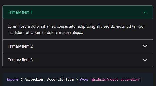
React Accordeon
React Accordeon component with expand/collapse CSS animation. The event trigger can be configured to any component, such in the Navigation and Content
Components
<Accordeon>
Primary component of React Accordeon. It keeps and handles the state of all the elements.
Props
header (optional)
A valid React component that will be rendered in a <header> html tag. This component will be provided with the two property functions expandAll and collapseAll.
footer (optional)
A valid React component that will be rendered in a <footer> html tag. This component will be provided with the two property functions expandAll and collapseAll.
Example
import Header from './Header.js';
import Footer from './Footer.js';
<Accordeon header={<Header />} footer={<Footer />}>
<Panel>
The Panel component is the container for each element in the accordeon. This will create the collapse/expand animation for the Content component.
Props
expanded (optional)
Boolean value to configure an initial state for the Panel. If true, the Panel is expanded. If false, the Panel is collapsed.
Example
Item expanded
<Panel key="panel1" expanded>
Item collapsed
<Panel key="panel1" expanded={false}>
or the expanded property can also be omitted
<Panel key="panel1">
<Nav>
This component accepts any string or any valid React component to render the Panel Header.
Props
This does not require any property at this moment.
<Content>
Any string, html tag, or a valid React component
Props
This does not require any property at this moment.
Examples
Accordeon with plain strings in the Nav and Content
import React, { PropTypes } from 'react';
import { Accordeon, Panel, Nav, Content } from 'react-accordeon';
function ExampleOne(props) {
  return (
    <Accordeon>
      <Panel key="panel1">
        <Nav>Question 1</Nav>
        <Content>
          Lorem Ipsum is simply dummy text of the printing and typesetting industry.
        </Content>
      </Panel>
      <Panel key="panel2">
        <Nav>Question 2</Nav>
        <Content>
          And more recently with desktop publishing software like Aldus PageMaker including versions of Lorem Ipsum.
        </Content>
      </Panel>
    </Accordeon>
    );
}
Given valid React Components
import React, { PropTypes } from 'react';
import { Accordeon, Panel, Nav, Content } from 'react-accordeon';
import AnotherReactComponentNav from './Another-react-component-nav.js';
import AnotherReactComponentContent from './Another-react-component-content.js';
function ExampleOne(props) {
  return (
    <Accordeon>
      <Panel key="panel1">
        <Nav><AnotherReactComponent /></Nav>
        <Content>
          <AnotherReactComponentContent />
        </Content>
      </Panel>
    </Accordeon>
    );
}

// A valid React stateless Component (AnotherReactComponentNav.js)
// We can configure the 'toggle' trigger in any React supported event (onClick={toggle})
import React, { PropTypes } from 'react';
const AnotherReactComponentNav = (props) => {
  const { expanded, toggle } = props;
  return (
    <h2>
      {expanded ? '-' : '+'}
      <button
        onClick={toggle}
        aria-expanded={expanded}
        role="tab"
      >
        Question 1
      </button>
    </h2>
  );
};

AnotherReactComponentNav.propTypes = {
  toggle: PropTypes.func,
  expanded: PropTypes.bool,
};

export default Nav;

// A valid React stateless Component (AnotherReactComponentContent.js)
import React, { PropTypes } from 'react';
const Content = (props) => {
  const { expanded, toggle } = props;
  return (
    <div>
      It is a long established fact that a reader will be distracted by the readable content of a page when looking at its layout.
    </div>
  );
};

Content.propTypes = {
  toggle: PropTypes.func,
  expanded: PropTypes.bool,
};

export default Content;
With some valid HTML
import React from 'react';
import { Accordeon, Panel, Nav, Content } from 'react-accordeon';
function ExampleOne(props) {
  return (
    <Accordeon>
      <Panel key="panel1">
        <Nav>Item 1</Nav>
        <Content>
          <img src="https://placekitten.com/g/500/500" alt="kitten" />
        </Content>
      </Panel>
    </Accordeon>
    );
}
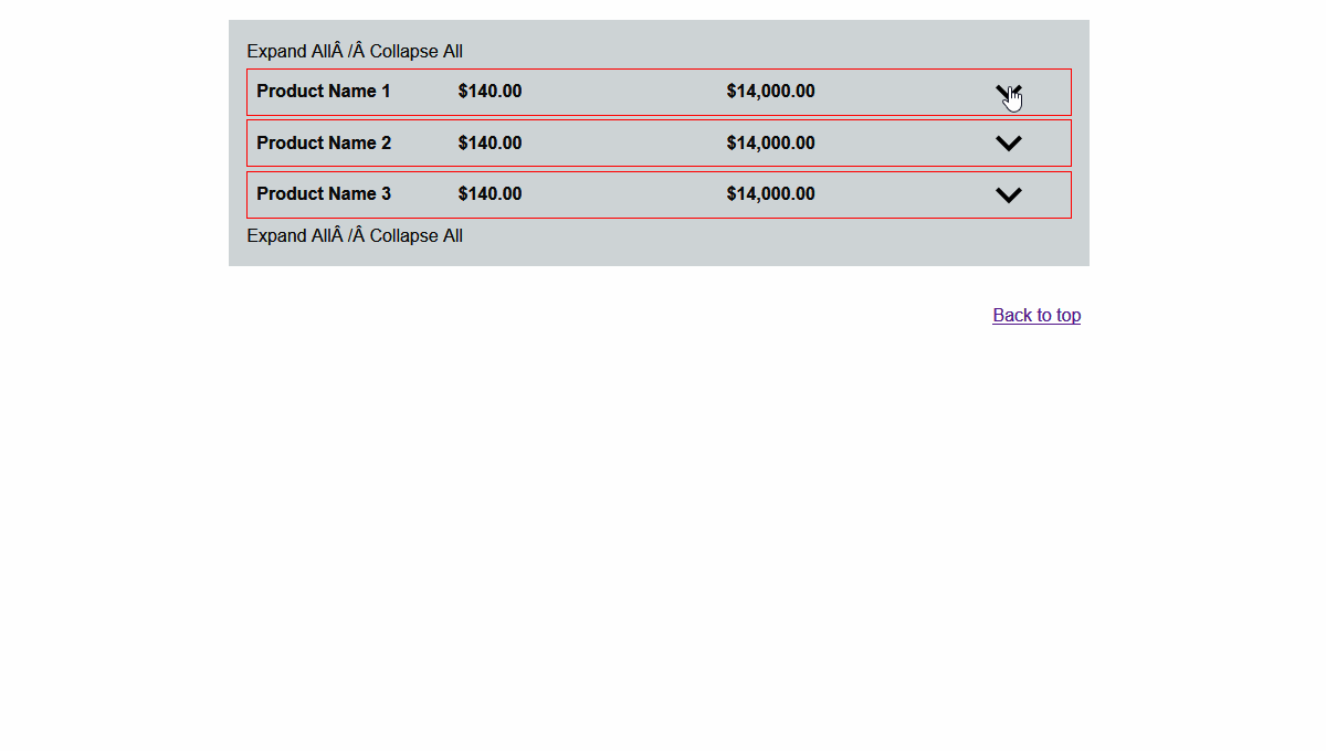
Accordeon with Header and Footer
import React from 'react';
import { Accordeon, Panel, Nav, Content } from 'react-accordeon';
import Header from './Header';
import Footer from './Footer';
import NavComponent from './NavComponent';
import ContentComponent from './ContentComponent';
<Accordeon header={<Header />} footer={<Footer />}>
  <Panel key="panel1">
    <Nav>Question 1</Nav>
    <Content>
      <div>
        <img src="https://placekitten.com/g/500/500" alt="kittlen" />
      </div>
    </Content>
  </Panel>
  <Panel key="panel2" expanded>
    <Nav><NavComponent /></Nav>
    <Content><ContentComponent /></Content>
  </Panel>
</Accordeon>

// The Header must be a valid React component (Header.js).
// Two functions are passed as properties: expandAll, collapseAll
import React from 'react';
const Header = (props) => {
  const { expandAll, collapseAll } = props;
  return (
    <div>
      <button onClick={expandAll}>Expand All</button> / <button onClick={collapseAll}>Collapse All</button>
    </div>
  );
};

Header.propTypes = {
  expandAll: React.PropTypes.func,
  collapseAll: React.PropTypes.func,
};

export default Header;

// The Footer must be a valid React component (Footer.js).
// Two functions are also passed as properties: expandAll, collapseAll
import React from 'react';
const Footer = (props) => {
  const { expandAll, collapseAll } = props;
  return (
    <div>
      <span onClick={expandAll}>Expand All</span> / <span onClick={collapseAll}>Collapse All</span>
    </div>
  );
};

Footer.propTypes = {
  expandAll: React.PropTypes.func,
  collapseAll: React.PropTypes.func,
};

export default Footer;