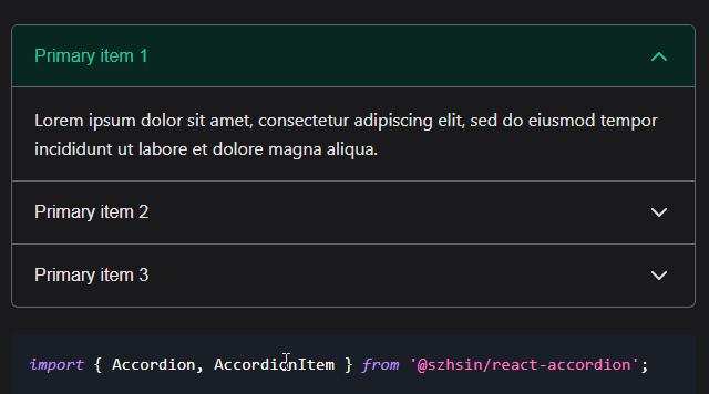
react-accordion-with-header
React accordion component with customizable flexbox header.
Install via NPM:
npm install react-accordion-with-header
Import the modules:
import {
    AccordionWithHeader,
    AccordionNode,
    AccordionHeader,
    AccordionPanel
} from 'react-accordion-with-header';
Items can be passed in to <AccordionHeader /> and <AccordionPanel />:
- as a component passed into the
templateprop - as children
NOTE: We cannot pass in a stateless component as a template at this time because of the way we use refs to calculate height... and according to react: "Stateless function components cannot be given refs"
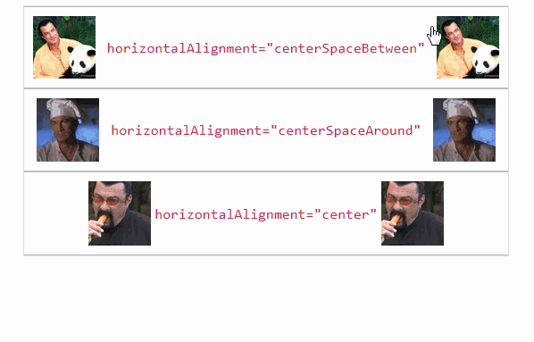
The elements passed in to <AccordionHeader /> can be horizontally justified and vertically aligned via their respective props
:tada: :boom: :beers:
horizontalAlignmentverticalAlignment
Pass in a component as children:
…
  render() {
    return (
      <AccordionWithHeader>
        {[1, 2, 3, 4].map((item, i) => {
          return (
            <AccordionNode key={i}>
              <AccordionHeader horizontalAlignment="centerSpaceAround" verticalAlignment="center">
                <HeaderTpl />
              </AccordionHeader>
              <AccordionPanel>
                <BodyTpl />
              </AccordionPanel>
            </AccordionNode>
          );
        })}
      </AccordionWithHeader>
    );
  }
…
Pass in a component as a template via template prop:
  render() {
    return (
      <AccordionWithHeader>
        {[1, 2, 3, 4].map((item, i) => {
          return (
            <AccordionNode key={i}>
              <AccordionHeader template={<HeaderTpl />} horizontalAlignment="centerSpaceBetween" />
              <AccordionPanel template={<BodyTpl />} />
            </AccordionNode>
          );
        })}
      </AccordionWithHeader>
    );
  }
...or pass in plain HTML as children
…
  render() {
    return (
      <AccordionWithHeader>
        {[1, 2, 3, 4].map((item, i) => {
          return (
            <AccordionNode key={i}>
              <AccordionHeader>
                <div>
                  <h2>Some title!</h2>
                </div>
              </AccordionHeader>
              <AccordionPanel>
                <section>
                  <header>Some body information etc</header>
                  <article>Interesting things...</article>
                </section>
              </AccordionPanel>
            </AccordionNode>
          );
        })}
      </AccordionWithHeader>
    );
  }
…
actionCallback
…
  actionCallback(panels) {
    // fires any time headers are clicked and panels change state
    // receives array of panels: [{ panel: 3, open: true }, { panel: 6, open: true }]
    console.log('panels', panels);
  }

  render() {
    return (
      <AccordionWithHeader actionCallback={this.actionCallback.bind(this)}>
        // ... stuff
      </AccordionWithHeader>
    );
  }
…
options / PropTypes
(all components accept a className and style prop)
AccordionWithHeader
| Property | Type | Description | Default |
|---|---|---|---|
| firstOpen | Boolean |
Determines if the first panel should be expanded by default | false |
| multipleOkay | Boolean |
True allows multiple panels to be expanded at the same time. False allows only one panel to be expanded at any time. | false |
| actionCallback | Function |
Callback function fired when a header is clicked and panel is opened or closed. Returns an array representing panels | null |
AccordionNode
| Property | Type | Description | Default |
|---|---|---|---|
| className | String |
Custom classname applied to root item div | null |
AccordionHeader
| Property | Type | Description | Default |
|---|---|---|---|
| title | String |
For simple headers, a title will render an <h1> and disallow child elements |
null |
| titleColor | String |
some valid CSS color or rgb or hex | black |
| horizontalAlignment | String |
One of: 'centerSpaceBetween', 'centerSpaceAround', 'center', 'left', 'right'. Maps to corresponding flex-box CSS property | centerSpaceAround |
| verticalAlignment | String |
One of: 'top', 'center', 'bottom' | center |
| template | Element |
Component to be rendered as a template | null |
AccordionPanel
| Property | Type | Description | Default |
|---|---|---|---|
| template | Element |
Component to be rendered as a template | null |
| speed | Number |
Speed in milliseconds to apply to CSS transition of open/close effect | 250 |
What about styling?
You can styles to any component with a style prop or className prop
For example: <AccordionHeader style={{border: '1px solid'}}>
Or: <AccordionHeader className="myCssClass">
Roadmap
- add tests