react-draggable-list
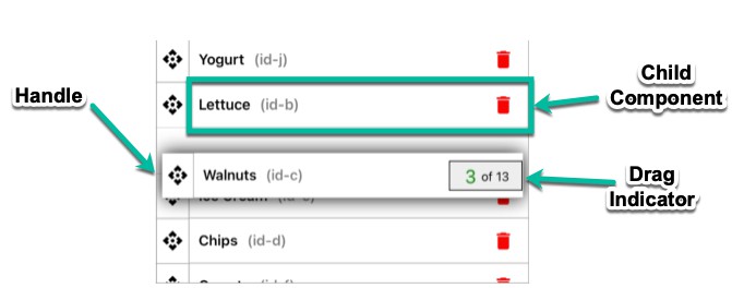
This component lets you make a user re-orderable list that animates nicely so that the user can easily move large items:
You can find its code in the example directory. The example may be compiled
by running:
yarn
yarn example-build
You can build the example with live editing enabled (using
react-transform-hmr and
browserify-hmr) by running:
yarn example-watch
DraggableList
This module exports the DraggableList React component, which takes the
following props:
listmust be an array of objects representing your list's items.itemKeymust be the name of a property of the list's objects to use as a
key to identify the objects, or it must be a function that takes an object as
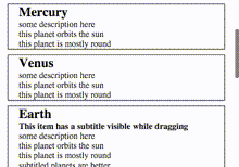
an argument and returns a key.templatemust be a React component used to render the list items. This must
not be a stateless-functional component. If possible, don't pass a new
class instance on every render. See the next section for more information
on the template including a description of the props passed to the component.onMoveEndmay be a function which will be called when the user drags and
drops an item to a new position in the list. The arguments to the function
will be(newList: Array<Object>, movedItem: Object, oldIndex: number, newIndex: number).container: If the DraggableList is inside a scrollable element, then this
property should be set to a function which returns a reference to it. When the
user moves an item in the list, the container will be scrolled to keep the
item in view. If the DraggableList is in no scrollable elements besides the
page itself, then a function returning a reference todocument.bodyshould
be given.springConfigis an optional object which sets the SpringHelperConfig
object passed to
React-Motion
for animations. This prop defaults to{stiffness: 300, damping: 50}.paddingis an optional number of pixels to leave between items. Defaults to 10.unsetZIndexis an optional property that defaults to false. If set to true,
then the z-index of all of the list items will be set to "auto" when the list
isn't animating. This may have a small performance cost when the list starts
and stops animating. Use this if you need to avoid having the list item create
a stacking context when it's not being animated.constrainDragis an option property that defaults to false. If it is set to
true, then the y-coordinate of a dragged item will be constrained vertically to
the bounds of the list.autoScrollMaxSpeedis an optional number that allows the scroll speed when
the user drags to the top or bottom of the list to be overridden.autoScrollRegionSizeis an optional number that allows the height of the
region that triggers auto-scrolling when dragged onto to be overridden.commonPropsis an optional value that will be passed as thecommonProps
prop to every template component instance.
A DraggableList instance has the following methods:
getItemInstance(key)will return a reference to the mounted instance of the
template for a given key.
Template
The template component is passed the following props:
itemis an object from the list prop passed to DraggableList.itemSelectedis a number from 0 to 1. It starts at 0, and quickly increases
to 1 when the item is picked up by the user. This may be used to animate the
item when the user picks it up or drops it.anySelectedis a number from 0 to 1. It starts at 0, and quickly increases
to 1 when any item is picked up by the user.dragHandleis a function which should be used during rendering to wrap the
element to be used as the drag handle. The whole item will be draggable by the
wrapped element.commonPropswill be set to the same value passed as thecommonPropsprop
to the DraggableList component.
The template component should be styled with max-height set to "100%" for best
results.
The template component will have its props updated many times quickly during
the animation, so implementing shouldComponentUpdate in its children is
highly recommended.
The template component may have a getDragHeight method which may return a
number to set the height in pixels of the item while the user is dragging it.
If the method returns null or is not present, then the drag height will be
equal to the element's natural height.
Bundling Note
To use this module in browsers, a CommonJS bundler such as Browserify or
Webpack should be used.
This project relies on Map and WeakMap being available globally. A global polyfill
such as Babel's polyfill is required to
support older browsers that don't implement these.
Types
Flow type declarations for this module are included!
If you are using Flow, they won't require any configuration to use.