React Markdown Preview
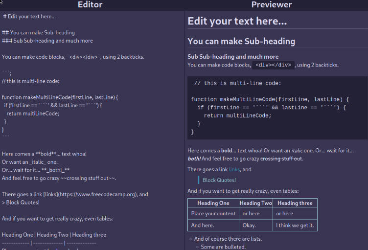
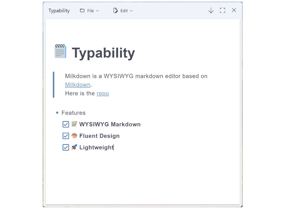
React component preview markdown text in web browser. The minimal amount of CSS to replicate the GitHub Markdown style. The current document website is converted using this react component.
Quick Start
$ npm install @uiw/react-markdown-preview --save
Usage Example
import MarkdownPreview from '@uiw/react-markdown-preview';

const source = `
## MarkdownPreview

> todo: React component preview markdown text.
`;

function Demo() {
  return (
    <MarkdownPreview source={source} />
  )
}
Options Props
import { ReactMarkdownProps } from 'react-markdown';

interface IMarkdownPreviewProps extends Omit<ReactMarkdownProps, 'className'> {
  prefixCls?: string;
  className?: string;
  style?: React.CSSProperties;
  onScroll?: (e: React.UIEvent<HTMLDivElement>) => void;
  onMouseOver?: (e: React.MouseEvent<HTMLDivElement>) => void;
}
This ReactMarkdownProps details.
sourceorchildren- string The Markdown source to parse (required)className- string Class name of the container element. If none is passed, a container will not be rendered.escapeHtml- boolean Setting tofalsewill cause HTML to be rendered (see notes below about proper HTML support). Be aware that setting this tofalsemight cause security issues if the
input is user-generated. Use at your own risk. (default:true).skipHtml- boolean Setting totruewill skip inlined and blocks of HTML (default:false).sourcePos- boolean Setting totruewill adddata-sourceposattributes to all elements,
indicating where in the markdown source they were rendered from (default:false).rawSourcePos- boolean Setting totruewill pass asourcePositionproperty to all renderers with structured source position information (default:false).includeNodeIndex- boolean Setting totruewill passindexandparentChildCountprops to all renderers (default:false).allowedTypes- array Defines which types of nodes should be allowed (rendered). (default: all
types).disallowedTypes- array Defines which types of nodes should be disallowed (not rendered).
(default: none).unwrapDisallowed- boolean Setting totruewill try to extract/unwrap the children of
disallowed nodes. For instance, if disallowingStrong, the default behaviour is to simply skip
the text within the strong altogether, while the behaviour some might want is to simply have the
text returned without the strong wrapping it. (default:false)allowNode- function Function execute if in order to determine if the node should be allowed.
Ran prior to checkingallowedTypes/disallowedTypes. Returning a truthy value will allow the
node to be included. Note that if this function returnstrueand the type is not in
allowedTypes(or specified as adisallowedType), it won't be included. The function will
receive three arguments argument (node,index,parent), wherenodecontains different
properties depending on the node type.linkTarget- function|string Sets the default target attribute for links. If a function is
provided, it will be called withurl,text, andtitleand should return a string
(e.g._blankfor a new tab). Default isundefined(no target attribute).transformLinkUri- function|null Function that gets called for each encountered link with a
single argument -uri. The returned value is used in place of the original. The default link URI
transformer acts as an XSS-filter, neutralizing things likejavascript:,vbscript:andfile:
protocols. If you specify a custom function, this default filter won't be called, but you can
access it asrequire('react-markdown').uriTransformer. If you want to disable the default
transformer, passnullto this option.transformImageUri- function|null Function that gets called for each encountered image with a
single argument -uri. The returned value is used in place of the original.renderers- object An object where the keys represent the node type and the value is a React
component. The object is merged with the default renderers. The props passed to the component
varies based on the type of node.
See Options Props for more details.
Development
Runs the project in development mode.
# Step 1, run first, listen to the component compile and output the .js file
npm run ts:watch
# Step 2, listen for compilation output type .d.ts file
npm run types:watch
# Step 3, development mode, listen to compile preview website instance
npm run doc:dev
Builds the app for production to the build folder.
npm run released
The build is minified and the filenames include the hashes.
Your app is ready to be deployed!

