ssuggestor
React component that enables users to quickly find and select from a pre-populated list of values as they type. Currently uses Bootstrap styles.
Instalation
# using yarn
yarn add ssuggestor

# using npm
npm i ssuggestor
Usage
npm
import React from 'react';
import { render } from 'react-dom';
import Suggestor from 'ssuggestor';

render(
    <Suggestor
        list={['suggestion-a', 'suggestion-b', 'suggestion-c', '...', 'suggestion-z']}
        placeholder="write something to display suggestions..."
        onChange={console.log}
        onSelect={(value, suggestion) => console.info(value, suggestion)}
        styles={{ width: 100 }}
        arrow
        close
    />,
    document.body
);
browser
Include react dependencies and ssuggestor scripts:
<script src="https://unpkg.com/[email protected]/umd/react.production.min.js"></script>
<script src="https://unpkg.com/[email protected]/umd/react-dom.production.min.js"></script>
<script src="https://unpkg.com/[email protected]/prop-types.min.js"></script>
<script src="https://unpkg.com/[email protected]/dist/ssuggestor.min.js"></script>

<!-- bootstrap styles -->
<link href="https://maxcdn.bootstrapcdn.com/bootstrap/3.3.7/css/bootstrap.min.css">
Description
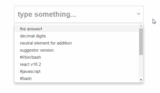
This Simple Suggestor package exports a single React component as the default export:
It handles clicks outside of DOM component in order to close the suggestion list.
All pattern matches are highlighted.
Example:
- input pattern:
sugge - items on suggestion list: autoSuggest, ssüggèstor and suggests
Then,
- matches are case insensitive: autoSuggest
- pattern test is performed removing accents: ssüggèstor
Suggestion Objects
Suggestion objects use requires a selector function to convert each object into string representation which will be displayed on the suggestion list.
Props:
| Prop | Type | Default | Description |
|---|---|---|---|
| accents | Boolean | false |
whether to differentiate chars with accents or not |
| arrow | Boolean | true |
▼ icon - open suggestion list |
| className | String | input-group |
css classes for component's root element |
| close | Boolean | true |
✖︎ icon - delete current value |
| list | Array | -- | suggestions (required) |
| selector | Function | s => s |
suggestions selector (must return a string) |
| openOnClick | Boolean | true |
whether suggestion list opens on click or not |
| onSelect | Function | () => {} |
onSelect handler: (value, suggestion) => { } |
| onChange | Function | () => {} |
onChange handler: (value) => { } |
| onKey | Function | () => {} |
onKey handler: (keyEvent) => { } |
| placeholder | String | -- | input placeholder text |
| required | Boolean | false |
if true, set required attribute on <input> element |
| selectOnTab | Boolean | false |
if true, enables Tab key to select ssuggestion |
| style | Object | -- | inline styles for component's root element |
| suggestOn | Number | 1 |
minimum size of search string to show suggestions |
| tooltip | String | -- | input title text (simple tooltip) |
| value | String | '' |
initial value |
| useKeys | Boolean | true |
whether to use supported keys or not |
Supported Keys
Up, Down, Enter, Escape & Tab.
Method
One public method for imperative action: focus()
instance.focus(); // focuses the control input
Bootstrap
Used bootstrap classes:
input-groupform-controldropdown-menuglyphicon(*-triangle-bottom,*-remove)
Development
In order to run this project locally clone this repo, restore dependencies and execute dev task:
git clone https://github.com/carloluis/ssuggestor.git
cd ssuggestor
yarn
yarn dev
Open browser on [localhost:9000](http://localhost:9000/)