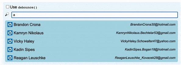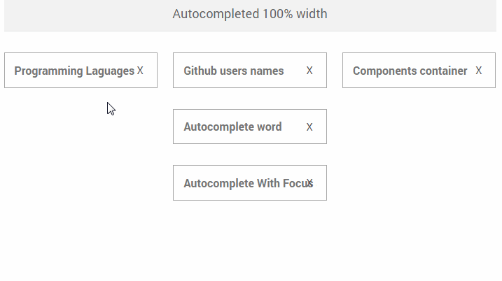
SUI-Autocompleted
React component that shows a list of suggestions under an input file when you start to write something.
Usage
import 'babel/polyfill';
import React from 'react';
import ReactDom from 'react-dom';
import AutocompletedContainer from './autocompleted-container';
import AutocompletedGithubUserContainer from './autocompleted-githubUsers-container';
import AutocompletedComponentContainer from './autocompleted-component-container';
import './style.scss';
import '../src/index.scss';

ReactDom.render(<AutocompletedContainer />, document.getElementById('languages'));
ReactDom.render(<AutocompletedGithubUserContainer />, document.getElementById('github-users'));
ReactDom.render(<AutocompletedComponentContainer />, document.getElementById('component-container'));
Component Properties
The component exposes the following props:
-
placeholder (String): Optional Default text value for the input file when no key is pressed (placeholder value).
-
suggests (Array): Required Array of SuggestionObjects. Te array contains the suggestions to show. If you don't want to show anything you have to send an empty array.
-
handleChange (Function): Required This function is called everytime user change the input field value.
const handleChange = function( inputFileValue ){ ... } -
handleSelect (Function): Required This function is called when one suggestion is selected (via click or enter pressed).
const handleSelect = function( suggestionValue ){ ... } -
handleBlur (Function): This function is called everytime user exits the input.
-
handleFocus (Function): This function is called everytime user focus on the input.
-
selectFirstByDefault (Boolean): Optional It sets first position for the autocomplete default active option. Defaults to
true. -
focus (Boolean): Optional It trigger focus in the input. Defaults to
false.
and then you have to create containers which one setting that properties in the sui-autocompleted component. You can view an example of this kind of container in the doc folder.
SuggestObject
An SuggestObject is a plain JS Object with these specials keys:
{
    'id': [Unique id for the suggestion],
    'value': [value to be passed to the handleSelect callback function]
    'content': [React Component] or [Text to be show in the UI]
    'literal': [String] This key is REQUIRED only if you are using a ReactJS Component like a content. It is used to decide which text has to be put in the input text when this suggestion is selected, in other case content will be used,
}
Theme
There are several classes in order to apply a theme to the component:
- sui-autocompleted
- sui-autocompleted-input
- sui-autocompleted-clear
- sui-autocompleted-results
- sui-autocompleted-item
- sui-autocompleted-item--active
The component exports a basic CSS that you can include from the package in the node_modules.
Installation
To run the component and play with the examples you have to:
Download files from GitHub repo.
$ git clone https://github.com/scm-spain/sui-autocompleted$ cd sui-autocompleted
Install dependencies.
$ npm install// Install npm dependencies from package.json
Launch the development environment.
$ npm run dev// Run development environment- Go to localhost:8080
Bundle
In order to generate the bundle including all React dependencies and the component logic we need to bundle a single JS file running the following command:
$ npm run build
JS Testing
Execute a complete test by running:
There are two options for executing tests:

* Single mode: `$ npm test`
* Watch mode: `$ npm run test:watch`


## Lint Testing
In addition, you can run specific test for linting JS and SASS:
SASS: (SASS linting rules specified in file .scss-lint.yml)
$ npm run lint:sass
NPM
The SUI-Autocompleted component is available as a NPM package here:
npm install @schibstedspain/sui-autocompleted`