React Responsive Collapsible Section Component
React component to wrap content in Collapsible element with trigger to open and close.
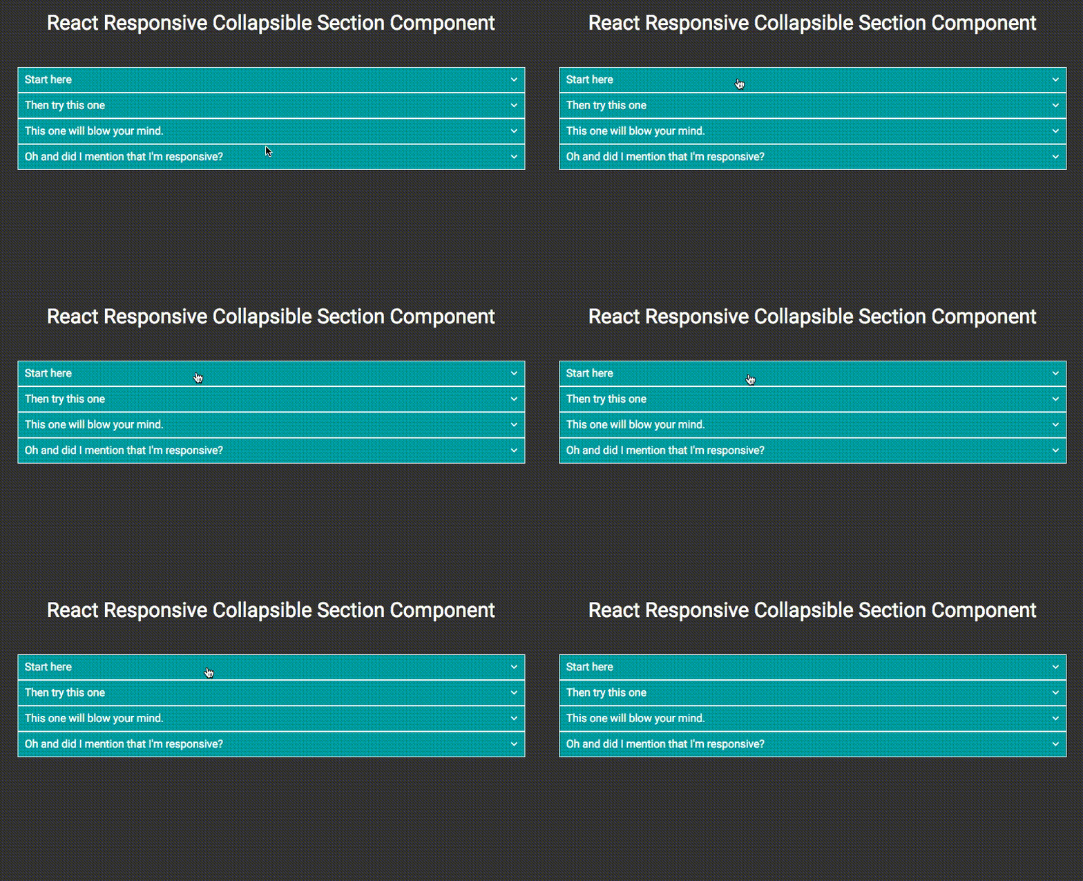
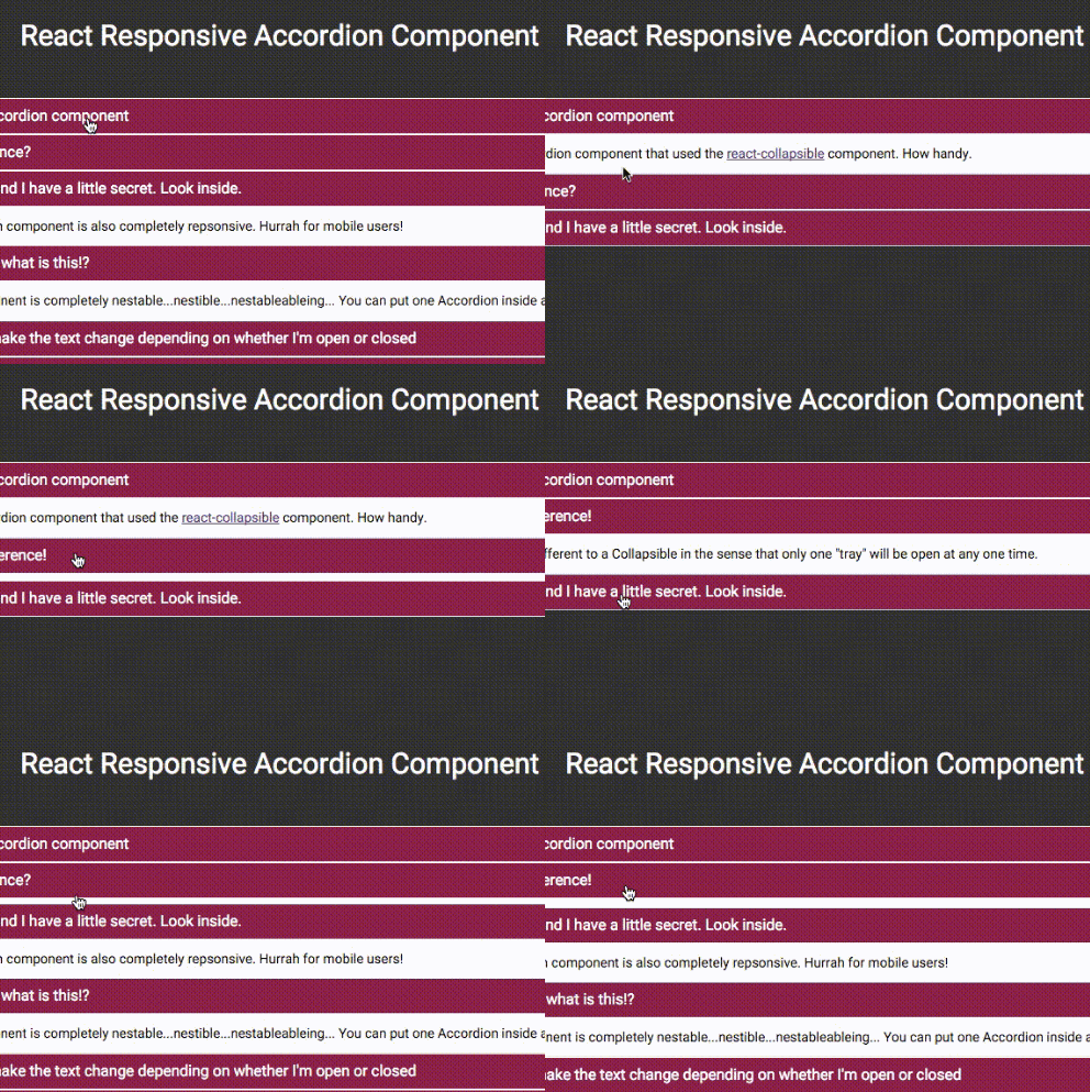
It's like an accordion, but where any number of sections can be open at the same time.
Migrating from v1.x to v2.x
Version 2 is 100% API complete to version 1. However, there is a breaking change in the onOpen and onClose callbacks. These methods now fire at the end of the collapsing animation. There is also the addition of onOpening and onClosing callbacks which fire at the beginning of the animation.
To migrate to v2 from v1 simply change the onOpen prop to onOpening and onClose to onClosing.
Installation
Install via npm or yarn
npm install react-collapsible --save
yarn add react-collapsible
Alternatively just download the Collapsible.js file form the src folder and include it in your project in your chosen way.
Usage
Collapsible can receive any HTML elements or React component as it's children. Collapsible will wrap the contents, as well as generate a trigger element which will control showing and hiding.
ES6
import React from 'react';
import Collapsible from 'react-collapsible';

var App = React.createClass({

  render: function() {
    return(

      <Collapsible trigger="Start here">
        <p>This is the collapsible content. It can be any element or React component you like.</p>
        <p>It can even be another Collapsible component. Check out the next section!</p>
      </Collapsible>

    );
  }

});

export default App;
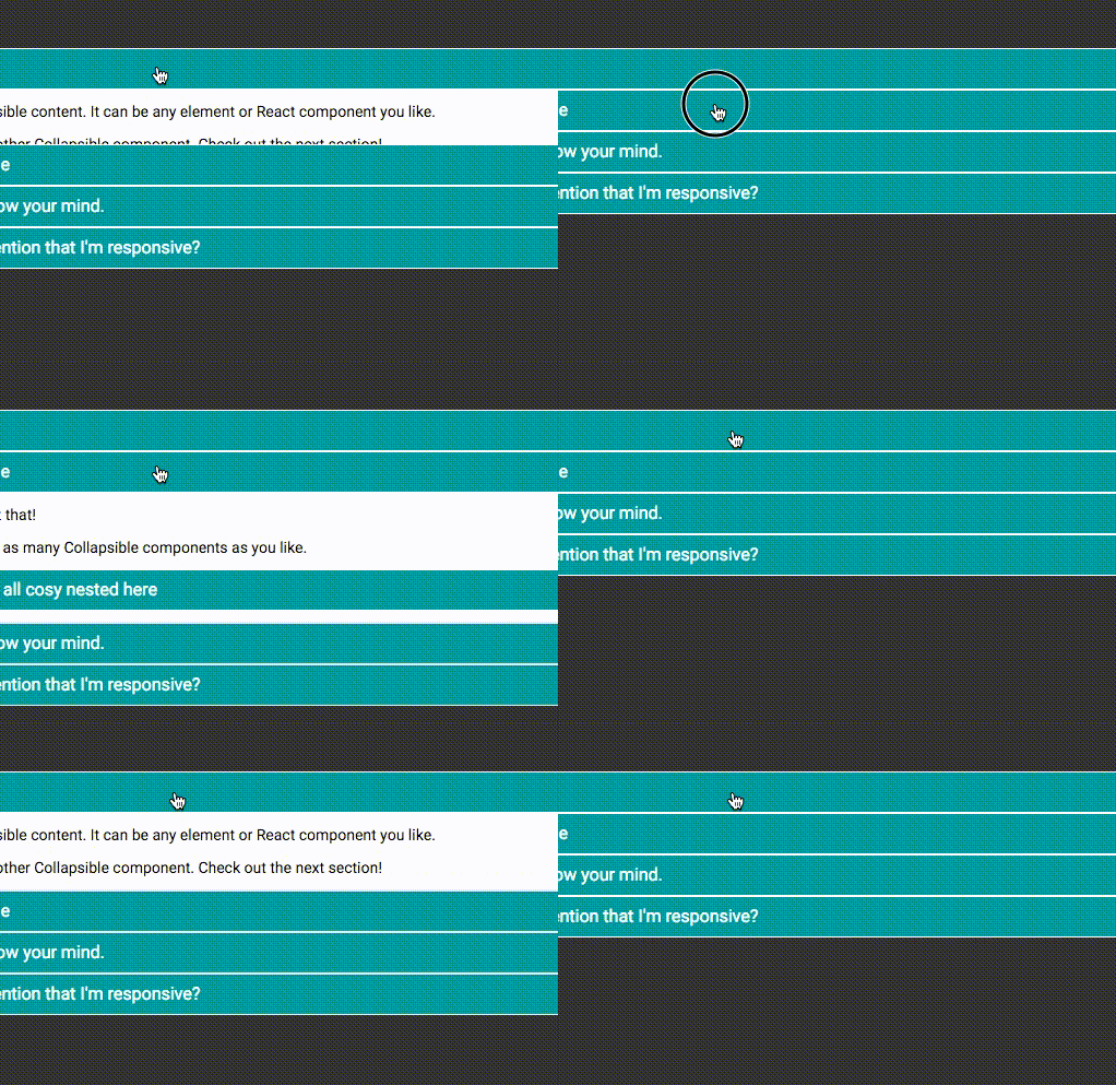
With a little CSS becomes

Properties (Options)
trigger | string or React Element | required
The text or element to appear in the trigger link.
triggerTagName | string | default: span
The tag name of the element wrapping the trigger text or element.
triggerStyle | object | default: null
Adds a style attribute to the trigger.
triggerWhenOpen | string or React Element
Optional trigger text or element to change to when the Collapsible is open.
triggerDisabled | boolean | default: false
Disables the trigger handler if true. Note: this has no effect other than applying the .is-disabled CSS class if you've provided a handleTriggerClick prop.
transitionTime | number | default: 400
The number of milliseconds for the open/close transition to take.
transitionCloseTime | number | default: null
The number of milliseconds for the close transition to take.
easing | string | default: 'linear'
The CSS easing method you wish to apply to the open/close transition. This string can be any valid value of CSS transition-timing-function. For reference view the MDN documentation.
open | bool | default: false
Set to true if you want the Collapsible to begin in the open state. You can also use this prop to manage the state from a parent component.
accordionPosition | string
Unique key used to identify the Collapse instance when used in an accordion.
handleTriggerClick | function
Define this to override the click handler for the trigger link. Takes one parameter, which is props.accordionPosition.
onOpen | function
Is called when the Collapsible has opened.
onClose | function
Is called when the Collapsible has closed.
onOpening | function
Is called when the Collapsible is opening.
onClosing | function
Is called when the Collapsible is closing.
lazyRender | bool | default: false
Set this to true to postpone rendering of all of the content of the Collapsible until before it's opened for the first time
overflowWhenOpen | enum | default: 'hidden'
The CSS overflow property once the Collapsible is open. This can be any one of the valid CSS values of 'hidden', 'visible', 'auto', 'scroll', 'inherit', 'initial', or 'unset'
triggerSibling | element | default: null
Escape hatch to add arbitrary content on the trigger without triggering expand/collapse. It's up to you to style it as needed. This is inserted in component tree and DOM directly
after .Collapsible__trigger
tabIndex | number | default: null
A tabIndex prop adds the tabIndex attribute to the trigger element which in turn allows the Collapsible trigger to gain focus.
CSS Class String Props
classParentString | string | default: Collapsible
Use this to overwrite the parent CSS class for the Collapsible component parts. Read more in the CSS section below.
className | string
.Collapsible element (root) when closed
openedClassName | string
.Collapsible element (root) when open
triggerClassName | string
.Collapsible__trigger element (root) when closed
triggerOpenedClassName | string
.Collapsible__trigger element (root) when open
contentOuterClassName | string
.Collapsible__contentOuter element
contentInnerClassName | string
.Collapsible__contentInner element
CSS Styles
In theory you don't need any CSS to get this to work, but let's face it, it'd be pretty rubbish without it.
By default the parent CSS class name is .Collapsible but this can be changed by setting the classParentString property on the component.
The CSS class names follow a type of BEM pattern of CSS naming. Below is a list of the CSS classes available on the component.
.Collapsible
The parent element for the components.
.Collapsible__trigger
The trigger link that controls the opening and closing of the component.
The state of the component is also reflected on this element with the modifier classes;
is-closed| Closed stateis-open| Open setStateis-disabled| Trigger is disabled
.Collapsible__contentOuter
The outer container that hides the content. This is set to overflow: hidden within the javascript but everything else about it is for you to change.
.Collapsible__contentInner
This is a container for the content passed into the component. This keeps everything nice and neat and allows the component to do all it's whizzy calculations.
If you're using a CSS framework such as Foundation or Bootstrap, you probably want to use their classes instead of styling .Collapsible. See Properties above.
Example
An example of the component in action is available in the example folder. To see it in action you can run
$ npm i
$ npm run example
This will run the webpack build and open the example.
