Orbit-components
Orbit-components is a React component library which provides developers with the easiest possible way of building Kiwi.com’s products.
Orbit Mission
Orbit aims to bring order and consistency to all of our products and processes. We elevate user experience and increase the speed and efficiency of how we design and build products.
Installation
orbit-components are served as an npm package.
Add them to your project by running:
// with npm
npm install @kiwicom/orbit-components

// with yarn
yarn add @kiwicom/orbit-components
Don't forget to install the styled-components ^4.0.0 also.
Usage
- Import fonts that are used in orbit-components:
<link
  href="https://fonts.googleapis.com/css?family=Roboto:400,400i,500,500i,700"
  rel="stylesheet"
/>
Or via CSS:
@import url("https://fonts.googleapis.com/css?family=Roboto:400,400i,500,500i,700");
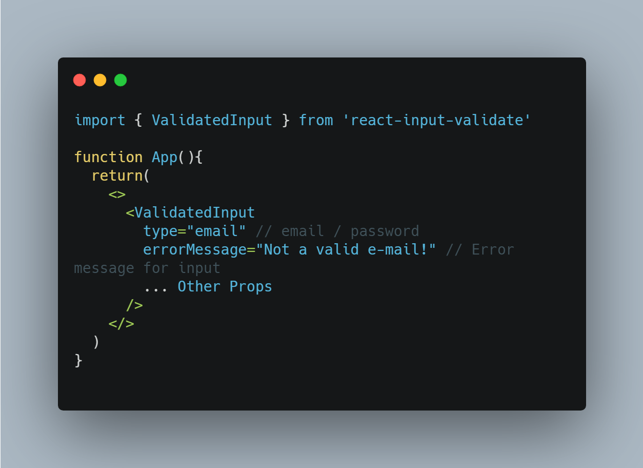
- Include any of our components in your project and use it:
import Alert from "@kiwicom/orbit-components/lib/Alert";

<Alert>Hello World!</Alert>;
If you want to use custom theme or dictionary inside your project, it's necessary to wrap your app into <ThemeProvider>. See this document for more information.
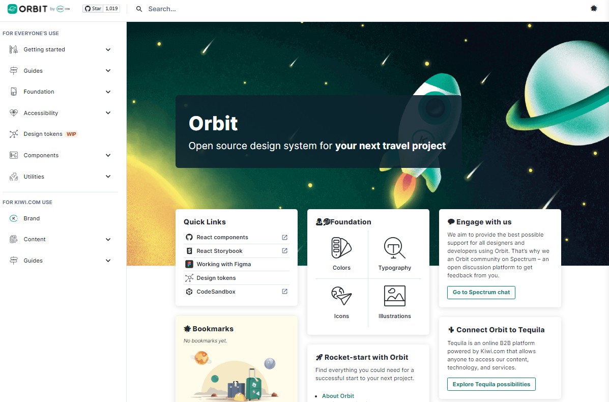
For live preview check out Storybook or orbit.kiwi.
You can also try orbit-components live on CodeSandbox.
Types
Orbit comes with both Flow and Typescript definitions files, so you can choose what fits your project. However, if you work with Typescript, you need to add type for styled-components.
// with npm
npm install @types/styled-components --save-dev

// with yarn
yarn add @types/styled-components -D