react-scroll-to-bottom
React container that will auto scroll to bottom or top if new content is added and viewport is at the bottom, similar to tail -f. Otherwise, a "jump to bottom" button will be shown to allow user to quickly jump to bottom.
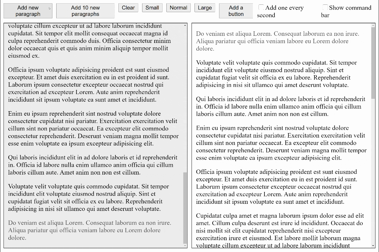
Sample code
import { css } from 'emotion';
import ScrollToBottom from 'react-scroll-to-bottom';
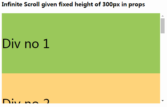
const ROOT_CSS = css({
height: 600,
width: 400
});
export default props => (
<ScrollToBottom className={ROOT_CSS}>
<p>
Nostrud nisi duis veniam ex esse laboris consectetur officia et. Velit cillum est veniam culpa magna sit
exercitation excepteur consectetur ea proident. Minim pariatur nisi dolore Lorem ipsum adipisicing do. Ea
cupidatat Lorem sunt fugiat. Irure est sunt nostrud commodo sint.
</p>
<p>
Duis consectetur ad in fugiat et aliquip esse adipisicing occaecat et sunt ea occaecat ad. Tempor anim consequat
commodo veniam nostrud sunt deserunt adipisicing Lorem Lorem magna irure. Eu ut ipsum magna nulla sunt duis Lorem
officia pariatur. Nostrud nisi anim nostrud ea est do nostrud cupidatat occaecat dolor labore do anim. Laborum
quis veniam ipsum ullamco voluptate sit ea qui adipisicing aliqua sunt dolor nulla. Nulla consequat sunt qui amet.
Pariatur esse pariatur veniam non fugiat laboris eu nulla incididunt.
</p>
<p>
Laboris duis do consectetur aliquip non aliquip ad ad quis minim. Aute magna tempor occaecat magna fugiat culpa.
Commodo id eiusmod ea pariatur consequat fugiat minim est anim. Ipsum amet ipsum eu nisi. Exercitation minim amet
incididunt tempor do ut id in officia eu sit est. Dolor qui laboris laboris tempor sunt velit eiusmod non ipsum
exercitation ut sint ipsum officia.
</p>
</ScrollToBottom>
);
We use
glamorfor component styles. It is not required, but we don't supportstyleprops for performance reason.
Props
| Name | Type | Default | Description |
|---|---|---|---|
checkInterval |
number |
150 | Recurring interval of stickiness check, in milliseconds (minimum is 17 ms) |
className |
string |
Set the class name for the root element | |
debounce |
number |
17 |
Set the debounce for tracking the onScroll event |
debug |
bool |
NODE_ENV === 'development' |
Show debug information in console |
followButtonClassName |
string |
Set the class name for the follow button | |
initialScrollBehavior |
string |
smooth |
Set the initial scroll behavior, either "auto" (discrete scrolling) or "smooth" |
mode |
string |
"bottom" |
Set it to "bottom" for scroll-to-bottom, "top" for scroll-to-top |
nonce |
string |
Set the nonce for Content Security Policy | |
scroller |
function |
() => Infinity |
A function to determine how far should scroll when scroll is needed |
scrollViewClassName |
string |
Set the class name for the container element that house all props.children |
Hooks
You can use React Hooks to perform various operations and signal state changes. The component which use the hook must stay under <ScrollToBottom> or <Composer>.
| Category | Name | Type | Description |
|---|---|---|---|
| Function | useScrollTo |
() => (scrollTop: number | '100%') => void |
Scroll panel to specified position |
| Function | useScrollToBottom |
() => () => void |
Scroll panel to bottom |
| Function | useScrollToEnd |
() => () => void |
Scroll panel to end (depends on mode) |
| Function | useScrollToStart |
() => () => void |
Scroll panel to start (depends on mode) |
| Function | useScrollToTop |
() => () => void |
Scroll panel to top |
| Observer | useObserveScrollPosition |
(observer: (({ scrollTop: number }) => void) | false) => void |
Observe scroll position change by passing a callback function |
| State | useAnimating |
() => [boolean] |
true if the panel is animating scroll effect |
| State | useAnimatingToEnd |
boolean |
true if the panel is animating scroll effect and towards the end (depends on mode) |
| State | useAtBottom |
() => [boolean] |
true if the panel is currently near bottom |
| State | useAtEnd |
() => [boolean] |
true if the panel is currently near the end (depends on mode) |
| State | useAtStart |
() => [boolean] |
true if the panel is currently near the start (depends on mode) |
| State | useAtTop |
() => [boolean] |
true if the panel is currently near top |
| State | useMode |
() => [string] |
"bottom" for scroll-to-bottom, "top" for scroll-to-top |
| State | useSticky |
() => [boolean] |
true if the panel is sticking to the end |
Callback function passed to
useObserveScrollPositionwill be called rapidly during scrolling. To unsubscribe, pass a falsy value.
Sample code
The following sample code will put a button inside the content view only if the view is not at the bottom. When the button is clicked, it will scroll the view to the bottom.
Note:
useScrollToBottomcan only be called inside components hosted under<ScrollToBottom>.
import ScrollToBottom, { useScrollToBottom, useSticky } from 'react-scroll-to-bottom';

const Content = () => {
  const scrollToBottom = useScrollToBottom();
  const [sticky] = useSticky();

  return (
    <React.Fragment>
      <p>
        Labore commodo consectetur commodo et Lorem mollit voluptate velit adipisicing proident sit. Dolor consequat
        nostrud aliquip ea anim enim. Culpa quis tempor et quis esse proident cupidatat reprehenderit laborum ullamco.
      </p>
      <p>
        Incididunt labore nulla cupidatat occaecat elit esse occaecat culpa irure et nisi excepteur. Duis Lorem labore
        consectetur nostrud et voluptate culpa consequat enim reprehenderit. Id voluptate occaecat anim consequat id ea
        eiusmod laborum proident irure veniam esse. Aliquip nostrud culpa nostrud laborum cillum adipisicing dolore. Est
        tempor labore Lorem ad cupidatat reprehenderit exercitation pariatur officia ex adipisicing cupidatat
        exercitation.
      </p>
      <p>
        Est labore cupidatat exercitation est laboris et tempor Lorem irure velit ea commodo sint officia. Ullamco
        exercitation cillum est fugiat do. Enim qui eu veniam nostrud tempor elit. Duis elit mollit ut reprehenderit sit
        adipisicing proident culpa veniam sint veniam consectetur fugiat Lorem. Sint dolor proident commodo proident non
        cupidatat labore.
      </p>
      {!sticky && <button onClick={scrollToBottom}>Click me to scroll to bottom</button>}
    </React.Fragment>
  );
};

export default () => (
  <ScrollToBottom>
    <Content />
  </ScrollToBottom>
);
Context
Starting with React Hooks, we are deprecating the React Context. New functions may not be added to context.
We use 2 different contexts with different performance characteristics to provide better overall performance. Function context contains immutable functions. State context may change when the user scroll the panel.
Function context
This context contains functions used to manipulate the container. And will not update throughout the lifetime of the composer.
| Name | Type | Description |
|---|---|---|
scrollTo |
(scrollTop: number | '100%') => void |
Scroll panel to specified position |
scrollToBottom |
() => void |
Scroll panel to bottom |
scrollToEnd |
() => void |
Scroll panel to end (depends on mode) |
scrollToStart |
() => void |
Scroll panel to start (depends on mode) |
scrollToTop |
() => void |
Scroll panel to top |
State context
This context contains state of the container.
| Name | Type | Description |
|---|---|---|
animating |
boolean |
true if the panel is animating scroll effect |
animatingToEnd |
boolean |
true if the panel is animating scroll effect and towards the end (depends on mode) |
atBottom |
boolean |
true if the panel is currently near bottom |
atEnd |
boolean |
true if the panel is currently near the end (depends on mode) |
atStart |
boolean |
true if the panel is currently near the start (depends on mode) |
atTop |
boolean |
true if the panel is currently near top |
mode |
string |
"bottom" for scroll-to-bottom, "top" for scroll-to-top |
sticky |
boolean |
true if the panel is sticking to the end |
atEndandstickyare slightly different. During scroll animation, the panel is not at the end yet, but it is still sticky.
Sample code
The following sample code will put a button inside the content view only if the view is not at the bottom. When the button is clicked, it will scroll the view to the bottom.
import ScrollToBottom from 'react-scroll-to-bottom';

const Content = ({ scrollToBottom, sticky }) => {
  return (
    <React.Fragment>
      <p>
        Labore commodo consectetur commodo et Lorem mollit voluptate velit adipisicing proident sit. Dolor consequat
        nostrud aliquip ea anim enim. Culpa quis tempor et quis esse proident cupidatat reprehenderit laborum ullamco.
      </p>
      <p>
        Incididunt labore nulla cupidatat occaecat elit esse occaecat culpa irure et nisi excepteur. Duis Lorem labore
        consectetur nostrud et voluptate culpa consequat enim reprehenderit. Id voluptate occaecat anim consequat id ea
        eiusmod laborum proident irure veniam esse. Aliquip nostrud culpa nostrud laborum cillum adipisicing dolore. Est
        tempor labore Lorem ad cupidatat reprehenderit exercitation pariatur officia ex adipisicing cupidatat
        exercitation.
      </p>
      <p>
        Est labore cupidatat exercitation est laboris et tempor Lorem irure velit ea commodo sint officia. Ullamco
        exercitation cillum est fugiat do. Enim qui eu veniam nostrud tempor elit. Duis elit mollit ut reprehenderit sit
        adipisicing proident culpa veniam sint veniam consectetur fugiat Lorem. Sint dolor proident commodo proident non
        cupidatat labore.
      </p>
      {!sticky && <button onClick={scrollToBottom}>Click me to scroll to bottom</button>}
    </React.Fragment>
  );
};

export default () => (
  <ScrollToBottom>
    <FunctionContext.Consumer>
      {({ scrollToBottom }) => (
        <StateContext.Consumer>
          {({ sticky }) => <Content scrollToBottom={scrollToBottom} sticky={sticky} />}
        </StateContext.Consumer>
      )}
    </FunctionContext.Consumer>
  </ScrollToBottom>
);
Observing scroll position
You can use useObserveScrollPosition to listen to scroll change.
// This is the content rendered inside the scrollable container
const ScrollContent = () => {
  const observer = useCallback(({ scrollTop }) => {
    console.log(scrollTop);
  }, []);

  useObserveScrollPosition(observer);

  return <div>Hello, World!</div>;
};
If you want to turn off the hook, in the render call, pass a falsy value, e.g.
useObserveScrollPosition(false).
Please note that the observer will called very frequently, it is recommended:
- Only observe the scroll position when needed
- Don't put too much logic inside the callback function
- If logic is needed, consider deferring handling using
setTimeoutor similar functions - Make sure the callback function passed on each render call is memoized appropriately, e.g.
useCallback
For best practices on handling scroll event, please read this article.
Programmatically pausing scroll
This only works when
modeprop is set tobottom(default).
You can pass a function to the scroller prop to customize how far the scrollable should animate/scroll (in pixel) when its content changed. The signature of the scroller function is:
scroller({ maxValue, minValue, offsetHeight, scrollHeight, scrollTop }) => number;
| Argument | Type | Description |
|---|---|---|
maxValue |
number |
Maximum distance (in pixel) to scroll |
minValue |
number |
Minimum distance (in pixel) to scroll, see notes below |
offsetHeight |
number |
View height of the scrollable container |
scrollHeight |
number |
Total height of the content in the container, must be equal or greater than offsetHeight |
scrollTop |
number |
Current scroll position (in pixel) |
Note: the scroller function will get called when the scrollable is sticky and the content size change. If the scrollable is not sticky, the function will not be called as animation is not needed.
When the scrollable is animating, if there are new contents added to the scrollable, the scroller function will get called again with minValue set to the current position. The minValue means how far the animation has already scrolled.
By default, the scroller function will returns Infinity. When new content is added, it will scroll all the way to the bottom.
You can return a different value (in number) to indicates how far you want to scroll when the content has changed. If you return 0, the scrollable will stop scrolling for any new content. Returning any values less than maxValue will make the scrollable to lose its stickiness after animation. After the scrollable lose its stickiness, the scroller function will not be called again for any future content change, until the scrollable regains its stickiness.