react-menu-list
This project is a set of components for building menus with. This project works well for dropdown and autocomplete menus. The menus are correctly keyboard-accessible, and it includes polish like established desktop application menus have such as well-behaved submenus which stay open even if the user briefly moves the mouse over other menu items while moving toward the submenu's dropdown.
This project differs from other similar projects because it allows arbitrary elements to be in the menu, including allowing menu items to be nested into other elements, and allows custom menu items that take control of the cursor.
This project doesn't include much CSS styling for the menus. You need to bring your own CSS. This makes this project great for someone trying to match their application's existing style. It's recommended that your application create wrapper components around this project's components that add your application's CSS.
You can find its code in the example directory. The example may be compiled
by running:
yarn
yarn example-build
You can build the example with live editing enabled (using
react-transform-hmr and
browserify-hmr) by running:
yarn example-watch
Components
This project exports the following components:
MenuList
This component defines a menu suitable for a dropdown. Whenever a MenuList is
rendered on the page, it will listen for keyboard button presses such as enter,
up, and down.
A MenuList supports the following props:
onItemChosen: This is an optional function which is called when an item in
the menu is chosen by the user. The callback is passed aChosenEventobject.
This event object does not identify which item was chosen by the user. Use the
MenuItem'sonItemChosenprop instead if you want to know which item was
picked.onLeftPushed,onRightPushed: These are optional functions which are
called when the user presses the left or right arrow key while the menu is
open. The callback is passed aMenuEventobject.
A MenuList has the following public methods:
moveCursor(direction: Direction, prevCursorLocation: ?Rect): Move the
cursor in the menu.directionmust be the the string "up" or "down".
prevCursorLocationmay be an object withtop,bottom,left, and
rightnumber properties, and it will be passed to the onHighlightChange
callback of the newly selected MenuItem. (This property is only useful for
when the cursor moves between two menu items which each implement their own
cursor over their own subitems.)hasHighlight(): Returns true if any items in the list are currently
highlighted.
MenuItem
This component defines a selectable item in a MenuList. It should only be used
as a descendant of a MenuList. It does not need to be a direct child of the
MenuList component.
A MenuItem supports the following props:
onItemChosen: This is an optional function which is called when the item is
chosen by the user. The callback is passed aChosenEventobject.onHighlightChange: This is an optional function which is called when the
item is highlighted or unhighlighted by the user. The callback is passed a
boolean representing whether the item is highlighted now, and if the item is
highlighted, the second argument is an object withbyKeyboardboolean
property,prevCursorLocationoptional property (see MenuList.moveCursor),
and an optionaldirectionstring of "up" or "down" describing which key the
user pressed to highlight the item.onLeftPushed,onRightPushed: These are optional functions which are
called when the user presses the left or right arrow key while the menu item
is highlighted. The callback is passed aMenuEventobject.className,style: These are optional and are passed as props to the
MenuItem's underlying div.highlightedClassName,highlightedStyle: These are optional and are
combined with the className and style props and passed to the underlying div
when the item is highlighted.index: This an optional number which overrides the menu item's index in the
MenuList for keyboard control purposes. The order of menu items is normally
determined by their position in the DOM when mounted. This property should be
unnecessary unless you're reordering mounted menu items. If any MenuItems
within a MenuList use this prop, then all of them should.onMouseLeave: This is an optional function which overrides the MenuItem's
default onMouseLeave event handler, which is in charge of unhighlighting the
menu item. Unless you're reimplementing SubMenuItem, you probably won't need
this.
A MenuItem has the following public methods:
takeKeyboard(): This causes the parent MenuList to stop listening for
keyboard events untilreleaseKeyboard()is called or this menu item is
removed. Used by SubMenuItem when a dropdown menu is opened.releaseKeyboard(): Cancels a previoustakeKeyboard()call on this item.lockHighlight(): This prevents other items in the MenuList from becoming
highlighted by the mouse untilunlockHighlight()is called or this menu item
is removed. Used by SubMenuItem to provide a grace period before it becomes
unhighlighted and closes its dropdown.unlockHighlight(): Cancels a previouslockHighlight()call on this item.highlight(byKeyboard: boolean=true): Attempt to highlight the menu item.
If byKeyboard is false, then the attempt may not be successful if a highlight
lock is in place.unhighlight(): Attempt to unhighlight the menu item.moveCursor(direction: Direction, prevCursorLocation: ?Rect): See
menuList.moveCursor.hasHighlight(): Returns true if the item is currently highlighted.
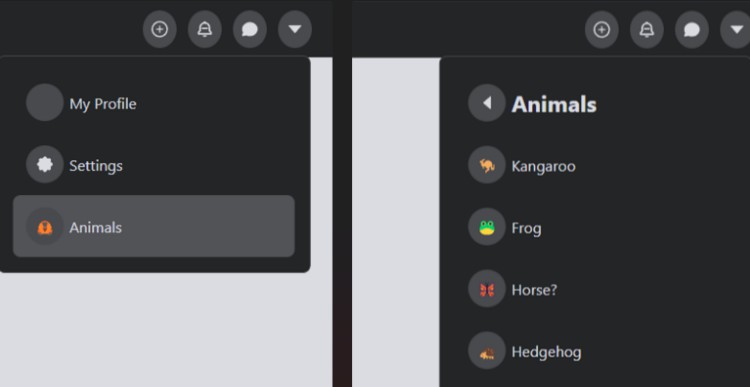
SubMenuItem
This component is similar to MenuItem, except that it defines a menu item that
displays a dropdown when selected. The dropdown can have a nested MenuList.
SubMenuItem automatically keeps the item selected and the dropdown open for a
short grace period when the user moves the mouse off of the menu item if
they're moving the mouse toward the dropdown.
A SubMenuItem supports the following props:
menu: This is the React element to show as the dropdown when the submenu is
open.positionOptions: This an optional object of options to control how the
dropdown is aligned to the menu item. The options are the same as those
supported by
contain-by-screen (version ^1.0).
This defaults to{position:'right', vAlign:'top', hAlign: 'left'}.menuZIndex: This an optional number controlling the z-index CSS property of
the menu's container.onWillOpen: This is an optional function called before the submenu opens.onDidOpen: This is an optional function called after the submenu opened.onWillClose: This is an optional function called before the submenu closes.className,style,highlightedClassName,highlightedStyle,index,
onItemChosen,onHighlightChange: These props are all passed through to the
underlying MenuItem element.openedClassName,openedStyle: These are optional and are combined with
the className and style props and passed to the underlying div when the item
is opened.
A SubMenuItem has the following public methods:
open(callback?: Function)close()toggle()reposition(): Repositions the floating submenu. Call this if you change the
size of the menu.highlight(byKeyboard: boolean=true): Attempt to highlight the menu item.
If byKeyboard is false, then the attempt may not be successful if a highlight
lock is in place. If byKeyboard is false, then the highlight will trigger the
submenu to display.unhighlight(): Attempt to unhighlight the menu item.moveCursor(direction: Direction, prevCursorLocation: ?Rect): See
menuList.moveCursor.hasHighlight(): Returns true if the item is currently highlighted.
MenuListInspector
This component lets you manipulate and listen to events from descendant
MenuList elements. See the Events section for more information. This component
is used by MenuButton to detect when a MenuList provided to it has been clicked
on, and by SubMenuItem to trigger highlighting its submenu.
A MenuListInspector supports the following props:
onItemChosen,onLeftPushed,onRightPushed: These work the same as on
MenuList.
A MenuListInspector has the following public methods:
moveCursor(direction: Direction, prevCursorLocation: ?Rect): boolean: This
calls moveCursor on the first descendant MenuList and returns true, or returns
false if no descendant MenuLists were found.hasHighlight(): Returns true if any descendant lists currently have a
highlighted item.
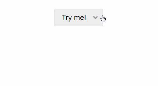
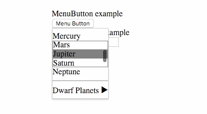
MenuButton
This is a button which shows a dropdown when pressed. You can put a MenuList
into the dropdown, and the MenuButton will close the dropdown once a menu item
is chosen. You can avoid having the MenuButton close when an item is chosen by
calling the stopPropagation method on the ChosenEvent object passed to the
MenuItem's onItemChosen callback.
A MenuButton supports the following props:
menu,positionOptions,menuZIndex,onWillOpen,onDidOpen,
onWillClose,className,style,openedClassName,openedStyle:
These work the same as the props on SubMenuItem.disabled,title: These are passed to the button element.ButtonComponent: Optional prop that allows a different component to be used
instead of an html<button>.
A MenuButton has the following public methods:
open(callback?: Function)close()toggle()reposition(): Repositions the floating submenu. Call this if you change the
size of the menu.
Dropdown
This is just a div with a bit of CSS on it to form the container for dropdown
contents. It's provided for convenience for use with SubMenuItem and
MenuButton. This component doesn't have any logic, so feel free to substitute
it with a component with styling more specific to your application.
This component supports no props besides children, which is passed through to
the underlying div.
Events
Many callback props are called with a MenuEvent object. MenuEvents bubble
between components. A MenuEvent is first emitted on the originating MenuItem,
then the parent MenuList, and then on each MenuListInspector going upwards.
A MenuEvent object has a type string property, and preventDefault and
stopPropagation methods. Calling the preventDefault or stopPropagation
methods will cause the same method to be triggered on the source DOM event
object. Additionally, then stopPropagation method will stop the MenuEvent
from bubbling up to the parent menu components.
Some callback props are passed a ChosenEvent object, which extends the
MenuEvent class with a byKeyboard boolean property.
Types
Flow type declarations for this module are included!
If you are using Flow, they won't require any configuration to use.