React Cool Dimensions
A React hook that measure an element's size and handle responsive components with highly-performant way, using ResizeObserver.
Features
- ? Measures element's size with highly-performant way, using ResizeObserver.
- ? Easy to use, based on React hook.
- ? Easy to handle responsive components, provides an alternative solution to the container queries problem.
- ? Supports border-box size measurement.
- ? Super flexible API design to cover most cases for you.
- ? Supports TypeScript type definition.
- ?️ Server-side rendering compatibility.
- ? Tiny size (~ 1.6KB gzipped). No external dependencies, aside for the
react.
Requirement
To use react-cool-dimensions, you must use [email protected] or greater which includes hooks.
Installation
This package is distributed via npm.
$ yarn add react-cool-dimensions
# or
$ npm install --save react-cool-dimensions
Usage
react-cool-dimensions has a flexible API design, it can cover simple to complex use cases for you. Here are some examples to show you how does it work.
⚠️ Most modern browsers support ResizeObserver natively. You can also use polyfill for full browser support.
Basic Use Case
To report the size of an element by the width and height states.
import React, { useRef } from "react";
import useDimensions from "react-cool-dimensions";

const App = () => {
  const ref = useRef();
  const { width, height, entry, unobserve, observe } = useDimensions(ref, {
    onResize: ({ width, height, entry, unobserve, observe }) => {
      // Triggered whenever the size of the target is changed
    },
  });

  return (
    <div ref={ref}>
      Hi! My width is {width}px and height is {height}px
    </div>
  );
};
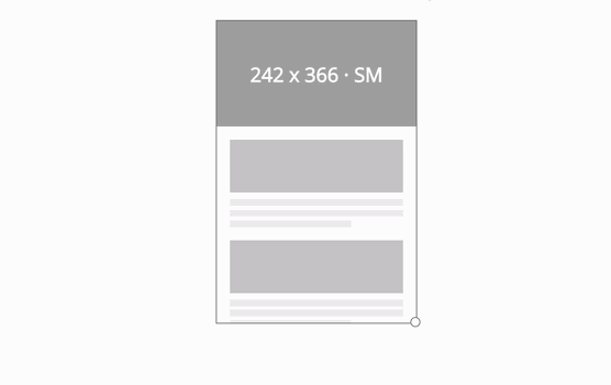
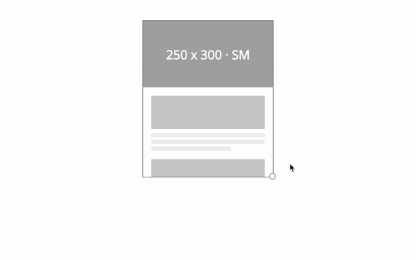
Responsive Components
We have media queries but those are based on the browser viewport not individual elements. In some case, we'd like to style components based on the width of a containing element rather than the browser viewport. To meet this demand there's a proposal for container queries, but it still doesn't exist today...
No worries, react-cool-dimensions provides an alternative solution for us! We can activate the responsive mode by the breakpoints option. It's a width-based solution, once it's activated we can easily apply different styles to a component according to the currentBreakpoint state. The overall concept as below.
import React, { useRef } from "react";
import useDimensions from "react-cool-dimensions";

const Card = () => {
  const ref = useRef();
  const { currentBreakpoint } = useDimensions(ref, {
    // The "currentBreakpoint" will be the object key based on the target's width
    // for instance, 0px - 319px (currentBreakpoint = XS), 320px - 479px (currentBreakpoint = SM) and so on
    breakpoints: { XS: 0, SM: 320, MD: 480, LG: 640 },
    onResize: ({ currentBreakpoint }) => {
      // Now the event callback will be triggered when breakpoint is changed
      // we can also access the "currentBreakpoint" here
    },
  });

  return (
    <div class={`card ${currentBreakpoint}`} ref={ref}>
      <div class="card-header">I'm ?</div>
      <div class="card-body">I'm ?</div>
      <div class="card-footer">I'm ?</div>
    </div>
  );
};
Note: If the
breakpointsoption isn't set or there's no the defined breakpoint (object key) for a range of width. ThecurrentBreakpointwill be empty string;
Border-box Size Measurement
By default, the hook reports the width and height based on the content rectangle of the target element. We can include the padding and border for measuring by the useBorderBoxSize option. Please note, the width and height states are rely on the ResizeObserverEntry.borderBoxSize but it hasn't widely implemented by browsers therefore we need to use polyfill for this feature.
import React, { useRef } from "react";
import useDimensions from "react-cool-dimensions";
import { ResizeObserver } from "@juggle/resize-observer";

const App = () => {
  const ref = useRef();
  const { width, height } = useDimensions(ref, {
    useBorderBoxSize: true, // Tell the hook to measure based on the border-box size, default is false
    polyfill: ResizeObserver, // Use polyfill to make this feature works on more browsers
  });

  return (
    <div
      style={{
        width: "100px",
        height: "100px",
        padding: "10px",
        border: "5px solid grey",
      }}
      ref={ref}
    >
      {/* Now the width and height will be: 100px + 10px + 5px = 115px */}
      Hi! My width is {width}px and height is {height}px
    </div>
  );
};
Performance Optimization
The onResize event will be triggered whenever the size of the target element is changed. We can reduce the frequency of the event callback by activating the responsive mode or implementing our own throttled/debounced function as below.
import _ from "lodash";

const { width, height } = useDimensions(ref, {
  onResize: _.throttle(() => {
    // Triggered once per every 500 milliseconds
  }, 500),
});
API
const returnObj = useDimensions(ref: RefObject<HTMLElement>, options?: object);
Return object
It's returned with the following properties.
| Key | Type | Default | Description |
|---|---|---|---|
width |
number | The width of the target element in pixel. | |
height |
number | The height of the target element in pixel. | |
currentBreakpoint |
string | Indicates the current breakpoint of the responsive components. | |
entry |
object | The ResizeObserverEntry of the target element. | |
unobserve |
function | To stop observing the target element. | |
observe |
function | To re-start observing the target element once it's stopped observing. |
Parameters
You must pass the ref to use this hook. The options provides the following configurations and event callback for you.
| Key | Type | Default | Description |
|---|---|---|---|
breakpoints |
object | Activates the responsive mode for responsive components or performance optimization. | |
useBorderBoxSize |
boolean | false |
Tells the hook to measure the target element based on the border-box size. |
onResize |
function | It's invoked whenever the size of the target element is changed. But in responsive mode, it's invoked based on the changing of the breakpoint rather than the size. | |
polyfill |
ResizeObserver | It's used for injecting a polyfill. |
ResizeObserver Polyfill
ResizeObserver has good support amongst browsers, but it's not universal. You'll need to use polyfill for browsers that don't support it. Polyfills is something you should do consciously at the application level. Therefore react-cool-dimensions doesn't include it.
We recommend using @juggle/resize-observer:
$ yarn add @juggle/resize-observer
# or
$ npm install --save @juggle/resize-observer
Then inject it by the polyfill option:
import { ResizeObserver } from "@juggle/resize-observer";

const { width, height } = useDimensions(ref, { polyfill: ResizeObserver });
Or pollute the window object:
import { ResizeObserver } from "@juggle/resize-observer";

if (!("ResizeObserver" in window)) window.ResizeObserver = ResizeObserver;
You could use dynamic imports to only load the file when the polyfill is required:
(async () => {
  if (!("ResizeObserver" in window)) {
    const module = await import("@juggle/resize-observer");
    window.ResizeObserver = module.ResizeObserver;
  }
})();