Henshu
Henshu is Sasaki’s solution for making it easy for developers to provide seamless, editable interfaces to content owners.
We wanted to build a CMS layer that was low overhead and allowed teams to toggle into an edit mode directly on our websites where they can edit the content in-place. Many other CMS solutions require a lot of meta programming, pulling the content away from the place where you are developing and your editors are editing.
Documentation
Install
yarn add henshu
then
import { Henshu, henshu, useHenshu } from 'henshu';
Henshu In Three Layers
The Elements
Converting to Henshu
The bulk of Henshu is at the component level, where you write your HTML how you normally would but namespaced to Henshu. The
elements that are Henshu-enabled are outlined in more detail in the API section below.
const Example = () => (
    <>
        <h1>This is a header</h1>
        <p>Some paragraph text</p>
    </>
);
becomes
const Example = () => (
    <>
        <henshu.h1 get={() => "This is a header"} />
        <henshu.p get={() => "Some paragraph text"} />
    </>
);
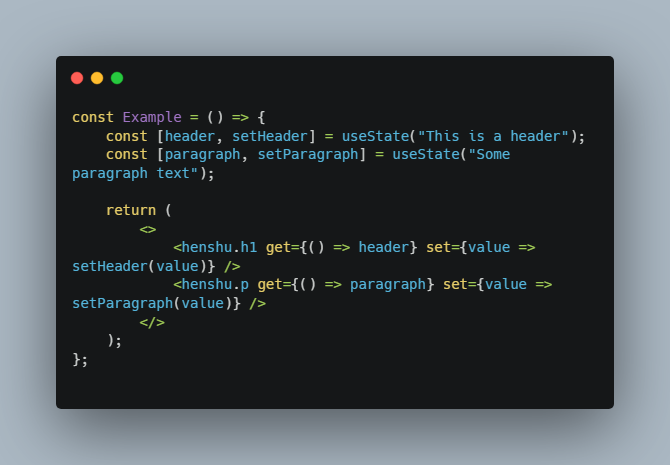
Getting new values from Henshu
As you can see from above, we namespaced the elements and then provided them with a get function prop. To retrieve the edited
content from inside of the Henshu element, we use a set function prop. Values returned are always strings.
const Example = () => {
    const [header, setHeader] = useState("This is a header");
    const [paragraph, setParagraph] = useState("Some paragraph text");

    return (
        <>
            <henshu.h1 get={() => header} set={value => setHeader(value)} />
            <henshu.p get={() => paragraph} set={value => setParagraph(value)} />
        </>
    );
};
The Provider
The next layer is our provider, which delegates state to the Henshu elements and ties them back together into a shared state.
const App = () => {
    const [isEditing, setIsEditing] = useState(false);
    const [content, setContent] = useState({});

    return (
        <Henshu content={content} onChange={tree => setContent(tree)} editing={isEditing}>
            <Example />

            <button onClick={() => setIsEditing(!isEditing)}>
                Toggle Edit Mode
            </button>
        </Henshu>
    );
}
The Context
The content prop that we passed to the provider is accessed through our final piece of Henshu, which is the useHenshu() hook.
This hook provides two things: the current state of the editing prop and a bindTo(). The latter function takes one argument
and returns an object with .get() and .set() bound to a node on the object passed through the content prop. The final form of our full example now looks like:
const Example = () => {
    const { bindTo } = useHenshu();

    return (
        <>
            <henshu.h1 {...bindTo('header')} />
            <henshu.p {...bindTo('paragraph')} />
        </>
    );
};

const App = () => {
    const [isEditing, setIsEditing] = useState(false);
    const [content, setContent] = useState({
        "header": "This is a header",
        "paragraph": "Some paragraph text"
    });

    return (
        <Henshu content={content} onChange={tree => setContent(tree)} editing={isEditing}>
            <Example />

            <button onClick={() => setIsEditing(!isEditing)}>
                Toggle Edit Mode
            </button>
        </Henshu>
    );
};
API
Henshu Elements
All Henshu elements are available from the henshu component and have get/set props, which means all Henshu elements can use the bindTo() helper.
Plain Text
The plain text elements allow editing of the elements text content.
Example
<henshu.p {...bindTo('app.landing.intro')} />
Plain text elements are: a, b, button, div, em, i, h1-6, label, li, p, span, strong
Rich Text
You can access a Slate component by using
<henshu.richtext />
Images
Images can be uploaded by using
<henshu.img />
The value provided to the set function prop is a base64 data uri of the image uploaded.
Lists
Henshu provides an component list editor via an each component. This special component passes a nested bindTo() function that iterates through the lists items.
<henshu.each {...bindTo('app.people'}>
	{(bindToItem, i) => (
		<>
			<henshu.h2 {...bindToItem('name')} />
			<henshu.p {...bindToItem('bio')} />
		</>
	)}
</henshu.each>
The each component takes an optional prop, max, which specifies the max length of the list if you want to restrict the content editor from creating too many list items.
Henshu Provider
The Henshu provider component manages what its descendant henshu elements have in their scope. Since the provider component uses React’s context API, you can have multiple Henshu providers throughout your site if you want to segment your content nodes into a superstructure of your choice or maybe only allow certain privileges to a class of users.
const App = () => {
	const user  = useUser();
	const [generalContent, setGeneralContent] = useState({});
	const [priviledgedContent, setPriviledgedContent] = useState({});

	return <>
		<Henshu
			editing={user.isLoggedIn}
			content={generalContent}
			onChange={setGeneralContent}
		>
			<GeneralSection />
		</Henshu>
		<Henshu
			editing={user.isLoggedIn && user.isPriviledged}
			content={priviledgedContent}
			onChange={setPriviledgedContent}
		>
			<PriviledgedSection />
		</Henshu>
	</>;
};
Content
The content prop of the provider component should be an object since Henshu operates on a key/value mechanism. Your updated content will only stick if you update the object being passed to the content prop through the onChange prop.
Editing
All of the descendant Henshu elements become editable by setting the boolean prop editing.