react-push-menu
react multi level push menu
Prerequisites
Install peer dependencies
npm install react react-dom react-icons --save
Install
npm install --save react-push-menu
How to use
import 'react-push-menu/styles/component.css';
import PushMenu from 'react-push-menu';

/* ... */

render(){
  return(
    <PushMenu
      nodes={this.state.menu}
      type={'cover'}
      propMap={{url: 'link'}}>

      <div className="rpm-trigger" id="rpm-trigger">trigger</div>

    </PushMenu>
  );
}
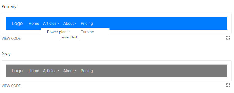
Demo

Properties
nodes (Object)
This property accepts an object with the definition for the menu. see the example for a sample menu definition
propMap (Object)
APIs can define/give a different structure or property names for required fields.
This give the user the option to tell react-push-menu which property on the node/menu item to find the value it's looking for.
| Mapping | Description |
|---|---|
| displayName | This is the text that will appear in the menu option. |
| linkClasses | These are class names that will be added to the menu option. |
| expanderClasses | These are class names that will be added to the menu option's expander given it has defined children. |
| url | This tells the library which prop the url for the menu item is located. will default to a hash (#) if none is found |
| childPropName | This is the property name that holds the children of each menu item node. We realize that data driven menu may differ and it is important to customize the properties that may hold the required data. default: children |
eg.
 <PushMenu propMap={{
   displayName: 'title',
   linkClasses: 'classes',
   expanderClasses: 'expClasses',
   childPropName: 'children',
   url: 'url'}} >
 </PushMenu>
type (string)
This defines the behaviour of the push menu and how it stacks submenus on top of each other.
It can be one of the following values:
coveroverlap
menuTrigger (string)
This is the id of the element that will be used to toggle the push menu.
default: rpm-trigger
isOpen (boolean)
This option allows you to initialize the push menu as open on load.
Default: false
autoHide
This option specifies whether the menu should be hidden when the user clicks outside of the menu element.
Default: true
onNodeClick (function)
This is an onClick callback fired when you click the link of a menu item.
Please note it won't be fired when you click the expand component for a menu item.
eg.
 <PushMenu
  onNodeClick={(e, data) => {
    console.log(data); // => {menu, node, propMap, rootNode}

    // following line will close the menu completely
    data.menu.tools.reset();
  }} >

 </PushMenu>
getRef (function)
This function allows you to get access to the menu instance to have access to its tools.
 <PushMenu
  getRef={(menu) => {
    this.menu = menu;
  }} >

 </PushMenu>
onMenuOpen (function)
This function triggered after the menu is open.
 <PushMenu
  onMenuOpen={(menu) => {
    // do something
  }} >

 </PushMenu>
onMenuClose (function)
This function triggered after the menu is closed.
 <PushMenu
  onMenuClose={(menu) => {
    // do something
  }} >

 </PushMenu>


