react-tabbordion
Universal, semantic and accessible React state managing components for creating Accordions and Tabs
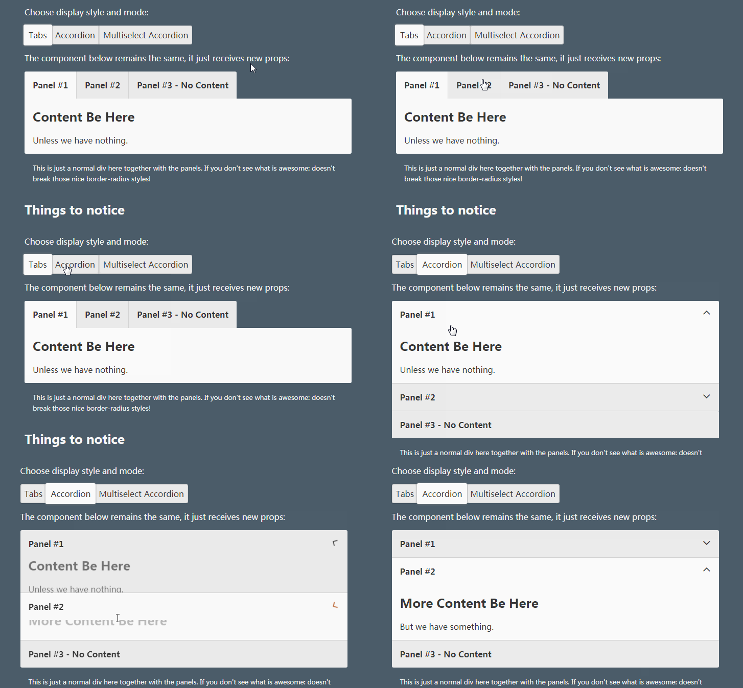
Tabbordion is a component for managing active state between multiple items. You can make anything out of it:
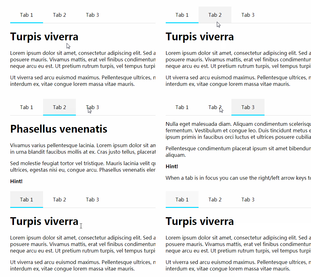
- Tabs component
- Accordion component
- Multi select list component
- Option component
- List of options
- List of checkboxes
Essentially Tabbordion handles the state, gives tools for complete CSS based styling, manages WAI ARIA and provides a
great HTML/DOM structure to work with. Tabbordion is universal and therefore works both server side and client side!
Keyboard usage works just like with radio buttons (or checkboxes when using multiple mode); the component avoids
reinventing the wheel and takes advantage of native browser behavior where possible, which is why you can't see any code
related to keyboard handling despite arrow keys and smart focus behavior being fully supported.
You have complete control over the generated classNames, you can even disable generating them if you wish to. There is
only one required style:
[data-state="tabbordion"] {
    clip: rect(0 0 0 0);
    height: 1px;
    position: absolute;
    position: fixed;
    width: 1px;
    z-index: -1;
}
This will hide the input elements so that they remain accessible via keyboard on all browsers.
What is new with v1.0?
- You can now make Tabbordion stateless, thus place the state where you want!
- Full state control: Tabbordion makes sure the state is correct for given mode.
- Viewport resize support: when using
animateContentelements are now updated when window is resized. bemClassNameis now exposed.- Performance optimizations for minimal renders. All Tabbordion components now extend PureComponent.
npm install react-tabbordion
You're welcome to steal the demo styles. Also, throw an issue if you have suggestions for improvements or
find problems with the demo styles :)
Usage example and sample output
import { Tabbordion, TabPanel, TabLabel, TabContent } from 'react-tabbordion'

const blockElements = {
    content: 'tabs-content',
    panel: 'tabs-panel',
    label: 'tabs-title'
}

<Tabbordion blockElements={blockElements} className="tabs" name="tabs">
    <TabPanel>
        <TabLabel>My title</TabLabel>
        <TabContent>
            <h2>Sample</h2>
            <p>Content</p>
        </TabContent>
    </TabPanel>
    <TabPanel>
        <TabLabel>Another title</TabLabel>
        <TabContent>
            <h2>Another Sample</h2>
            <p>Some other kind of content</p>
        </TabContent>
    </TabPanel>
</Tabbordion>
Output:
<ul role="tablist" class="tabs">
    <li aria-expanded="true" aria-selected="true" class="tabs-panel tabs-panel--checked tabs-panel--content tabs-panel--first" role="tab">
        <input aria-controls="panel-tabs-0" checked data-state="tabbordion" id="tabs-0" name="tabs" value="0" type="radio" />
        <label class="tabs-title tabs-title--checked tabs-title--content tabs-title--first" id="label-tabs-0" for="tabs-0">
            My title
        </label>
        <div aria-labelledby="tabs-0" class="tabs-content tabs-content--checked tabs-content--first" id="panel-tabs-0" role="tabpanel">
            <h2>Sample</h2>
            <p>Content</p>
        </div>
    </li>
    <li aria-expanded="false" aria-selected="false" class="tabs-panel tabs-panel--unchecked tabs-panel--content tabs-panel--last" role="tab">
        <input aria-controls="panel-tabs-1" data-state="tabbordion" id="tabs-1" name="tabs" value="1" type="radio" />
        <label class="tabs-title tabs-title--unchecked tabs-title--content tabs-title--last" id="label-tabs-1" for="tabs-1">
            Another title
        </label>
        <div aria-labelledby="tabs-1" class="tabs-content tabs-content--unchecked tabs-content--last" id="panel-tabs-1" role="tabpanel">
            <h2>Another Sample</h2>
            <p>Some other kind of content</p>
        </div>
    </li>
</ul>
The first tab is open as single mode is the default setting. If another mode is set then no tabs will be open unless
initialPanels is given.
Developing
npm install
npm run build
npm test


