react-web-tabs
Modular and accessible React tabs according to the WAI-ARIA Authoring Practices 1.1.
Installation
Note! This package depends on React ^15.5.4
Using npm:
npm install --save react-web-tabs
Using yarn:
yarn add react-web-tabs
Then with a module bundler like webpack you can import it like usual:
// using ES6 modules
import { Tabs, Tab, TabPanel, TabList } from 'react-web-tabs';

// using ES6 Partial imports
import Tabs from 'react-web-tabs/lib/Tabs';
import Tab from 'react-web-tabs/lib/Tab';
import TabPanel from 'react-web-tabs/lib/TabPanel';
import TabList from 'react-web-tabs/lib/TabList';

// using CommonJS modules
var Tabs = require('react-web-tabs').Tabs;
var Tab = require('react-web-tabs').Tab;
var TabPanel = require('react-web-tabs').TabPanel;
var TabList = require('react-web-tabs').TabList;
The UMD build is also available on unpkg:
<script src="https://unpkg.com/react-web-tabs/dist/react-web-tabs.min.js"></script>
Usage
import React, { Component } from 'react';
import { render } from 'react-dom';
import { Tabs, Tab, TabPanel, TabList } from 'react-web-tabs';
class App extends Component {
render() {
return (
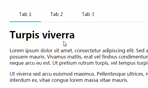
<Tabs
defaultTab="one"
onChange={(tabId) => { console.log(tabId) }}
>
<TabList>
<Tab tabFor="one">Tab 1</Tab>
<Tab tabFor="two">Tab 2</Tab>
<Tab tabFor="three">Tab 3</Tab>
</TabList>
<TabPanel tabId="one">
<p>Tab 1 content</p>
</TabPanel>
<TabPanel tabId="two">
<p>Tab 2 content</p>
</TabPanel>
<TabPanel tabId="three">
<p>Tab 3 content</p>
</TabPanel>
</Tabs>
);
}
}
render(<App/>, document.getElementById('app'));
If you need to make it more interesting and mix in other elements you can do that to:
import React, { Component } from 'react';
import { render } from 'react-dom';
import { TabProvider, Tab, TabPanel, TabList } from 'react-web-tabs';


class App extends Component {
  render() {
    return (
      <TabProvider defaultTab="one">
        <section className="my-tabs">
          <TabList className="my-tablist">
            <Tab tabFor="one">Tab 1</Tab>
            <span className="divider">•</span>
            <Tab tabFor="two">Tab 2</Tab>
            <span className="divider">•</span>
            <Tab tabFor="three" className="my-tab">Tab 3</Tab>
          </TabList>
          <div className="wrapper">
            <TabPanel tabId="one">
              <p>Tab 1 content</p>
            </TabPanel>
            <TabPanel tabId="two">
              <p>Tab 2 content</p>
            </TabPanel>
            <TabPanel tabId="three">
              <p>Tab 3 content</p>
            </TabPanel>
          </div>
        </section>
      </TabProvider>
    );
  }
}

render(<App/>, document.getElementById('app'));
And of course every component supports adding additional props like custom className's or data attributes.
Styles
Some basic styles are provided as well but they are optional as the tabs are fully functional without styling and I do encourage you to create your own. Both minified and unminified versions are available in the /dist folder.
With webpack:
import 'react-web-tabs/dist/react-web-tabs.css';
Keyboard support
The following keys can be used to navigate between tabs when in focus, according to the WAI-ARIA Authoring Practices 1.1.
- ← Navigate to previous tab
- → Navigate to next tab
- HOME Navigate to first tab
- END Navigate to last tab
When the tabs are vertical:
- ↑ Navigate to previous tab
- ↓ Navigate to next tab
- HOME Navigate to first tab
- END Navigate to last tab