React Calendar
100% test coverage, responsive, and flexible event calendar for React.
Backstory: After using react-big-calendar for years, I decided to create my own that is simpler to use, allows for easy customization, and uses modern React (no deprecated methods).
npm install @zach.codes/react-calendar date-fns
Basic Usage
import {
MonthlyBody,
MonthlyCalendar,
MonthlyNav,
DefaultMonthlyEventItem,
} from '@zach.codes/react-calendar';
export const MyMonthlyCalendar = () => {
let [currentMonth, setCurrentMonth] = useState<Date>(
startOfMonth(new Date())
);
return (
<MonthlyCalendar
currentMonth={currentMonth}
onCurrentMonthChange={date => setCurrentMonth(date)}
>
<MonthlyNav />
<MonthlyBody
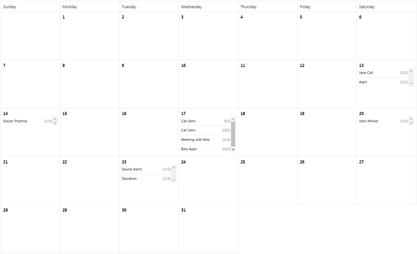
events={[
{ title: 'Call John', date: subHours(new Date(), 2) },
{ title: 'Call John', date: subHours(new Date(), 1) },
{ title: 'Meeting with Bob', date: new Date() },
]}
renderDay={data =>
data.map((item, index) => (
<DefaultMonthlyEventItem
key={index}
title={item.title}
date={item.date}
/>
))
}
/>
</MonthlyCalendar>
);
};
This renders a monthly calendar view in its simplest form. Whenever a user presses next or previous on the <MonthlyNav /> the onCurrentMonthChange callback will be invoked, and it's up to you to control the state.
This approach gives you full flexibilty to do anything you want. In my applications, I will refetch a graphql query anytime the month changes, and load events for that month.
The events get passed into MonthlyBody and then renderDay is called for every day on the calendar that has events. You can render any React component you wish, giving you as much freedom as possible.
Styling
This library uses Tailwind. This gives you two options for including the necessary CSS for the components.
I'm already using Tailwind
Awesome! You need to add node_modules/@zach.codes/react-calendar/dist/**/*.js to your tailwind.config.js to ensure the required classes aren't purged on your production build.
I'm not using Tailwind
No problem! The library includes the minimal CSS required to render the components. Somewhere in your app, you need to import our CSS:
import 'react-big-calendar/dist/calendar-tailwind.css';
MonthlyCalendar
This is a monthly view similar to react-big-calendar or a Calendar application. It makes it easy to load events 1 month at a time, and render custom elements on each day.
Props
MonthlyCalendar
currentMonththis must be a Date instance representing the first of the month you wish to viewonCurrentMonthChangeis called any time the month is changing from the Navigation area
MonthlyNav
No props at this time
MonthlyBody
omitDayslets you hide certain days from the calendar, for instance, hide Saturday and Sunday. Days are represented as 0-6, as seen in the date-fns documentation. Hiding Monday would beomitDays={[1]}Hiding the weekend would beomitDays={[0, 6]}eventsthis is an array of events, the only thing required inside each object is adatefield with a Date object representing the exact time of the eventrenderDaycallback function that is passed an array of events for each day displayed, letting you render the events for the day
WeeklyCalendar
View 1 week at a time, useful for scheduling appointments, or rendering events in a smaller area of the screen
<WeeklyCalendar week={new Date()}>
  <WeeklyContainer>
    <WeeklyDays />
    <WeeklyBody
      events={[{ title: 'Jane doe', date: new Date() }]}
      renderItem={({ item, showingFullWeek }) => (
        <DefaultWeeklyEventItem
          key={item.date.toISOString()}
          title={item.title}
          date={
            showingFullWeek
              ? format(item.date, 'MMM do k:mm')
              : format(item.date, 'k:mm')
          }
        />
      )}
    />
  </WeeklyContainer>
</WeeklyCalendar>
This code renders an event for the current date. When you are in the week view, it displays the day and time. When you drill into a single day, it displays the time only.
Props
WeeklyCalendar
weeka date object to initialize for the weekly view
WeeklyContainer
A view only component to flex the buttons and content area
WeeklyDays
Renders the buttons to view an individual day
omitDays, same as theMonthlyBodyprop
WeeklyBody
styleoptional style info for setting the container heighteventsarray of events with a date field, and anything else you want.renderItemcallback to render individual items on the side.
Full Control
This library has very few props to understand. It takes a component-first approach instead of endless prop options.
Building a calendar is highly opinionated. This library lets you easily customize any piece of it. Let's take a look at the MonthlyNav component:
import { useMonthlyCalendar } from '@zach.codes/react-calendar';

export const MonthlyNav = () => {
  let { currentMonth, onCurrentMonthChange } = useMonthlyCalendar();

  return (
    <div className="flex justify-end mb-4">
      <button
        onClick={() => onCurrentMonthChange(subMonths(currentMonth, 1))}
        className="cursor-pointer"
      >
        Previous
      </button>
      <div className="ml-4 mr-4 w-32 text-center">
        {format(
          currentMonth,
          getYear(currentMonth) === getYear(new Date()) ? 'LLLL' : 'LLLL yyyy'
        )}
      </div>
      <button
        onClick={() => onCurrentMonthChange(addMonths(currentMonth, 1))}
        className="cursor-pointer"
      >
        Next
      </button>
    </div>
  );
};
It's rendering some button elements, and then the current month. If it's not the current year, it renders the year as well.
You can copy / paste this component into your own repo. The magic piece is useMonthlyCalendar. This hook will let you access anything from the calendar context.
With this in mind, you can fully replace any of the default components to have custom behavior for your own app.