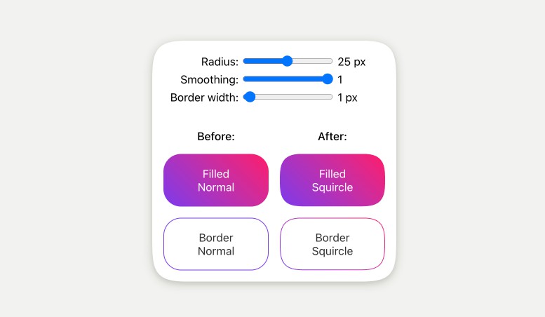
Corner smoothing
Squircles for the web.
Supports filled squircles and border quircles. Supports React and vanilla js. Works for all components/HTML elements.
The corner smoothing is the same as the Figma corner smoothing through the use of figma-squircle.
The implementation uses clip-path, so user interactions such as hover follows the smooth corners.
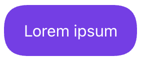
React component
import { Squircle } from 'corner-smoothing'

<Squircle
  cornerRadius={20}
  style={{
    padding: '1rem 1.25rem',
    backgroundColor: '#7c3aed',
    color: '#fff',
    display: 'inline-block',
  }}
>
  Lorem ipsum
</Squircle>
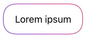
Squircle border
A squircle border is created by rendering two squircles on top of each other. The inner one being smaller and centered in the outer. The border is the region where the outer squircle is not covered by the inner squircle. The inner squircle is rendered with the ::before pseudo-element. The corner radius of the inner squircle is adjusted to follow the radius of the outer squircle to give the correct visuals.
All this happens automatically. You just need to know that the border color is defined by background-color and that actual background color is defined by background-color on the ::before pseudo-element. An added benefit of this is that the border can have a gradient.
import { Squircle } from 'corner-smoothing'
import styled from 'styled-components'

const StyledSquircle = styled.div`
  padding: 1rem 1.25rem;
  display: inline-block;

  /* Border color */
  background: linear-gradient(45deg, #7c3aed, #ff1b6b);

  ::before {
    /* Background color  */
    background: #fff;
  }`

// Create a Squircle with the `Squircle` component:
<Squircle
  cornerRadius={20}
  borderWidth={1}
  as={StyledSquircle}
>
  Lorem ipsum
</Squircle>
React HOC (higher-order component)
import { squircle } from 'corner-smoothing'

// Create a Squircle with the `squircle` HOC:
const MySquircle = squircle(StyledSquircle, {
  cornerRadius: 20,
  borderWidth: 1
})
Vanilla function
Zero dependencies.
import { squircleObserver } from 'auto-text-size'

// squircleObserver runs the returned function directly and
// re-runs it when the element changes size.
const renderSquircle = squircleObserver(element, options)

// There is normally no need to call this manually.
renderSquircle()

// Disconnect the resize observer when done.
renderSquircle.disconnect()
One-off:
import { renderSquircle } from 'corner-smoothing'

renderSquircle(options)
The options are the same as for the React component, excluding the as property.
Options
| Name | Type | Default | Description |
|---|---|---|---|
cornerRadius |
number |
Similar to the CSS property border-radius. |
|
cornerSmoothing |
number |
1 |
The degree of corner smoothing as a number in the range 0–1. 0 is equivalent to no smoothing and looks like normal border-radius. 1 indicates maximal smoothing. |
preserveSmoothing |
boolean |
true |
Allow corner smoothing to work better on large rounded corners. |
borderWidth |
number |
undefined |
If defined, the border mode is used. |
as |
string | ReactComponent |
'div' |
The underlying component that Squircle will use. Only available for the Squircle React component. |
Optional props to override corner radius for individual corners.
| Name | Type |
|---|---|
topLeftCornerRadius |
number |
topRightCornerRadius |
number |
bottomRightCornerRadius |
number |
bottomLeftCornerRadius |
number |
Developing
When developing one typically wants to see the output in the example application without having to publish and reinstall. This is achieved by linking the local package into the example app.
Because of issues with yarn link, Yalc is used instead. A linking approach is preferred over yarn workspaces since we want to use the package as it would appear in the real world.
npm i yalc -g
yarn
yarn watch

# Other terminal
cd example
yarn
yalc link corner-smoothing
yarn dev
Yalc and HMR
Using yalc link (or yalc add--link) makes it so that Next.js HMR detects updates instantly.
Publishing
# Update version number
yarn clean && yarn build
npm publish