? Superkey is under development and is not ready for production. If you have any bugs or problems please create an issue. ?


? Introduction
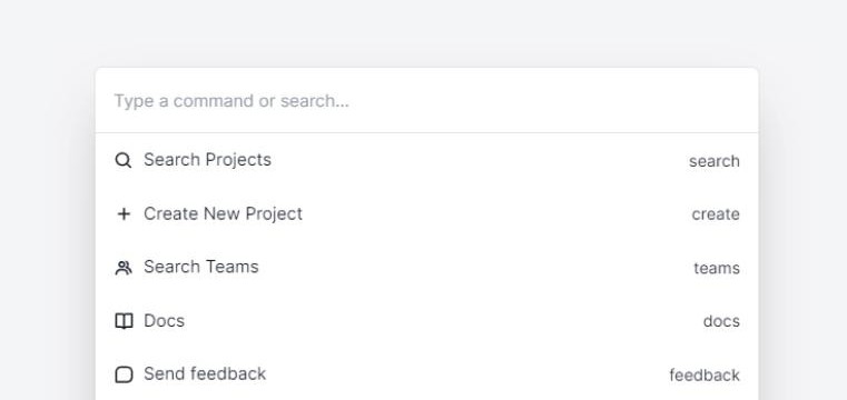
Superkey is a stylized command palette component built with React, Tailwind CSS & HeadlessUI ready to be used in your next project.
? Getting Started
- ? Superkey is only compatible with React 18.
1. Install dependency:
npm install superkey
2. Import styles:
import "superkey/styles.css";
3. How to use:
import { Command, CommandInput, CommandList, CommandOption } from "superkey";

function App() {
  return (
    <Command open={true}>
      <CommandInput />
      <CommandList>
        <CommandOption value="Option 1">
          <h1>Option 1</h1>
          <p>Description</p>
        </CommandOption>
        <CommandOption value="Option 2">
          <h1>Option 1</h1>
          <p>Description</p>
        </CommandOption>
      </CommandList>
    </Command>
  );
}
- ? Check examples here.
? Props
Command
| – | Prop | Description | Required |
|---|---|---|---|
| ⚙️ | children |
Inside it uses the input, list and options components. | Required |
| ⚙️ | open |
Open or close the command palette. | Required |
| ⚙️ | commandFunction |
Function to be executed when click an option. | Optional |
| ⚙️ | onClose |
Function to be executed when close the command palette. | Optional |
| ⚙️ | afterLeave |
Function to be executed after close the command palette. | Optional |
| ? | className |
Class to be added to the command palette. | Optional |
| ? | overlayClassName |
Class to be added to the overlay. | Optional |
CommandInput
| – | Prop | Description | Type |
|---|---|---|---|
| ⚙️ | onChange |
Action when the user types in the search field. | Required |
| ⚙️ | placeholder |
The placeholder of the search text field. | Optional |
| ? | searchIcon |
Adds an icon to the search field. | Optional |
| ? | className |
Class to be added to the all component. | Optional |
| ? | inputClassName |
Class to be added to the input text field component. | Optional |
CommandList
| – | Prop | Description | Type |
|---|---|---|---|
| ⚙️ | children |
Inside imports CommandOptions. | Required |
CommandOption
| – | Prop | Description | Type |
|---|---|---|---|
| ⚙️ | value |
Value of each option. | Required |
| ⚙️ | children |
Inside, the option information will be displayed. | Required |
| ? | className |
Modifies the styles of the option component. | Optional |
?️ Roadmap
- Improve light & dark mode.
- Add dark mode.
- Add more examples (using Remix).
- Create website.
? Examples
? Contributing
- Fork & clone the project:
git clone [email protected]:[your-user]/superkey.git
- Install dependencies:
cd superkey
npm install
- Make your changes, create commits and push to your fork:
git add .
git commit -m "My super changes"
git push origin [your-branch]
- Open a pull request ?.
? License
- MIT.