react-tiny-tabs
Easy to use React tab component
Easy to use Tab Component for React with basic options to skin and change layout.
Easy to use React tab component

- 3 different looks/themes
- Define transition speed or use the navigation in the bottom
- Nest tab components inside other tabs components
- Customize the tab nav to use title and subtitle
- Constrain content to match the nav width
- Customize colors for text and background
Install
npm install react-tiny-tabs
Usage
Include the CSS
<link rel="stylesheet" href="node_modules/react-tiny-tabs/dist/index.css">
Import and define the components
import {Tabs, Nav, Content} from 'react-tiny-tabs';
...
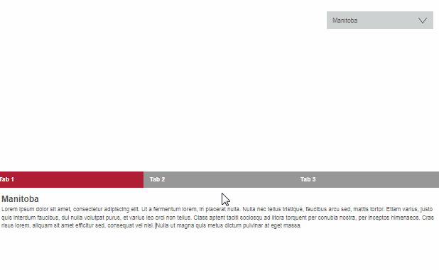
<Tabs className="theme-default" settings={bgColor: royalBlue, color: white}>
<Nav>
<div>First Tab</div>
<div>Second Tab</div>
<div>Third Tab</div>
</Nav>
<Content>
<div>
<p>Ut enim ad minim veniam, quis nostrud exercitation</p>
</div>
<div>
<p>Magna aliqua. Ut enim ad minim veniam, quis nostrud</p>
</div>
<div>
<p>Duis aute irure dolor in reprehenderit in voluptate</p>
</div>
</Content>
</Tabs>
Options
| option | type | description |
|---|---|---|
| index | Number | Initialize active tab index |
| color | String | active tab text color |
| bgColor | String | active tab background color |
| contentWrap | Boolean | Restrains panel content to the width of the tabs nav |
| bottomNav | Boolean | Uses the nav in the bottom |
| fadeTime | Number | (ms) Adds fade transition when switching |
Classes
<Tabs className="theme-x">
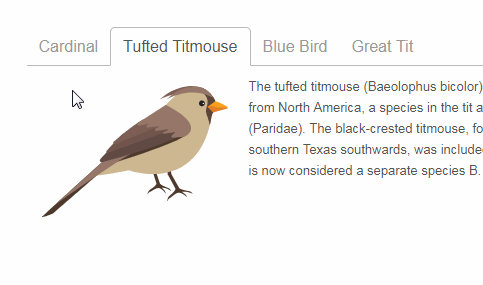
Themes
- .theme-default
- .theme-box
- .theme-folder
Nav modifier
- .two-rows (add support for 2 lines in the tab navigation)
Carry-over html attributes
Custom markup properties will be rendered in the resulting markup (good for aria roles, etc)
  <Nav role="tablist" className="your-own-class">
    <div role="tab" >First Tab</div>
    <div role="tab">Second Tab</div>
    <div role="tab">Third Tab</div>
  </Nav>