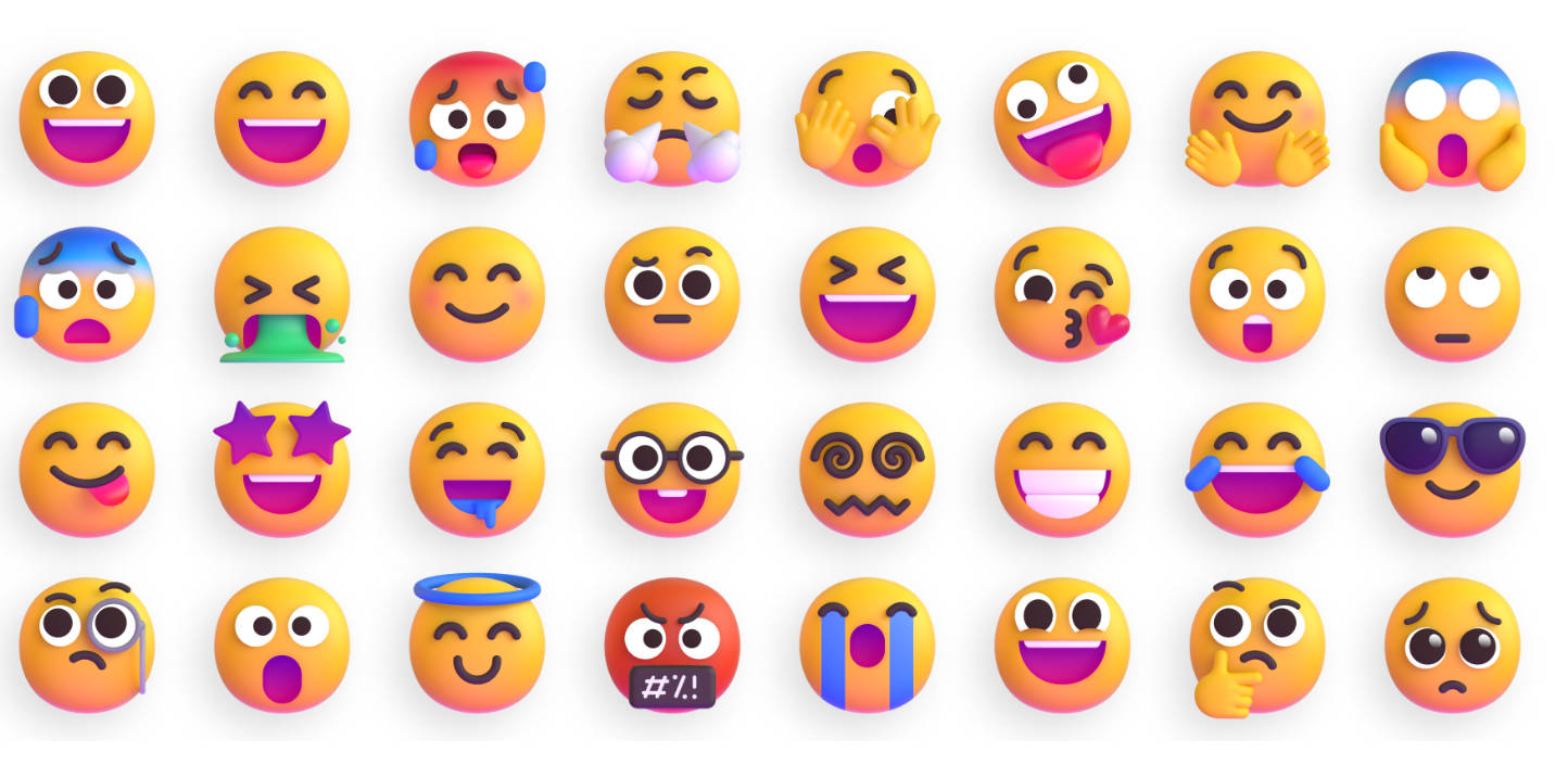
loom/reactions
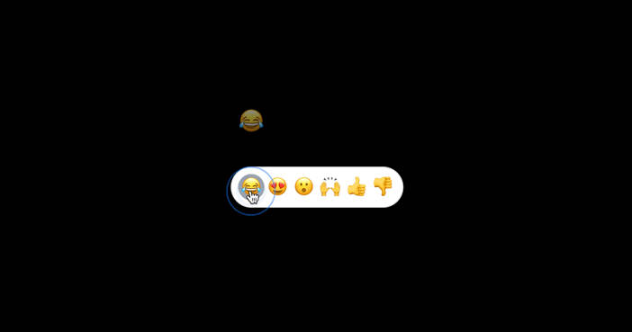
This is the open-source Tailwindcss version of Looms’s beautiful Emoji Toolbar React component to react to anything.

Demo
View the demo here: https://reaction-demo.vercel.app
Installation
Requirements
tailwindcsstailwindcss-animate
It’s pretty easy to install. I made it a standalone component that you can copy in your codebase.
-
Copy the
toolbarcomponentcp ./app/toolbar.tsx your-project/components/toolbar.tsx
or go directly to it here: toolbar.tsx
-
Add keyframes and animation to your
tailwind.config.tsimport type { Config } from "tailwindcss"; const config: Config = { content: [ "./pages/**/*.{js,ts,jsx,tsx,mdx}", "./components/**/*.{js,ts,jsx,tsx,mdx}", "./app/**/*.{js,ts,jsx,tsx,mdx}", ], theme: { fontFamily: { emoji: [ "Twemoji Mozilla", "Apple Color Emoji", "Noto Color Emoji", "Segoe UI Emoji", "Segoe UI Symbol", "Segoe UI", "EmojiOne Color", "Android Emoji", ], }, extend: { keyframes: { flyEmoji: { "0%": { transform: "translateY(0) scale(1)", opacity: "0.7", }, "100%": { transform: "translateY(-150px) scale(2)", opacity: "0", }, }, }, animation: { flyEmoji: "flyEmoji 1s forwards", }, }, }, plugins: [require("tailwindcss-animate")], }; export default config;
-
Import into your page
import { Toolbar } from "@/components/toolbar";

export default function Home() {
  return (
    <>
      // ...
      <Toolbar />
      // ...
    </>
  );
}
-
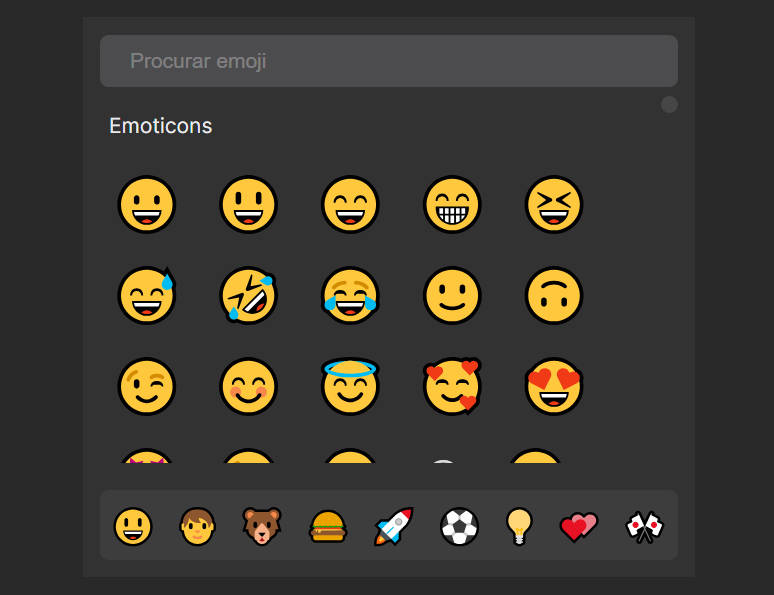
Change the emojis in the
REACTIONSobject intoolbar.tsx// ... const REACTIONS = [ { emoji: "?", label: "joy", }, { emoji: "?", label: "love", }, { emoji: "?", label: "wow", }, { emoji: "?", label: "yay", }, { emoji: "?", label: "up", }, { emoji: "?", label: "down", }, ];
Future Ideas
onClickhandlersizeprop to adjust the size of the toolbar- dark mode support
Inspiration
- Thanks to the @loom design team for the awesome component.
- Thanks to @shadcn who gave me a new joy for UI design.