Frogress
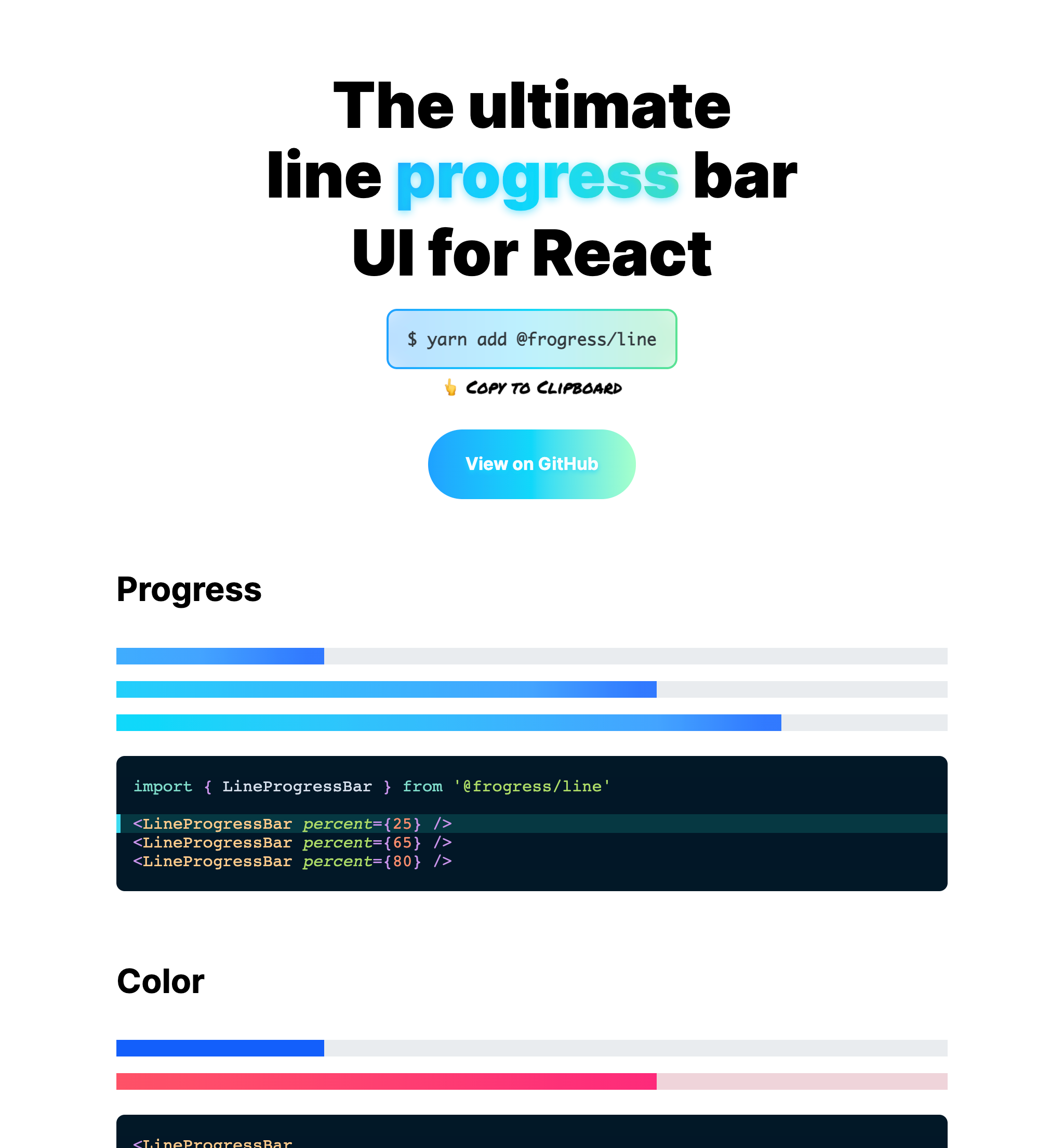
he ultimate Line Progress Bar UI for React - Supports Natural color gradients & Coherent border rounding
@frogress/line
? Installation
# Install peer depedencies
yarn add react react-dom styled-components

# Install Frogress's Line Progress Bar component
yarn add @frogress/line
styled-componentswill be replaced soon by React's internalStyleSheet(to reduce depedencies).
? Usage
import { LineProgressBar } from '@frogress/line'

<LineProgressBar percent={65} />
percent is the percentage of the progress bar(number type value with a range of 0 to 100).
This property is required in TypeScript, but it will default to 0 if you ignore it.
? Compile-time Type checking
- <LineProgressBar percent={-32} />
- <LineProgressBar percent={-1} />

+ <LineProgressBar percent={0} />
+ <LineProgressBar percent={45} />
+ <LineProgressBar percent={100} />

- <LineProgressBar percent={101} />
- <LineProgressBar percent={9999} />
The type is enforced so that only integers within the correct range are allowed.
? What problem does this solve?
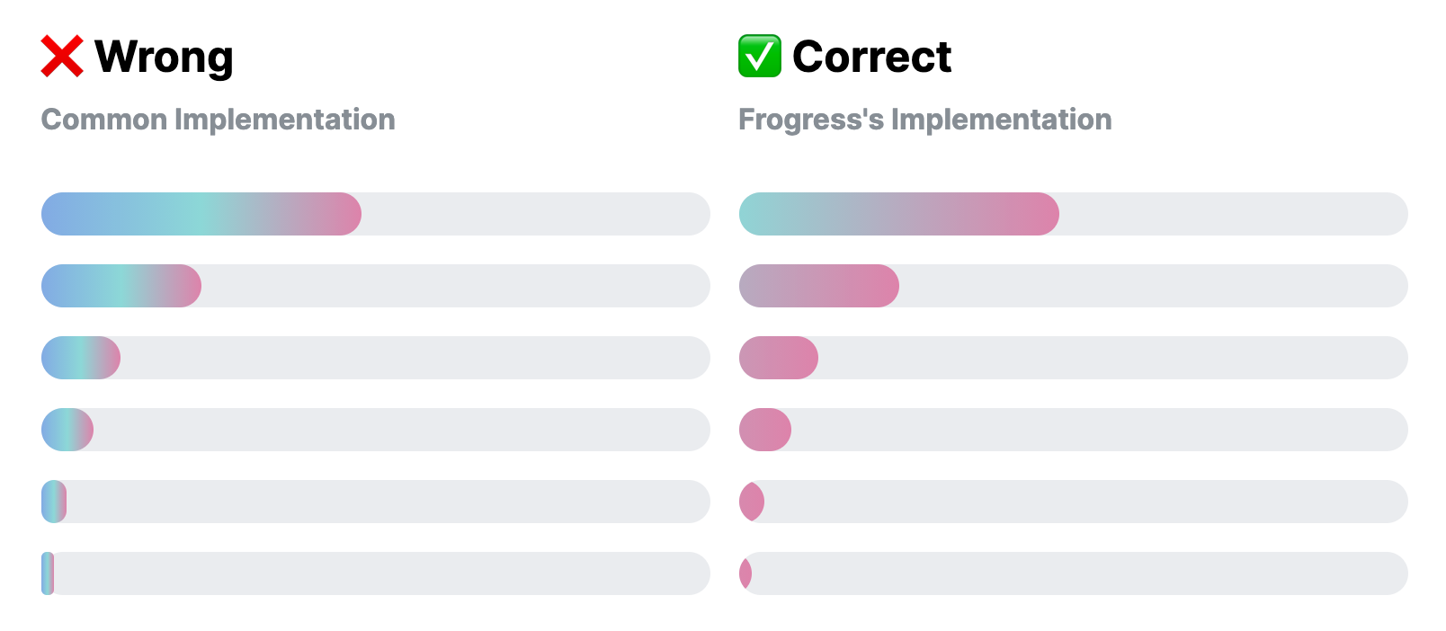
Lots of existing line progress bar UIs do not support color gradients or rounded edges.
Most implementations it wrong. The upper-left image is the most common mistake with inconsistent behavior; Gradients are shrunk with the progress width, border-radius is working strangely with small values.
? Styling
TBD
Size
Color
Rounding
Direction
@frogress/docs
Development
# ? Clone git repository
git clone https://github.com/junhoyeo/frogress
cd frogress
# ? Install depedencies
yarn install
# ? Build @frogress/line
yarn workspace @frogress/line build
# ?♀️ Run development server for @frogress/docs
yarn workspace @frogress/docs dev