unplugin-icons

Access thousands of icons as components on-demand universally.
Features
- ? Universal
- ? Any icon sets – 100+ popular sets with over 10,000 icons, logos, emojis, etc. Powered by Iconify.
- ? Major build tools – Vite, Webpack, Rollup, Nuxt, etc. Powered by unplugin.
- ? Major frameworks – Vanilla, Web Components, React, Vue 3, Vue 2, Solid, Svelte, and more. Contribute.
- ? Any combinations of them!
- ☁️ On-demand – Only bundle the icons you really use, while having all the options.
- ? SSR / SSG friendly – Ship the icons with your page, no more FOUC.
- ? Stylable – Change size, color, or even add animations as you would with styles and classes.
- ? Custom icons – load your custom icons to get universal integrations at ease.
- ? Auto Importing – Use icons as components directly in your template.
- ? TypeScript support.
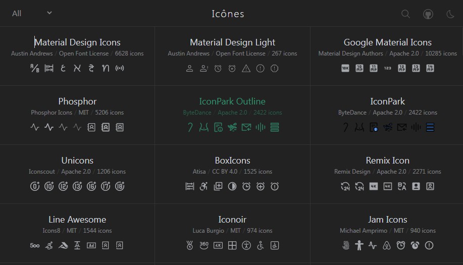
- ? Browse Icons
|
? Story behind this tool: Journey with Icons Continues – a blog post by Anthony |
vite-plugin-iconshas been renamed tounplugin-icons, see the migration guide
Usage
Import icons names with the convension ~icons/{collection}/{icon} and use them directly as components. Auto importing is also possible.
React
import IconAccessibility from '~icons/carbon/accessibility'
import IconAccountBox from '~icons/mdi/account-box'

function App() {
  return (
    <div>
      <IconAccessibility />
      <IconAccountBox style={{ fontSize: '2em', color: 'red' }}/>
    </div>
  )
}
Vue
<script setup>
import IconAccessibility from '~icons/carbon/accessibility'
import IconAccountBox from '~icons/mdi/account-box'
</script>

<template>
  <icon-accessibility/>
  <icon-account-box style="font-size: 2em; color: red"/>
</template>
Install
Plugin
npm i -D unplugin-icons
Icons Data
We use Iconify as the icons data source (supports 100+ iconsets).
You have two ways to install them:
Install Full Collection
npm i -D @iconify/json
@iconify/json (~120MB) includes all the iconsets from Iconify so you can install once and use any of them as you want (only the icons you actually use will be bundle into the production build).
Install by Icon Set
If you only want to use a few of the icon sets and don’t want to download the entire collection, you can also install them individually with @iconify-json/[collection-id].
For example, to install Material Design Icons, you can do:
npm i -D @iconify-json/mdi
To boost your workflow, it’s also possible to let unplugin-icons handle that installation by enabling the autoInstall option.
Icons({
  // expiremental
  autoInstall: true
})
It will install the icon set when you import them. The right package manager will be auto-detected (npm, yarn or pnpm).
Configuration
Build Tools
Vite
// vite.config.ts
import Icons from 'unplugin-icons/vite'

export default defineConfig({
  plugins: [
    Icons({ /* options */ }),
  ],
})
Rollup
// rollup.config.js
import Icons from 'unplugin-icons/rollup'

export default {
  plugins: [
    Icons({ /* options */ }),
  ],
}
Webpack
// webpack.config.js
module.exports = {
  /* ... */
  plugins: [
    require('unplugin-icons/webpack')({ /* options */ })
  ]
}
This module works for both Nuxt 2 and Nuxt ViteNuxt
// nuxt.config.js
export default {
  buildModules: [
    ['unplugin-icons/nuxt', { /* options */ }],
  ],
}
Vue CLI
// vue.config.js
module.exports = {
  configureWebpack: {
    plugins: [
      require('unplugin-icons/webpack')({ /* options */ }),
    ],
  },
}
Check instructions in the Svelte Kit
// svelte.config.js
import preprocess from 'svelte-preprocess'
import Icons from 'unplugin-icons/vite'

/** @type {import('@sveltejs/kit').Config} */
const config = {
  // Consult https://github.com/sveltejs/svelte-preprocess
  // for more information about preprocessors
  preprocess: preprocess(),
  kit: {
    // hydrate the <div id="svelte"> element in src/app.html
    target: '#svelte',
    vite: {
      plugins: [
        Icons({
          compiler: 'svelte',
        }),
      ],
    },
  },
}

export default config
Frameworks -> Svelte section below if you faced module import errors.
Svelte support requires plugin dependency The Check instructions in the Svelte + Vite
@sveltejs/vite-plugin-svelte:npm i -D @sveltejs/vite-plugin-svelte
unplugin-icons plugin should be configured on vite.config.js configuration file:// vite.config.js
import { defineConfig } from 'vite'
import { svelte } from '@sveltejs/vite-plugin-svelte'
import Icons from 'unplugin-icons/vite'
export default defineConfig({
plugins: [
svelte(),
Icons({
compiler: 'svelte',
}),
],
})
Frameworks -> Svelte section below if you faced module import errors.
Frameworks
Vue 3
Vue 3 support requires peer dependency @vue/compiler-sfc:
npm i -D @vue/compiler-sfc
Icons({ compiler: 'vue3' })
Type Declarations
// tsconfig.json
{
  "compilerOptions": {
    "types": [
      "unplugin-icons/types/vue",
    ]
  }
}
Vue 2 support requires peer dependency Type DeclarationsVue 2
vue-template-compiler:npm i -D vue-template-compiler
Icons({ compiler: 'vue2' })
// tsconfig.json
{
  "compilerOptions": {
    "types": [
      "unplugin-icons/types/vue",
    ]
  }
}
JSX support requires peer dependency Type DeclarationsReact
@svgr/core:npm i -D @svgr/core
Icons({ compiler: 'jsx', jsx: 'react' })
// tsconfig.json
{
  "compilerOptions": {
    "types": [
      "unplugin-icons/types/react",
    ]
  }
}
JSX support requires peer dependency Type DeclarationsPreact
@svgr/core:npm i -D @svgr/core
Icons({ compiler: 'jsx', jsx: 'preact' })
// tsconfig.json
{
  "compilerOptions": {
    "types": [
      "unplugin-icons/types/preact",
    ]
  }
}
Type DeclarationsSolid
Icons({ compiler: 'solid' })
// tsconfig.json
{
  "compilerOptions": {
    "types": [
      "unplugin-icons/types/solid",
    ]
  }
}
Type Declarations For Svelte Kit, on For Svelte + Vite, on Svelte
Icons({ compiler: 'svelte' })
src/global.d.ts file:/// <reference types="@sveltejs/kit" />
/// <reference types="unplugin-icons/types/svelte" />
src/vite-env.d.ts file:/// <reference types="svelte" />
/// <reference types="vite/client" />
/// <reference types="unplugin-icons/types/svelte" />
Custom Icons
From v0.11, you can now load your own icons!
import { promises as fs } from 'fs'
// loader helpers
import { FileSystemIconLoader } from 'unplugin-icons/loaders'

Icons({
  customCollections: {
    // key as the collection name
    'my-icons': {
      'account': '<svg><!-- ... --></svg>',
      // load your custom icon lazily
      'settings': () => fs.readFile('./path/to/my-icon.svg', 'utf-8'),
      /* ... */
    },
    'my-other-icons': async (iconName) => {
      // your custom loader here. Do whatever you want.
      // for example, fetch from a remote server:
      return await fetch(`https://example.com/icons/${iconName}.svg`).then(res => res.text())
    },
    // a helper to load icons from the file system
    // files under `./assets/icons` with `.svg` extension will be loaded as it's file name
    'my-yet-other-icons': FileSystemIconLoader('./assets/icons'),
  }
})
Then use as
import IconAccount from '~icons/my-icons/account'
import IconFoo from '~icons/my-other-icons/foo'
import IconBar from '~icons/my-yet-other-icons/bar'
? SVG Authoring Tips:
- To make your icons color adaptable, set
fill="currentColor"forstroke="currentColor"in your SVG.- Leave the
heightandwidthunspecified, we will set them for you.
Use with Resolver
When using with resolvers for auto-importing, you will need to tell it your custom collection names:
IconResolver({
  customCollections: [
    'my-icons',
    'my-other-icons',
    'my-yet-other-icons',
  ]
})
See the Vue 3 + Vite example.
Migrate from vite-plugin-icons
package.json
{
  "devDependencies": {
-   "vite-plugin-icons": "*",
+   "unplugin-icons": "^0.7.0",
  }
}
vite.config.json
import Components from 'unplugin-components/vite'
- import Icons, { ViteIconsResolver } from 'vite-plugin-icons'
+ import Icons from 'unplugin-icons/vite'
+ import IconsResolver from 'unplugin-icons/resolver'

export default {
  plugins: [
    Vue(),
    Components({
      resolvers: IconsResolver(),
    }),
    Icons(),
  ],
}
* – imports usage
- import IconComponent from 'virtual:vite-icons/collection/name'
+ import IconComponent from '~icons/collection/name'
You can still use
virtual:iconsprefix in Vite if you prefer, but it’s not yet supported in Webpack, we are unifying it as a workaround in the docs.
Options
You can set default styling for all icons.
The following config shows the default values of each option:
Icons({
  scale: 1.2, // Scale of icons against 1em
  defaultStyle: '', // Style apply to icons
  defaultClass: '', // Class names apply to icons
  compiler: null, // 'vue2', 'vue3', 'jsx'
  jsx: 'react' // 'react' or 'preact'
})
Auto Importing
Vue 2 & 3
Use with unplugin-vue-components
For example in Vite:
// vite.config.js
import Vue from '@vitejs/plugin-vue'
import Icons from 'unplugin-icons/vite'
import IconsResolver from 'unplugin-icons/resolver'
import Components from 'unplugin-vue-components/vite'

export default {
  plugins: [
    Vue(),
    Components({
      resolvers: IconsResolver(),
    }),
    Icons(),
  ],
}
Then you can use any icons as you want without explicit importing. Only the used icons will be bundled.
<template>
  <i-carbon-accessibility/>
  <i-mdi-account-box style="font-size: 2em; color: red"/>
</template>
React & Solid
Use with unplugin-auto-import
For example in Vite:
// vite.config.js
import Icons from 'unplugin-icons/vite'
import IconsResolver from 'unplugin-icons/resolver'
import AutoImport from 'unplugin-auto-import/vite'

export default {
  plugins: [
    /* ... */
    AutoImport({
      resolvers: [
        IconsResolver({
          prefix: 'Icon',
          extension: 'jsx'
        })
      ],
    }),
    Icons({
      compiler: 'jsx' // or 'solid'
    }),
  ],
}
Then you can use any icons with the prefix Icon as you want without explicit importing. Type declarations will be generated on the fly.
export function Component() {
  return (
    <div>
      <IconCarbonApps />
      <IconMdiAccountBox style="font-size: 2em; color: red"/>
    </div>
  )
}
Name Conversion
When using component resolver, you have to follow the name conversion for icons to be properly inferred.
{prefix}-{collection}-{icon}
The collection field follows Iconify’s collection IDs.
By default, the prefix is set to i while you can customize via config
IconsResolver({
  prefix: 'icon' // <--
})
<template>
  <icon-mdi-account />
</template>
Non-prefix mode is also supported
IconsResolver({
  prefix: false, // <--
  // this is optional, default enabling all the collections supported by Iconify
  enabledCollections: ['mdi']
})
<template>
  <mdi-account />
</template>
Collection Aliases
When using component resolver, you have to use the name of the collection that can be long or redundant: for example,
when using icon-park collection you need to use it like this <icon-icon-park-abnormal />.
You can add an alias for any collection to the IconResolver plugin:
IconsResolver({
  alias: {
    park: 'icon-park',
    fas:  'fa-solid',
    ...
  }
})
You can use the alias or the collection name, the plugin will resolve both.
Following with the example and configuring the plugin with previous alias entry, you can now use
<icon-park-abnormal /> or <icon-icon-park-abnormal />.
Sponsors
This project is part of my Sponsor Program

License
MIT License © 2020-PRESENT Anthony Fu