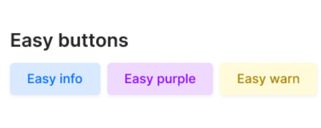
react-easy-button
Implement easily customize out of the box. Work with a vast number of pre-maid react button themes

Installation
# NPM
npm i react-easy-button

# Yarn
yarn add react-easy-button

# Pnpm
pnpm add react-easy-button
Simple example
import React from 'react'
import {EasyButton} from 'react-easy-button';

const Button: React.FC = () => {
    return (
	<EasyButton label="Press me" />
    )
}
Custom style
Style
Note: If theme is not equal to custom it will not work
If the style is provided through style prop it will reset previous styles & apply provided style. In this example below button will only have color & background color style. The rest of the styles will be reset. To avoid this use extendStyle prop.
<EasyButton label="Press me" style={{color: "#242424", backgroundColor: "#fcfcfc"}} />
Extend styles
It will keep all previous styles & only change provided styles. It will work for all themes
<EasyButton label="Press me" extendStyle={{color: "#242424", backgroundColor: "#fcfcfc"}} />
EasyButton props
| Attributes | Type | Default value | Description |
|---|---|---|---|
| label | string |
undefined |
Required. If not provided, will throw error. |
| title | string |
undefined |
Optional. Title attribute of html button tag. |
| theme | string |
primary |
Optional. Available themes (custom, error, success, warn, purple, pink, primary) |
| debounceTimeout | number |
0 |
Optional. Delaytime in ms (eg. 100 = 100ms)) |
| disabled | boolean |
false |
Optional. |
| style | object |
undefined |
Optional. If provided & theme === "custom" then only provided style will be applyed |
| extendStyle | object |
undefined |
Optional. If provided, will change only provided styles. eg. theme="purple" & extendStyle={{border: “2px solid purple”}} it will keep theme styles with provided style border: "2px solid purple"“” |
| hoverStyle | object |
undefined |
Optional. If mouse entered then provided style will applied |
| extendHoverStyle | object |
undefined |
Optional. Provided styles will be applied if mouse entered. |
| easyRef | object |
undefined |
Optional. Will return referance of the button |
| onClick | function |
undefined |
Optional. Will run the function if button is clicked |
| onHover | function |
undefined |
Optional. Will run the function if mouse cursor hovered on the button |
| onFocus | function |
undefined |
Optional. Will run the function if button is focused |
License
MIT