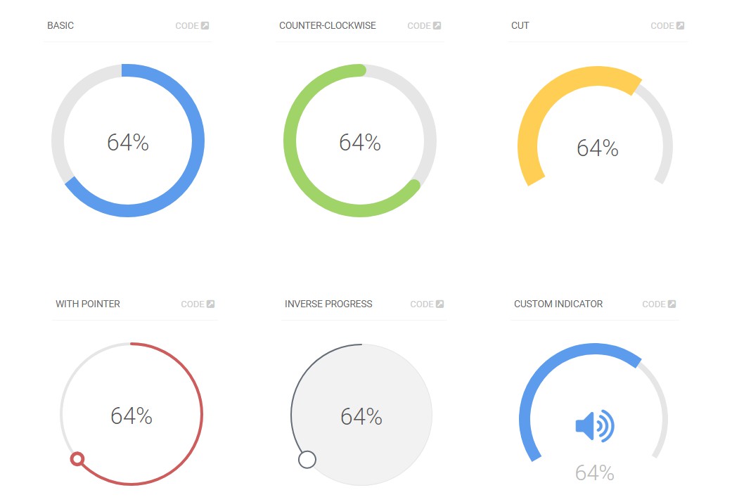
Circular Dashed Progress React
This is zero dependency dashed circular progress bar component in React. It generates a dashed circular progress indicator using SVG.
Usage
Examples:

import CircularProgressBar from "./index";
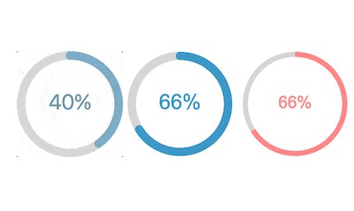
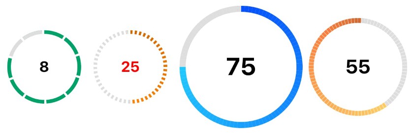
<CircularProgressBar selectedValue={8} />
<CircularProgressBar
selectedValue={25}
maxValue={50}
textColor='#f00'
activeStrokeColor='#cc6600'
withGradient
/>
<CircularProgressBar
selectedValue={75}
maxValue={100}
radius={100}
activeStrokeColor='#0f4fff'
withGradient
/>
<CircularProgressBar
selectedValue={55}
maxValue={90}
radius={80}
activeStrokeColor='#cc6633'
withGradient
anticlockwise
/>
Properties
| Prop | Description | Default |
|---|---|---|
maxValue |
Max Value of the progress. |
10 |
selectedValue |
Selected Value of the progress. |
0 |
radius |
Radius of the Circular Progress Bar. | 60 |
strokeWidth |
Stroke Width of the progress. | 6 |
label |
This is any label that needs to be shown below the progress number. | “ |
labelFontSize |
Font Size for Label. | #000 |
activeStrokeColor |
Active Stroke. | #05a168 |
inactiveStrokeColor |
Inactive Stroke Color. | #ddd |
backgroundColor |
Background Color inside the progress circle. | #fff |
textColor |
Color of the Number Text, which shows the active number. | #000 |
valueFontSize |
Font Size of the number Text. | “ |
withGradient |
Whether to apply gradient on the outer Progress bar. | false |
anticlockwise |
Whether progress bar in Clockwise or not (default: Clockwise). | false |
initialAngularDisplacement |
Any initial Angular Displacement. | 0 |