React Circular Progressbar
A circular progressbar component, built with SVG and extensively customizable.

Installation
Install with yarn:
yarn add react-circular-progressbar
or npm:
npm install --save react-circular-progressbar
Usage
Import the component:
import CircularProgressbar from 'react-circular-progressbar';
If you have a CSS loader configured, you can import the stylesheet:
import 'react-circular-progressbar/dist/styles.css';
If not, you can copy styles.css into your project instead, and include <link rel="stylesheet" href="styles.css" /> in your <head>.
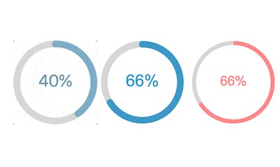
Now you can use the component:
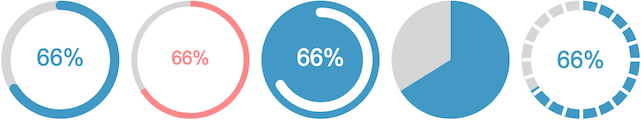
const percentage = 66;

<CircularProgressbar
  percentage={percentage}
  text={`${percentage}%`}
/>
Props
Take a look at the CodeSandbox for interactive examples on how to use these props.
| Name | Description |
|---|---|
percentage |
Numeric percentage to display, from 0-100. Required. |
className |
Classes to apply to the svg element. Default: ''. |
text |
Text to display inside progressbar. Default: null. |
strokeWidth |
Width of circular line as a percentage relative to total width of component. Default: 8. |
background |
Whether to display background color. Default: false. |
backgroundPadding |
Padding between background and edge of svg as a percentage relative to total width of component. Default: null. |
initialAnimation |
Toggle whether to animate progress starting from 0% on initial mount. Default: false. |
counterClockwise |
Toggle whether to rotate progressbar in counterclockwise direction. Default: false. |
circleRatio |
Number from 0-1 representing ratio of the full circle diameter the progressbar should use. Default: 1. |
classes |
Object allowing overrides of classNames of each svg subcomponent (root, trail, path, text, background). Enables styling with react-jss. See this PR for more detail. |
styles |
Object allowing customization of styles of each svg subcomponent (root, trail, path, text, background). |
Version 1.0.0 removed the classForPercentage and textForPercentage props in favor of the newer className and text props. Take a look at the migration guide for instructions on how to migrate.
Theming (customizing styles)
Use CSS or inline styles to customize the styling - the default CSS is a good starting point, but you can override it as needed.
Using the styles prop
You can use the styles prop to customize the inline styles of each subcomponent of the progressbar (the root svg, path, trail, text, and background). This uses the native style prop for each subcomponent, so you can use any CSS properties here, not just the ones mentioned below.
<CircularProgressbar
  percentage={percentage}
  text={`${percentage}%`}
  styles={{
    // Customize the root svg element
    root: {},
    // Customize the path, i.e. the "completed progress"
    path: {
      // Path color
      stroke: `rgba(62, 152, 199, ${percentage / 100})`,
      // Whether to use rounded or flat corners on the ends - can use 'butt' or 'round'
      strokeLinecap: 'butt',
      // Customize transition animation
      transition: 'stroke-dashoffset 0.5s ease 0s',
    },
    // Customize the circle behind the path, i.e. the "total progress"
    trail: {
      // Trail color
      stroke: '#d6d6d6',
    },
    // Customize the text
    text: {
      // Text color
      fill: '#f88',
      // Text size
      fontSize: '16px',
    },
    // Customize background - only used when the `background` prop is true
    background: {
      fill: '#3e98c7',
    },
  }}
/>
See the CodeSandbox examples for a live example on how to customize styles.
Using CSS
You can also customize styles with CSS. There are equivalent CSS hooks for the root, path, trail, text, and background of the progressbar.
If you're importing the default styles, you can override the defaults like this:
import 'react-circular-progressbar/dist/styles.css';
import './custom.css';
// custom.css
.CircularProgressbar-path       { stroke: red;  }
.CircularProgressbar-trail      { stroke: gray; }
.CircularProgressbar-text       { fill: yellow; }
.CircularProgressbar-background { fill: green;  }
Customizing the text/content inside progressbar
If you want to add images or multiple lines of text within the progressbar, the suggested approach is to overlay it on top of a regular <CircularProgressbar /> using absolute positioning - this gives you the ability to put arbitrary HTML content in there. You can create your own wrapper component to make this easy to work with.

Customizing animation and animating text
You can adjust the animation characteristics using CSS or the styles prop:
<CircularProgressbar
  styles={{
    path: {
      transition: 'stroke-dashoffset 0.5s ease 0s',
    }
  }}
/>
See this Codesandbox example to see how the transition can be customized.
If you want to animate the text as well, you can! You'll instead control the percentage prop using a third-party animation library, like react-move. See a Codesandbox example here on how to do that.
Fixing text centering in Internet Explorer (IE)
Because the dominant-baseline CSS property does not work in IE, the percentage text may not be centered.
A solid cross-browser way to fix this is to use this approach for overlaying arbitrary content inside the progressbar.
However, if you don't want to do that, you can also work around this by setting the text prop to be a <tspan> element and then adjusting the dy vertical offset, like so:
// Use feature or browser detection to determine if IE
const needDominantBaselineFix = ...

<CircularProgressbar
  percentage={percentage}
  text={<tspan dy={needDominantBaselineFix ? -10 : 0}>{percentage}</tspan>}
/>
See this Codesandbox example to see this in action.
