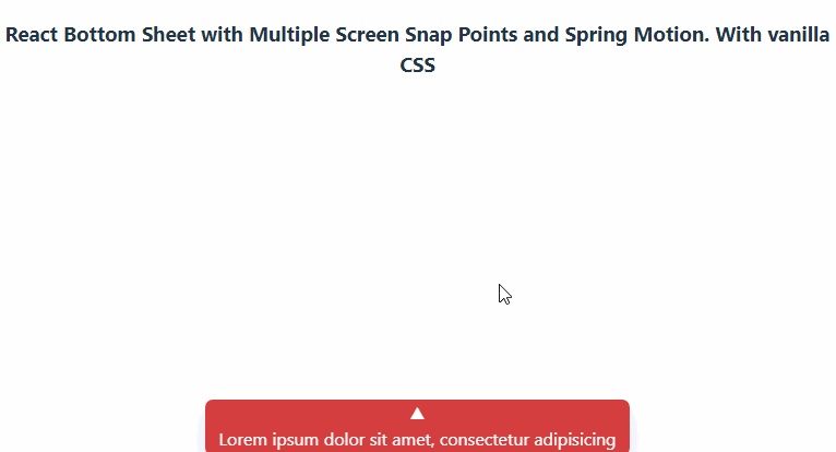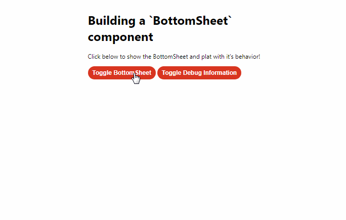
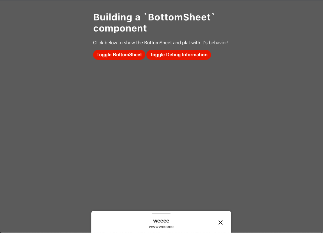
BottomSheet component
A basic bottom sheet implementation
Stack
- Create React App + Typescript – boilerplate app. Used Typescript because it’s important to
- Styled-components – styles. Assuming the projects that would use this would have this as a dependency
- React-spring – animation hook
Component Behavior
| “Expanded” | “Collapsed” | “Dismissed” |
|---|---|---|
 |
 |
 |
Bonus: The component snaps to the top of the screen if you get close enough.
Accessibility
In this component we:
- Turn off animation if your local has set “prefers reduce motion” to true (see docs)
- Made the BottomSheet’s scrollable area have a tab index of 0 so that you can use arrow keys to scroll
- Use rem for font sizes so users can have larger font sizes if their local is defaulted to do so.
- Make the close button accessible by tabbing by making it a button.
- Allow devs to pass down a custom aria label for the close button (closeButtonAriaLabel prop)
- Say this is a modal by setting aria-modal to true
- Set the component’s role to “dialog”
- Set the aria-labelledby’s value to the dialog’s title
Styles
Since all of the colors on the page change when the bottom sheet opens I added some quick theme functionality. The component is using styled-components and is expecting a theme object to be provided for it so that it can support whatever mode you want.
You can find the expected theme object shape in theme.ts. The nomenclature is based on Material Design’s logic
Starting Project on Local
- run
yarn install - pick an app
- regular app:
yarn start - storybook:
yarn storybook
- regular app:
Note
Would like to revisit the state where there is not title or subtitle to see what design would like to do with that.
Extra Credit:
- How might you test this component
- Jest component tests for collapsed, expanded, and dismissed states, scrolling behavior, tab index
- e2e cypress tests for any important feature using this.
- pull out any possible function to make unit tests
- A quick note on how you might assist others in adopting/using the component in their code?
- Do a presentation about it and how to use it in whatever meeting is appropriate
- have a storybook UI story so they can play around with it before using it. This includes grab and go code
- Meet with anyone who has questions during office hours (or honestly whenever)
- If there is a documentation site both design and engineering share would update it
- How might you expand customization of the component?
- Could be interesting to add custom color features for it instead of it’s set colors right now.
- make collapsed state height an optional prop
- customize the thumb bar
- make the heights for everything inline more flexible instead of static numbers, potentially based on a ref’s heights.
- Create an example app that uses this component with different content, configurations
- start storybook link up by running
yarn storybookon local
- Describe how this might work with/in-conjunction with other kinds of similar components. Modals, Tooltips, Toasts, etc
- Modals: ideally only one Modal or Bottom sheet is open at a time, so we could keep track of what is open in some form of shared context.
- Tooltips: this is where we would get into some really fun zIndex elevations rules so that the bottom sheet can exist over tooltips in the body and the – tooltips inside of the bottom sheet have a higher zindex elevation than the bottom sheet.
- Toasts: since toasts have to do with alerts I could see either making sure that toasts are just a higher zIndex above the bottom sheet OR making it so that when an error shows in a toast the bottom sheet closes first and then the toast shows.