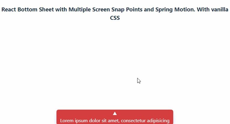
React Stateful Bottom Sheet
React Stateful Bottom Sheet is a versatile and customizable npm package that provides a stateful bottom sheet component for your React applications. The bottom sheet can be easily integrated into your project, allowing you to create interactive and dynamic user interfaces.
Features
- Flexible and customizable: The bottom sheet component can be easily customized and adapted to match your project’s design and functionality requirements.
- Draggable and resizable: Users can drag the bottom sheet up and down, and the component automatically adjusts its height accordingly.
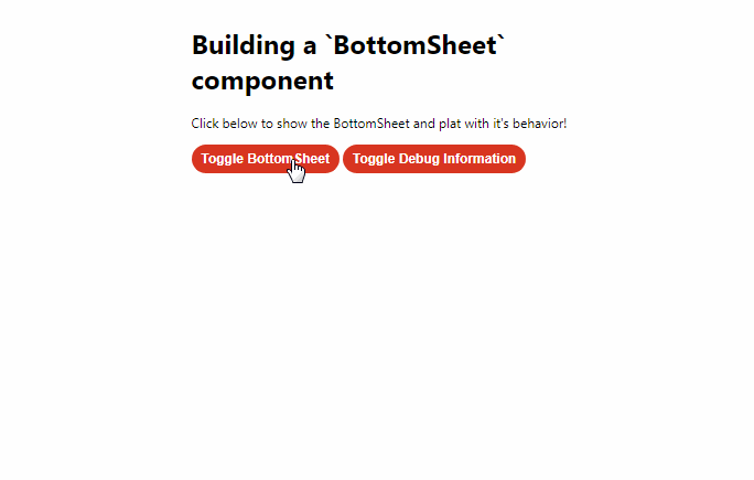
- Toggle functionality: The bottom sheet can be toggled open or closed, providing a seamless user experience.
- Keyboard detection: The component can detect if the keyboard is open, allowing for appropriate UI adjustments.
- Motion and animation: Utilizes the framer-motion library to provide smooth animations and transitions.
- TypeScript support: Written in TypeScript for improved type safety and developer experience.
These features make the React Stateful Bottom Sheet an excellent choice for implementing bottom sheets in your React applications. It provides a powerful and customizable solution for creating dynamic user interfaces.
Demo
https://codesandbox.io/p/sandbox/gifted-http-wlh3yg?welcome=true
Installation
npm install react-stateful-bottom-sheet
Usage
Here is an example of how you can use the React Stateful Bottom Sheet component::
import React from "react";
import StatefulBottomSheet from "react-stateful-bottom-sheet";

const MyComponent = () => {
  return (
    <StatefulBottomSheet
      className="bottom-sheet"
      compactHeight="20vh"
      fullHeight="90vh"
    >
      <div>
        <h1>Bottom Sheet Content</h1>
        <p>This is the content of the bottom sheet.</p>
      </div>
    </StatefulBottomSheet>
  );
};

export default MyComponent;
Props
The StatefulBottomSheet component accepts the following props:
- className (optional): A string representing the CSS class name for the bottom sheet container.
- compactHeight (optional): The height of the bottom sheet when in compact mode. Default is “20vh”.
- fullHeight (optional): The height of the bottom sheet when in full mode. Default is “90vh”.
- children (optional): React nodes to be rendered inside the bottom sheet.
- autoHeight (optional): A boolean indicating whether the height of the bottom sheet should be automatically adjusted based on its content. Default is false.
License
React Clickable Post Wrapper is released under the MIT License.