Practical react components
A catalogue of React components, focused on ease-of-use.
To install the core package, run:
yarn add practical-react-components-core
This contains all the core components. All the icons are located in a separate
practical-react-components-icons package.
Dependencies
Practical react components is dependent on some packages, in addition to react
and react-dom, that need to be installed for it to work. Make sure the
following packages are installed:
yarn add styled-components
yarn add react-transition-group
yarn add pepjs
If you are using practical-react-components-formik you also need to make sure
the following packages are installed:
yarn add formik
Typescript
Install additional typings:
yarn add @types/styled-components
If you use Typescript and want to use styled-components, you need to add a
file to your source directory, e.g.:
styled-components.d.ts
with the following contents:
import 'styled-components'
import { Theme } from './theme'

declare module 'styled-components' {
  export interface DefaultTheme extends Theme {}
}
in which case you should get proper typings for the theme prop in your own
styled components.
Make sure this file is included in your tsconfig.json files, e.g.
"include": ["src/styled-components.d.ts", "./src/index.ts"].
Electron
If you are using Practical react components with an Electron app you might have
to add the following lines in the root of you package.json file.
"electronWebpack": {
  "whiteListedModules": [
    "practical-react-components-core",
    "styled-components"
  ]
}
Usage
Practical react components makes use of contexts to provide theme and toast
creators. To make it possible to use the components, you need to wrap your app
in a PracticalProvider.
On the provider you can optionally specify a theme and behaviors for toasts.
export const Entry: React.FC = () => {
  return (
    <PracticalProvider>
      <App />
    </PracticalProvider>
  )
}
In your app, you can then start using Practical react components:
export const App: React.FC = () => {
  const [text, setText] = useState()
  const { showSuccessToast } = useToasts()

  return (
    <AppContainer>
      <TextInput onValueChange={setText} />
      <SpaceBlock variant={16} />
      <Button
        label="Yay"
        onClick={() => showSuccessToast({ label: `You wrote: ${text}` })}
      />
    </AppContainer>
  )
}
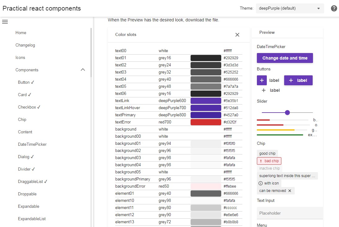
For more information on what components are available and how to use them
please visit the documentation.
GitHub
https://github.com/AxisCommunications/practical-react-components