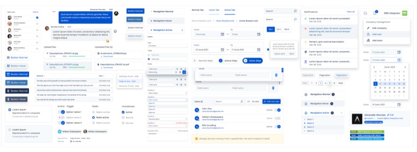
EBS Design System

A React-based UI toolkit for enterprise grade applications.
⭐ Features
- Modern design and exceptional user experience.
- Fully customizable components using variables.
- Written in TypeScript with predictable static types.
- High-quality and performant React components.
- 100% Open Source.
? Installation
Use the package manager yarn or npm to install library.

⚠️ Peer Dependencies
| Package's name | Version |
|---|---|
| react | >= 16.8 |
| react-dom | >= 16.8 |
| node-sass | >=4.0.0 <5.0.0 |
?️ Usage guide
import { Button } from 'ebs-design';
Import styles scss into a src/App.(js|tsx)
import 'ebs-design/dist/styles/index.scss';
Or create and import your scss to customize variables
import './variables.scss';
// Main colors
$primary-color: #3366ff;
$success-color: #2ac952;
$info-color: #3bc0f9;
$warning-color: #ffd83d;
$danger-color: #ff3a30;
$normal-color: #a5a5a5;

// Primary colors
$primary-000: #eef5ff;
$primary-100: #d6e4ff;
$primary-200: #adc8ff;
$primary-300: #85a9ff;
$primary-400: #6690ff;
$primary-600: #254eda;
$primary-700: #1a39b6;
$primary-800: #102693;
$primary-900: #0a1a7a;

@import 'ebs-design/dist/styles/index.scss';