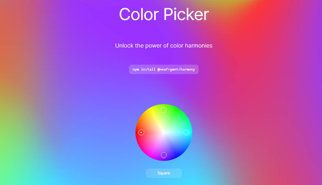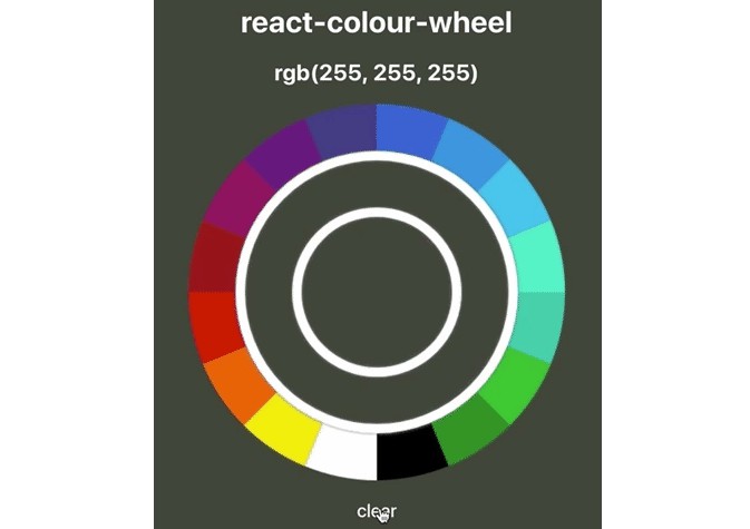
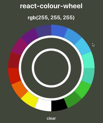
react-colour-wheel
A circular colour-picker React component; built with HTML5's canvas & context-api. Full customisation & control through props.
Quick-start guide
Installation
npm install react-colour-wheel
yarn add react-colour-wheel
...and wherever you need the component:
import ColourWheel from 'react-colour-wheel'
Start by giving your ColourWheel a radius, lineWidth, and utilise the rgb-value sent through onColourSelected:
<ColourWheel
  radius={200}
  lineWidth={50}
  onColourSelected={(rgb) => this.setState({ selectedColour: rgb })}
/>
However, a more typical implementation might look like:
<ColourWheel
  radius={200}
  padding={10}
  lineWidth={50}
  onColourSelected={(rgb) => this.setState({ rgb })}
  onRef={ref => (this.colourWheel = ref)}
  spacers={{
    colour: '#FFFFFF',
    shadowColour: 'grey',
    shadowBlur: 5
  }}
  preset
  presetColour={this.state.rgb}
  animated
/>
Customisation
The ColourWheel component has many options available for customisation through props:
radius
Customise the radius of the ColourWheel, all the way to the outer-edge.
- pixels,
px propTypes: number, isRequired
radius={200}
lineWidth
Customise the width of the outer- and inner-wheels.
- pixels,
px propTypes: number, isRequired
lineWidth={50}
onColourSelected
Method that returns an rgb-value; typical use case might be to setState({ rgb }) on the parent-component.
propTypes: func
onColourSelected={(rgb) => ... )}
padding
Sets the space between the outer-wheel, inner-wheel, and the center-circle.
- pixels,
px propTypes: number
padding={10}
spacers
Allows you to customise the styling of the padding that was set:
- Need to specify an object with
colour,shadowColour, andshadowBlurproperties. propTypes: object
  spacers={{
    colour: '#FFFFFF',
    shadowColour: 'grey',
    shadowBlur: 5
  }}
colours
Allows you to define an array of colours that will populate the outer-wheel of the colour-wheel.
- By default, an array of 16 hex-strings is provided to help you get started.
coloursaccepts hex-strings, rgb-strings & objects, names and other variations.- This is based on tinycolor2's core
.toRgb()method.
- This is based on tinycolor2's core
propTypes: array
  colours={[
    'blue',
    'green',
    'red',
    'yellow',
    'black',
    'white
  ]}