React Widgets
Technologies Used
React.js– Frontend JavaScript libraryWebpack– Module bundler@babel/core– JavaScript coverter for backwards compatibilityGeolocation API– Request user’s current location andOpen Weather API– Fetch free weather data for the user’s location
Widgets
Clock
The Clock component displays the current date and time, updating every second.
- Date
- Weekday (full length)
- Month (full length)
- Calendar date (two digit integer)
- Time
- Seconds, minutes, and hours (in 12-hour format)
- AM/PM indicator

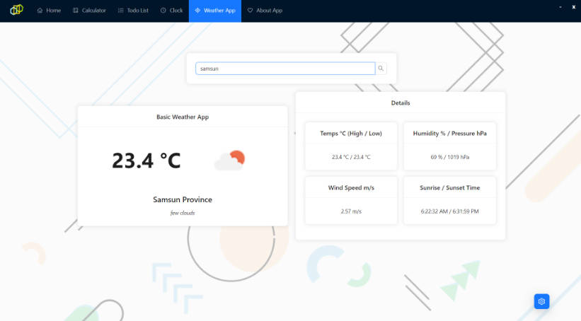
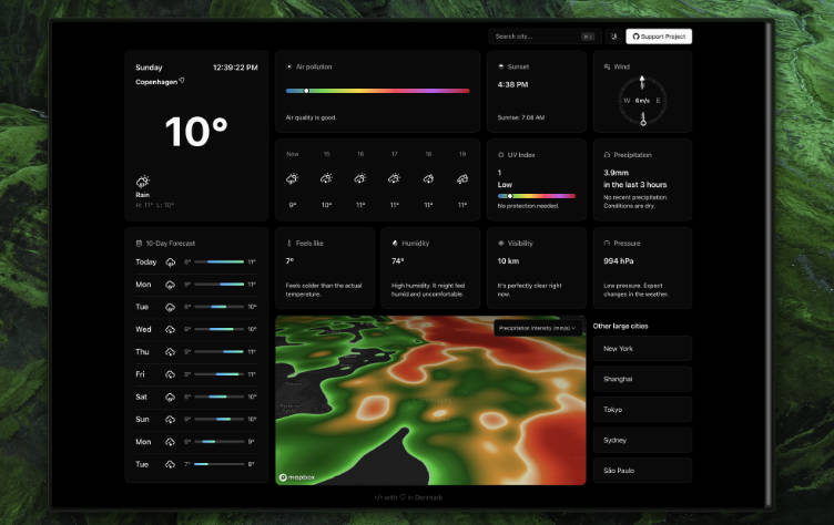
Weather
The Weather component provides local weather data in an organized and digestible fashion. Weather data includes:
- Description
- Short description of the current weather conditions along with a relevant icon
- Current location being used for weather data
- Temperatures (all in fahrenheit)
feelsLike– what it currently ‘feels like’actual– what the actual current temperature ismaxandmin– highest and lowest temperatures for the current date
- Wind
- Directional arrow icon that is rotated based on the current direction of wind
- Two letter abbreviations for the compass direction of the current wind
- Speed of current wind (imperial miles/hr)
- Gusts (imperial miles/hr), only if there are high wind gusts in the forecast

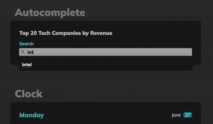
AutoComplete
The AutoComplete component filters a list of names based on the user’s input. Matches are detected by comparing the user’s input to the list of names, each sliced to the length of input and checked for equality. When a user clicks on the recommended name, the field autocompletes the name and displays the company’s data below the search bar.
- Suggestions
- Absolute positioned list of company names recommened based on user’s input
onClickevent handler to complete the search and render the company data
- Dynamic Lists
- The array of names suggested are provided as props, and therefore can easily be changed
- Format of the company names accepted as props:
[{ name: "Apple", revenue: "$274.5 B" }, ...]

Tabs
The Tabs widget is an interactive container that dynamically displays content based on the label selected by the user.
- Dynamic Props
- Tabs are passed as props formatted as an array objects, each with a
title(string) andcontent(React ComponentsorHTML Elements):
[{title: "Weather", content: <Weather type='tab' />}, ...]
- Tabs are passed as props formatted as an array objects, each with a
- Active Tabs
- Selected tab index stored in component’s state
- The actively selected tab is styled with a blue background, box-shadow, and bold text