@mohsen007/react-goftino
A component simplifies Goftino widget usage in your React application
Introduction
This component applies to Goftino Web Widget including contact form, live chat, talk, answer bot and help center. For more information on widget and API, please check Goftino official documentation
Installation
with npm
npm i @mohsen007/react-goftino
with yarn
yarn add @mohsen007/react-goftino
Component Usage
import React from 'react';
import ReactDOM from 'react-dom';
import { GoftinoSnippet } from '@mohsen007/react-goftino';
const GOFTINO_KEY = 'your goftino embed key';

const App = () => {
  return (
    <GoftinoSnippet
      goftinoKey={GOFTINO_KEY}
      onReady={() => {
        window.Goftino.open();
      }}
    />
  );
};

ReactDOM.render(<App />, document.getElementById('#app'));
Examples
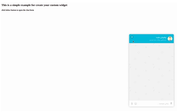
Your Own Widget

import React from 'react';
import ReactDOM from 'react-dom';
import { GoftinoSnippet } from '@mohsen007/react-goftino';
const GOFTINO_KEY = 'your goftino embed key';

const App = () => {
  const [hideButton, setHideButton] = React.useState(false);

  return (
    <GoftinoSnippet
      goftinoKey={GOFTINO_KEY}
      onReady={() => {
        window.Goftino.setWidget({
            hasIcon: false,
          });
      }}
      onClose={() => {
          setHideButton(false);
        }}
    />
    <button
        onClick={() => {
          window.Goftino.open();
          setHideButton(true);
        }}
        style={{
          opacity: hideButton ? 0 : 1,
          visibility: hideButton ? 'hidden' : 'visible',
          transition: 'all 0.15s linear',
          color: 'white',
          backgroundColor: 'red',
          border: '1px solid yellow',
          borderRadius: 8,
          padding: 8,
          cursor: 'pointer',
        }}
      >
        My Custom Widget
      </button>
  );
};

ReactDOM.render(<App />, document.getElementById('#app'));