React User Tour
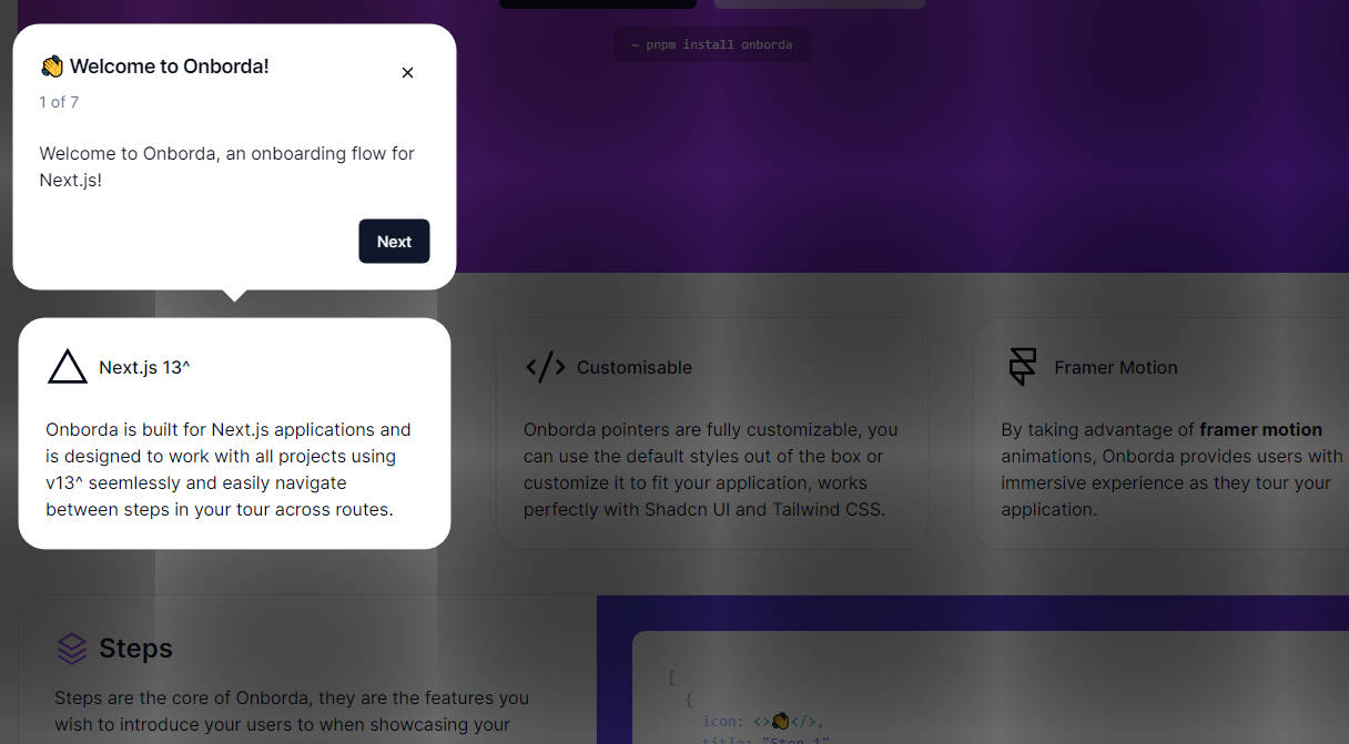
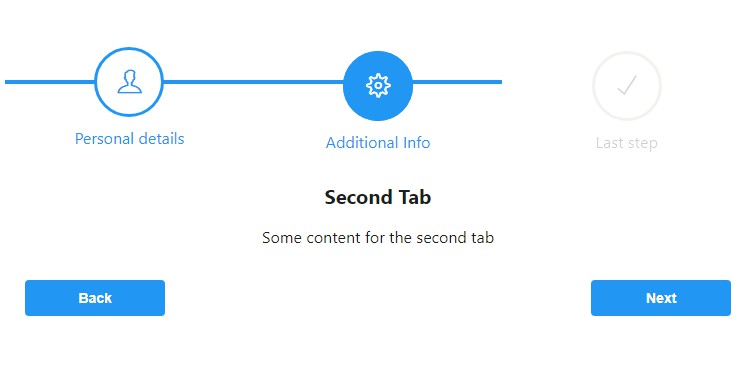
A component that allows you to give a user a guided tour around your application.
Install
npm install react-user-tour
Props
active
A boolean value representing whether or not the tour should currently be displayed
step
An integer representing the current active step of the tour
onNext
function that fires when user clicks the Next button. Receives the next step integer as a callback. For example, if current step is 1 and user clicks the Next button, onNext(2) will be called.
onBack
function that fires when user clicks the Back button. Receives the previous step integer as a callback. For example, if current step is 2 and user clicks the Back button, onBack(1) will be called.
onCancel
function that fires when user clicks the X button or the Done Button.
steps
An array of steps. Each step object takes: step (integer), selector (CSS selector to be passed to document.querySelector()), title (a react element representing the header of the current step), and body (a react element representing the main body message of the tour step). Each step can also take an optional argument, position which will override the position of the tour component in relation to the selector that is determined by the application. Valid arguments for the position step are left , right, top, topLeft, bottom, and bottomLeft. Optional properties horizontalOffset and verticalOffset values allow to move tooltip around pointed element. You can control distance from the edge of pointed element by margin property (25 by default). It's not taken into account in case of top and bottom overrides.
style
Optional style object.
containerStyle
Optional style object for the top level component container.
buttonStyle
Optional style object for buttons displayed on component.
buttonContainerStyle
Optional style object for the container div around the buttons.
arrow
We provide an arrow that points to the selector, but you may optionally pass in your own React element in the place of the arrow provided.
arrowSize
If you choose to use the provided arrow, you can set the pixel size here with an integer value.
arrowColor
If you choose to use the provided arrow, you can set the color here by passing in a hex value.
nextButtonText
Text that will appear on the button that moves the tour forward. Defaults to Next
backButtonText
Text that will appear on the button that moves the tour backwards. Defaults to Back
doneButtonText
Text that will appear on the button that finishes the tour. Defaults to Done
closeButtonText
Text that will appear on the button that closes the tour. Defaults to Close
hideButtons
Boolean to disable the showing of next/back/done buttons. Set this to true if you want to insert your own buttons in the body.
hideClose
Boolean to disable the showing of the close text in the upper left of the component. Set this to true if you want to insert your own close functionality or if you would like to disable the ability for the user to prematurely exit the tour.
Use
import React, { Component }from "react";
import Tour from "react-user-tour";
export default class UserTour extends Component {
	constructor() {
		super();
		this.state = {
			isTourActive: false,
			tourStep: 1
		};
	}
	componentDidMount() {
		/* set state to active in cDM to make sure nodes being attached to have been mounted */
		this.setState({
			isTourActive: true
		});
	}
	render() {
		return (
			<div>
				<Tour
					active={this.state.isTourActive}
					step={this.state.tourStep}
					onNext={(step) => this.setState({tourStep: step})}
					onBack={(step) => this.setState({tourStep: step})}
					onCancel={() => this.setState({isTourActive: false})}
					steps={[
						{
							step: 1,
							selector: ".my-fun-website",
							title: <div style={{color: "blue"}}>My Web</div>,
							body: <div style={{color: "green"}}>Site</div>
						},
						{
							step: 2,
							selector: ".my-website-is-amazing",
							title: <div style={{color: "blue"}}>Wow</div>,
							body: <div style={{color: "yellow"}}>so good</div>
						}
					]}
				/>
			</div>
		);
	}
}


