React Split Flap Display
A React component that mimics a Split-Flap/Solari display.
Install
npm install --save react-split-flap-display
or
yarn add react-split-flap-display
This package has a peer dependency on styled-components
Usage
import React, { Component } from 'react';

import SplitFlapDisplay from 'react-split-flap-display';

class Display extends Component {
  render() {
    return <SplitFlapDisplay characterSet={['1', '2', '3', '4', ':']} value="12:34" />;
  }
}
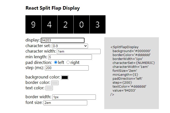
Props
| Key | Type | Default | Description |
|---|---|---|---|
| background | string | '#000000' | Hex or rgb() string for the display's background |
| borderColor | string | '#dddddd' | Hex or rgb() string for the color of the border between characters |
| borderWidth | string | '1px' | Any valid CSS width value for the width of the border between characters |
| characterSet | Array of strings (required) | null | The array of characters for the display to flip through |
| characterWidth | string | '1em' | Any valid CSS width value for the width of each character. Useful with non-monospaced fonts |
| fontSize | string | '1em' | Any valid CSS font-size value |
| minLength | number | null | Minimum # of characters in the display |
| padDirection | string | 'left' | If minLength > number of characters currently displayed, append blank characters to left or right side |
| step | number | 200 | Sets the speed (ms) of flips |
| textColor | string | '#dddddd' | Hex or rgb() string for color of the display characters |
| value | string (required) | null | The string of characters to display or flip to |
For characterSet, there are three convenience constants that ship with this component (you can see how they might be used in the example):
NUMERIC: [0-9]
ALPHA: whitespace ' ' + [A-Z]
PUNCTUATION: the non-alphanumeric characters found in a Vesta Board