Smoothr
A custom React router that leverages the Web Animations API and CSS animations.
Background
In my experience from using animations with React Router and other Single Page App routing solutions, the work to add animation transitions on changing routes was a lot more complicated than just regular routing. I also was inspired by the Web Animations API and decided to create my own flavor of a Router, that treats animations as first class citizens.
Anyway, thanks for checking this library out. If you end up using Smoothr in production, let me know and I'll add a link here in the README.
May your single page routing animations be smoother, with Smoothr... (pardon the cheesyness)
Getting Started
Prerequisites
- React 16.3.0 or higher
- Support for
Object.assignandPromisein Javascript - Any necessary polyfills for the Web Animations API
Installation
npm install smoothr
Minimal Example Usage
import React from 'react';
import ReactDOM from 'react-dom';

// Bring in the Smoothr components
import { Smoothr, SmoothRoutes, Route, Link } from 'smoothr';

const Page = props => <section>{props.message}</section>;

const App = () => (
  <Smoothr
    // Required prop! Return animation duration in milliseconds
    configAnimationSetDuration={() => 750}
  >
    <div>
      {/* Link is our wrapper around anchors for Smoothr navigation  */}
      <Link href="/">Home</Link>
      <Link href="/page1">Page 1</Link>
    </div>
    <div>
      <SmoothRoutes>
        <Route
          path="/"
          component={Page}
          // Use the Web Animations API
          animationIn={[{ opacity: 0 }, { opacity: 1 }]}
          animationOut={[{ opacity: 1 }, { opacity: 0 }]}
          animationOpts={{
            duration: 750,
            easing: 'ease-in-out'
          }}
          // Any other props will be passed to `component`
          message="Welcome to the homepage!"
        />
        <Route
          path="/anotherpage"
          component={Page}
          // Use CSS classes for animating
          animationIn={'fadeInCSSClassName'}
          animationOut={'fadeOutCSSClassName'}
          message="Welcome to the other page!"
        />
        <Route
          // The `notFound` prop designates a route, path, and component for 404 page
          notFound
          path="/notfound"
          component={Page}
          message="404 Error!"
        />
      </SmoothRoutes>
    </div>
  </Smoothr>
);

ReactDOM.render(<App />, document.getElementById('root'));
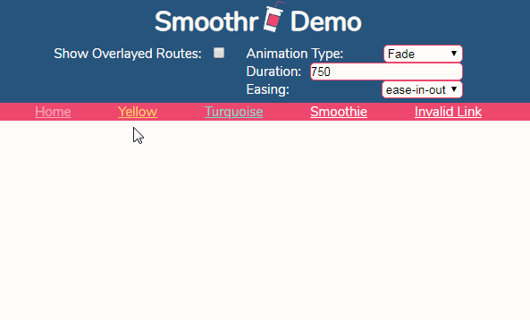
For a more complete example, check out the demo and its source code
API Documentation
<Smoothr>
Usage:
The <Smoothr> component just needs to be used up the tree of any <Link>s or <SmoothRoutes>. I just recommend having it at the top level of your Single Page App.
Available props: (* indicates a required prop)
configAnimationSetDuration* - (function) - This method allows changing of local state in order to conditionally set the upcoming animation. It is aPromise, to ensure any asynchonous state changes to be completed before the animating begins. Example:
configAnimationSetDuration = ({
  // Url's are the exact urls
  outgoingUrl,
  incomingUrl,
  // Routes are the original matching routes, as set in the <Route /> components
  outgoingRoute,
  incomingRoute,
  // If the user nagivated with the "back" button in the browser (boolean)
  backNavigation
}) => {
  // Have this method return the duration of the animation as an int in milliseconds
  return 750;
};
onAnimationStart- (function) - This function will run right before the animation begins. Use it to imperitively kick off transition animations. If you want to kick off an animation based on incoming or outgoing routes, useconfigAnimationSetto set some state, and then use that state in this method. Example:
onAnimationStart = ({ initialPageload }) => {
  // Do stuff...
};
-
onAnimationEnd- (function) - This takes place after the animation is finished. Reset your animations if they're saved in state, or do something else. There are no arguments passed. -
originPath- (string) - The path after the domain to the origin of this single page app.
Include the beginning backslash, but not the trailing backslash.
All of the<Link />hrefproperties will be relative to that origin path.
Example:"/smoothr-app", and<Link href="/page1" />will link to"/smoothr-app/page1".
This defaults to an empty string, which signifies the document root.
<SmoothRoutes>
Usage:
Imagine <SmoothRoutes> as a regular DOM element that changes when the url changes. Its children MUST be <Route> components. You can use as many of these on the page as you want. Often you'll want to wrap each <SmoothRoutes> component in a wrapper DOM element with some CSS rules to set its size.
Available props:
Each of these props are identical to their <Route> counterparts. They will be applied to all routes if set at the <SmoothRoutes> level, but if a <Route> has an animation prop, the logic will favor the props set on the <Route> at transition.
animationIn- (array of objects/string indicating class name)animationOut- (array of objects/string indicating class name)animationOpts- (object with keys fordurationandeasing)reverseAnimationIn- (array of objects/string indicating class name)reverseAnimationOut- (array of objects/string indicating class name)reverseAnimationOpts- (object with keys fordurationandeasing)
<Route>
Usage:
Most of the actual animation configuration takes place on the <Route> level. Animations are set by the props of the <Route> that is being transitioned in. The reverseAnimation prop equivalents take precedence when the user nagivates back with the "back" button in their browser, but aren't required.
Available props: (* indicates a required prop)
component* - (React Component) - The component that you want to be rendered when the URL matches a given path.path* - (string) - When the url matches thepathof your<Route>, it will render to the page. Variabled routes are supported, and can be indicated with a:. The value of that variable will be passed down as a prop by the name in the path to the renderedcomponent. Example of usingpathwith variables:
<Route path="/users/:id" component={UsersPage} />

// If the url is "/users/12345", the following will be rendered:
<UsersPage id="12345">
animationIn- (array of objects/string indicating class name) - The value of this prop corresponds to the first argument of theElement.animate()method, or a css class name, which will be applied to the<Route>DOM element during the duration of the animation. If this isn't passed, then no animation will occur, but be aware that the incoming<Route>won't show up until the duration ends, as set in theconfigAnimationSetDurationprop of the top level<Smoothr>component.animationOut- (array of objects/string indicating class name) - Similiar toanimationIn, but is applied to the outgoing<Route>animationOpts- (object with keys fordurationandeasing) - This corresponds to the second argument of theElement.animate()method. These options are applied to both the incoming and outgoing<Route>s during transition. If using a CSS class transition, then this is optional.reverseAnimationIn- (array of objects/string indicating class name) - Same as theanimationInbut happens when the user nagivates back with the "back" button in their browser.reverseAnimationOut- (array of objects/string indicating class name) - Reverse equivalent of theanimationOutprop.reverseAnimationOpts- (object with keys fordurationandeasing) - Reverse equivalent of theanimationOptsprop.notFound- (No type, just add the prop) - This designates apathandcomponentto show when the URL doesn't match any of the other paths.- Any other props that are set will be passed down to the rendered
component.
<Link>
Usage:
Links are wrappers around anchor (<a>) tags, except it adds the disabled property to simulate the CSS :visited behavior (unless you manually pass a disabled property)
Available props: (* indicates a required prop)
href* - (string) - Same as anchor tagonClick- (function) - This is self-explanatoryfuzzyDisable- (bool) - If is prop is set totrue, it will disable the link if the route matches the current variabled route. By default, only exact url matches will be disabled.- Any other props that are set will be passed down to the rendered anchor tag.
To do list:
- [x] Release initial build to NPM
- [ ] Test callback functions as
<Route>componentprop - [ ] Test app in Preact/add Preact support
- [ ] Add prop checks with
PropTypes - [ ] Remove need to polyfill
Object.assignand possiblyPromise - [ ] General cleanup and optimizations
- [ ] Add more animations to the demo page