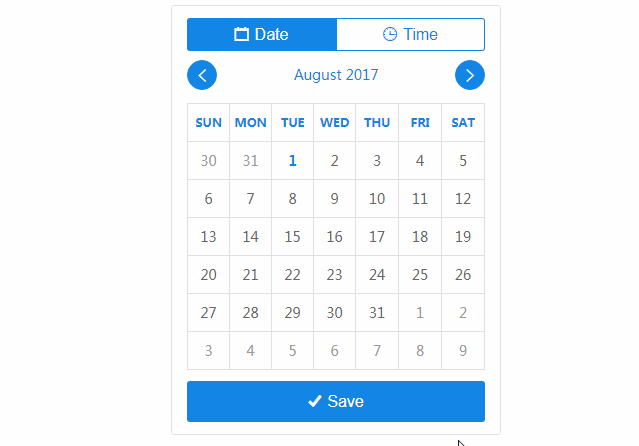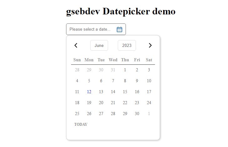
react-datetime
A date and time picker in the same React.js component. It can be used as a datepicker, timepicker or both at the same time. It is highly customizable and it even allows to edit date's milliseconds.
This project started as a fork of https://github.com/quri/react-bootstrap-datetimepicker but the code and the API has changed a lot.
Live Demo
https://codepen.io/simeg/pen/mEmQmP
Installation
Install using npm:
npm install --save react-datetime
Install using yarn:
yarn add react-datetime
Usage
React.js and Moment.js are peer dependencies for react-datetime. These dependencies are not installed along with react-datetime automatically, but your project needs to have them installed in order to make the datepicker work. You can then use the datepicker like in the example below.
require('react-datetime');

...

render: function() {
    return <Datetime />;
}
Don't forget to add the CSS stylesheet to make it work out of the box.
i18n
Different language and date formats are supported by react-datetime. React uses Moment.js to format the dates, and the easiest way of changing the language of the calendar is changing the Moment.js locale.
var moment = require('moment');
require('moment/locale/fr');
// Now react-datetime will be in french
If there are multiple locales loaded, you can use the prop locale to define what language shall be used by the instance.
<Datetime locale="fr-ca" />
<Datetime locale="de" />
Here you can see the i18n example working.
Customize the Appearance
It is possible to customize the way that the datepicker display the days, months and years in the calendar. To adapt the calendar for every need it is possible to use the props renderDay(props, currentDate, selectedDate), renderMonth(props, month, year, selectedDate) and renderYear(props, year, selectedDate) to customize the output of each rendering method.
var MyDTPicker = React.createClass({
    render: function(){
        return <Datetime
            renderDay={ this.renderDay }
            renderMonth={ this.renderMonth }
            renderYear={ this.renderYear }
        />;
    },
    renderDay: function( props, currentDate, selectedDate ){
        return <td {...props}>{ '0' + currentDate.date() }</td>;
    },
    renderMonth: function( props, month, year, selectedDate ){
        return <td {...props}>{ month }</td>;
    },
    renderYear: function( props, year, selectedDate ){
        return <td {...props}>{ year % 100 }</td>;
    }
});
You can see a customized calendar here.
Method Parameters
propsis the object that the datepicker has calculated for this object. It is convenient to use this object as thepropsfor your custom component, since it knows how to handle the click event and itsclassNameattribute is used by the default styles.selectedDateandcurrentDateare moment objects and can be used to change the output depending on the selected date, or the date for the current day.monthandyearare the numeric representation of the current month and year to be displayed. Notice that the possiblemonthvalues range from0to11.
Specify Available Units
You can filter out what you want the user to be able to pick by using dateFormat and timeFormat, e.g. to create a timepicker, yearpicker etc.
In this example the component is being used as a timepicker and can only be used for selecting a time.
<Datetime dateFormat={false} />
Working example of a timepicker here.
In this example you can only select a year and month.
<Datetime dateFormat="YYYY-MM" timeFormat={false} />
Working example of only selecting year and month here.
Selectable Dates
It is possible to disable dates in the calendar if the user are not allowed to select them, e.g. dates in the past. This is done using the prop isValidDate, which admits a function in the form function(currentDate, selectedDate) where both arguments are moment objects. The function shall return true for selectable dates, and false for disabled ones.
In the example below are all dates before today disabled.
// Let's use the static moment reference in the Datetime component
var yesterday = Datetime.moment().subtract( 1, 'day' );
var valid = function( current ){
    return current.isAfter( yesterday );
};
<Datetime isValidDate={ valid } />
Working example of disabled days here.
It's also possible to disable the weekends, as shown in the example below.
var valid = function( current ){
    return current.day() !== 0 && current.day() !== 6;
};
<Datetime isValidDate={ valid } />
Working example of disabled weekends here.
Usage with TypeScript
This project includes typings for TypeScript versions 1.8 and 2.0. Additional typings are not
required.
Typings for 1.8 are found in react-datetime.d.ts and typings for 2.0 are found in typings/index.d.ts.
import * as Datetime from 'react-datetime';

class MyDTPicker extends React.Component<MyDTPickerProps, MyDTPickerState> {
    render() JSX.Element {
        return <Datetime />;
    }
}