SOLID DND DIRECTIVE
This is a feature-complete implementation of drag and drop for Solid JS using a custom directive.
It supports almost every imaginable drag and drop use-case, any input device and is fully accessible.
It requires very minimal configuration, while offering a rich set of primitives that allow overriding basically any of its default behaviours (using the handler functions).
The reason it is so feature rich, robust and production ready is that under the hood it utilises the most popular drag and drop library for svelte (which actually has no dependency on svelte whatsoever): svelte-dnd-action

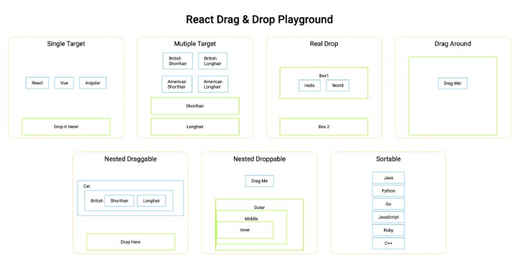
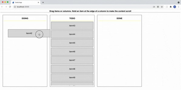
Play with this example here
Current Status
While the core of this library is used in commercial svelte apps in production and has a very stable API, the thin adapter that makes it Solid friendly is very new and still experimental.
It introduces its own, very minimal, implementation of flip animations, which still needs to be tested under fire.
I will add examples and improvements to this repo. The greater the interest from the Solid community – the faster I will do it ?
Features
- Awesome drag and drop with minimal fuss
- Supports horizontal, vertical or any other type of container (it doesn’t care much about the shape)
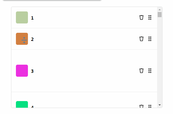
- Supports nested dnd-zones (draggable containers with other draggable elements inside, think Trello)
- Rich animations (can be opted out of)
- Touch support
- Define what can be dropped where (dnd-zones optionally have a “type”)
- Scroll dnd-zones and/or the window horizontally or vertically by placing the dragged element next to the edge
- Supports advanced use-cases such as various flavours of copy-on-drag and custom drag handles (see examples below)
- Performant and small footprint
- Fully accessible (beta) – keyboard support, aria attributes and assistive instructions for screen readers
Installation
Pre-requisites: solid-js ^1.0.0
yarn add solid-dnd-directive
or
npm install solid-dnd-directive
Usage
import { createSignal } from "solid-js";
import {dndzone} from "solid-dnd-directive";
const containerStyle = {border: "1px solid black", padding: "0.3em", "max-width": "200px"};
const itemStyle = {border: "1px solid blue", padding: "0.3em", margin: "0.2em 0"};

function App() {
  const [items, setItems] = createSignal([
    {id: 1, title: "item 1"},
    {id: 2, title: "item 2"},
    {id: 3, title: "item 3"}
  ]);

  function handleDndEvent(e) {
     const {items: newItems} = e.detail;
     setItems(newItems);
  }
  return (
    <main>
         <section style={containerStyle} use:dndzone={{items}} on:consider={handleDndEvent} on:finalize={handleDndEvent}>
            <For each={items()}>{item => <div style={itemStyle}>{item.title}</div>}</For>
        </section>
    </main>
  );
}

export default App;
Input:
Except for items, all the other options can be either a value (won’t be reactive), or a function that returns a value (Signal, or function to a Store, will update reactively)
An options-object with the following attributes:
| Name | Type | Required? | Default Value | Description |
|---|---|---|---|---|
items |
() => Array<Object> a Signal, or a function that returns a Store | Yes. Each object in the array has to have an id property (key name can be overridden globally) with a unique value (within all dnd-zones of the same type) |
N/A | The data array that is used to produce the list with the draggable items (the same thing you run your For block on). The dndzone should not have children that don’t originate in items |
flipDurationMs |
Number | No | 150 |
The duration of the items animations. Set to zero if you don’t want animations |
type |
String | No | Internal | dnd-zones that share the same type can have elements from one dragged into another. By default, all dnd-zones have the same type |
dragDisabled |
Boolean | No | false |
Setting it to true will make it impossible to drag elements out of the dnd-zone. You can change it at any time (if you passed in a Signal), and the zone will adjust on the fly |
morphDisabled |
Boolean | No | false |
By default, when dragging over a zone, the dragged element is morphed to look like it would if dropped. You can prevent it by setting this option. |
dropFromOthersDisabled |
Boolean | No | false |
Setting it to true will make it impossible to drop elements from other dnd-zones of the same type. Can be useful if you want to limit the max number of items for example. You can change it at any time, and the zone will adjust on the fly |
zoneTabIndex |
Number | No | 0 |
Allow user to set custom tabindex to the list container when not dragging. Can be useful if you want to make the screen reader to skip the list container. You can change it at any time. |
dropTargetStyle |
Object<String> | No | {outline: 'rgba(255, 255, 102, 0.7) solid 2px'} |
An object of styles to apply to the dnd-zone when items can be dragged into it. Note: the styles override any inline styles applied to the dnd-zone. When the styles are removed, any original inline styles will be lost |
dropTargetClasses |
Array<String> | No | [] |
A list of classes to apply to the dnd-zone when items can be dragged into it. Note: make sure the classes you use are available globally. |
transformDraggedElement |
Function | No | () => {} |
A function that is invoked when the draggable element enters the dnd-zone or hover overs a new index in the current dnd-zone. Signature: function(element, data, index) {} element: The dragged element. data: The data of the item from the items array. index: The index the dragged element will become in the new dnd-zone. This allows you to override properties on the dragged element, such as innerHTML to change how it displays. If what you are after is altering styles, do it to the children, not to the dragged element itself |
autoAriaDisabled |
Boolean | No | false |
Setting it to true will disable all the automatically added aria attributes and aria alerts (for example when the user starts/ stops dragging using the keyboard). Use it only if you intend to implement your own custom instructions, roles and alerts. In such a case, you might find the exported function alertToScreenReader(string) useful. |
centreDraggedOnCursor |
Boolean | No | false |
Setting it to true will cause elements from this dnd-zone to position their center on the cursor on drag start, effectively turning the cursor to the focal point that triggers all the dnd events (ex: entering another zone). Useful for dnd-zones with large items that can be dragged over small items. |
Output:
The action dispatches two custom events:
consider– dispatched whenever the dragged element needs to make room for itself in a new position in the items list and when it leaves. The host (your component) is expected to update the items list (you can keep a copy of the original list if you need to)finalize– dispatched on the target and origin dnd-zones when the dragged element is dropped into position. This is the event you want to use to save the items to the server for example.
The expectation is the same for both event handlers – update the list of items.
In both cases the payload (within e.detail) is the same: an object with two attributes: items and info.
items: contains the updated items list.info: This one can be used to achieve very advanced custom behaviours (ex: copy on drag). In most cases, don’t worry about it. It is an object with the following properties:trigger: will be one of the exported list of TRIGGERS (Please import if you plan to use): [DRAG_STARTED, DRAGGED_ENTERED, DRAGGED_ENTERED_ANOTHER, DRAGGED_OVER_INDEX, DRAGGED_LEFT, DRAGGED_LEFT_ALL, DROPPED_INTO_ZONE, DROPPED_INTO_ANOTHER, DROPPED_OUTSIDE_OF_ANY, DRAG_STOPPED]. Most triggers apply to both pointer and keyboard, but some are only relevant for pointer (dragged_entered, dragged_over_index and dragged_left), and some only for keyboard (drag_stopped).id: the item id of the dragged elementsource: will be one of the exported list of SOURCES (Please import if you plan to use): [POINTER, KEYBOARD]
You have to listen for both events and update the list of items in order for this library to work correctly.
For advanced use-cases (ex: custom styling for the placeholder element, you might also need to import SHADOW_ITEM_MARKER_PROPERTY_NAME, which marks the placeholder element that is temporarily added to the list the dragged element hovers over.
For use cases that have recursively nested zones, you might want to import SHADOW_PLACEHOLDER_ITEM_ID in order to filter the placeholder out when passing the items in to the nested component.
If you need to manipulate the dragged element either dynamically (and don’t want to use the transformDraggedElement option), or statically targeting it or its children with CSS, you can import and use DRAGGED_ELEMENT_ID;
Accessibility (beta)
If you want screen-readers to tell the user which item is being dragged and which container it interacts with, please add aria-label on the container and on every draggable item. The library will take care of the rest.
For example:
<h2>{listName}</h2>
<section aria-label="{listName}" use:dndzone="{{items}}" on:consider="{handleDndConsider}" on:finalize="{handleDndFinalize}">
    <For each={items()}>
        {item => <div aria-label="{item.name}">{item.name}</div>}
    </For>
</section>
If you don’t provide the aria-labels everything will still work, but the messages to the user will be less informative.
Note: in general you probably want to use semantic-html (ex: ol and li elements rather than section and div) but the library is screen readers friendly regardless (or at least that’s the goal :)).
If you want to implement your own custom screen-reader alerts, roles and instructions, you can use the autoAriaDisabled options and wire everything up yourself using markup and the consider and finalize handlers (for example: unsortable list).
Keyboard support
- Tab into a dnd container to get a description and instructions
- Tab into an item and press the Space/Enter key to enter dragging-mode. The reader will tell the user a drag has started.
- Use the arrow keys while in dragging-mode to change the item’s position in the list (down and right are the same, up and left are the same). The reader will tell the user about position changes.
- Tab to another dnd container while in dragging-mode in order to move the item to it (the item will be moved to it when it gets focus). The reader will tell the user that item was added to the new list.
- Press Space/Enter key while focused on an item, or the Escape key anywhere to exit dragging mode. The reader will tell the user that they are no longer dragging.
- Clicking on another item while in drag mode will make it the new drag target. Clicking outside of any draggable will exit dragging-mode (and tell the user)
- Mouse drag and drop can be preformed independently of keyboard dragging (as in an item can be dragged with the mouse while in or out of keyboard initiated dragging-mode)
- Keyboard drag uses the same
consider(only on drag start) andfinalize(every time the item is moved) events but share only some of theTRIGGERS. The same handlers should work fine for both.
Examples and Recipes
- Most basic (the code snippet above), single zone
- Board (Trello like) draggable columns and auto scroll
- Drag handles
- More examples coming soon based on the level of interest from the community
Rules/ assumptions to keep in mind
- Only one element can be dragged in any given time
- The data that represents items within dnd-zones of the same type is expected to have the same shape (as in a data object that represents an item in one container can be added to another without conversion).
- Item ids are unique in all dnd containers of the same type. EVERY DRAGGABLE ITEM (passed in through
items) MUST HAVE AN ID PROPERTY CALLEDid. You can override it globally if you’d like to use a different key (see below) - If you need to make a copy an item, you allocate a new id for the copy upon creation.
- The items in the list that is passed-in are render using a
<For>element, and the container has no extra (and no fewer) children. - Any data that should “survive” when the items are dragged around and dropped should be included in the
itemsarray that is passed in. - The host component must refresh the items that are passed in to the custom-action when receiving consider and finalize events (do not omit any handler).
- FYI, the library assumes it is okay to add a temporary item to the items list in any of the dnd-zones while an element is dragged around.
- If you want dragged items to be able to scroll the container, make sure the scroll-container (the element with overflow:scroll) is the dnd-zone (the element decorated with this custom action)
Overriding the item id key name
Sometimes it is useful to use a different key for your items instead of id, for example when working with PouchDB which expects _id. It can save some annoying conversions back and forth.
In such cases you can import and call overrideItemIdKeyNameBeforeInitialisingDndZones. This function accepts one parameter of type string which is the new id key name.
For example:
import {overrideItemIdKeyNameBeforeInitialisingDndZones} from "solid-dnd-directive";
overrideItemIdKeyNameBeforeInitialisingDndZones("_id");
It applies globally (as in, all of your items everywhere are expected to have a unique identifier with this name). It can only be called when there are no rendered dndzones (I recommend calling it within the top-level <script> tag, ex: in the App component).
Debug output
By default, no debug output will be logged to the console. If you want to see internal debug messages, you can enable the debug output like this:
import {setDebugMode} from "solid-dnd-directive";
setDebugMode(true);
Contributing 
There is still quite a lot to do. If you’d like to contribute please get in touch (raise an issue or comment on an existing one).
Ideally, be specific about which area you’d like to help with.
Thank you for reading ?