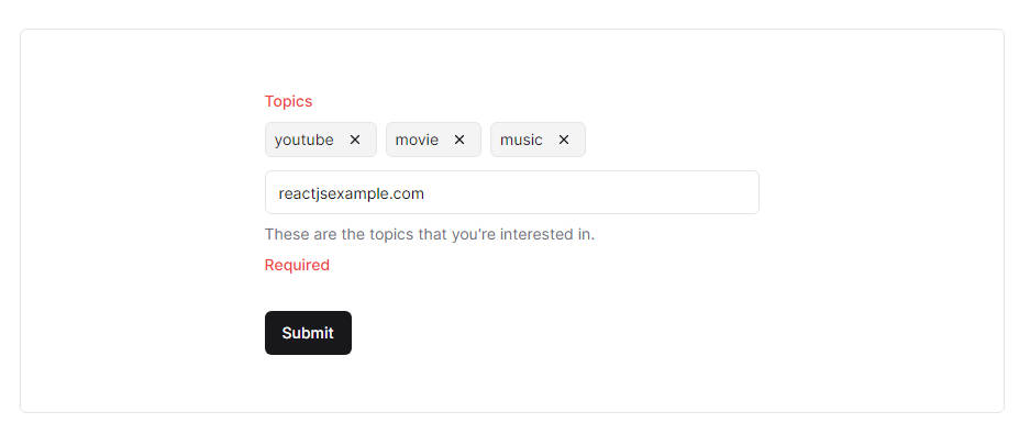
React Chips
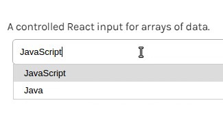
A controlled React input for arrays of data.
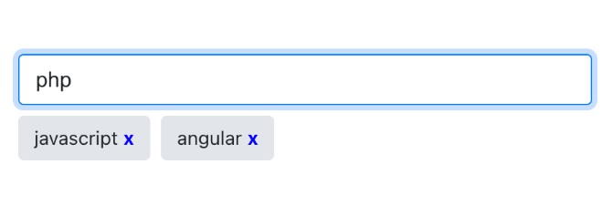
Chip
A chip is a component used to represent an arbitrary data object.
Getting Started
npm install --save react-chips
import React, { Component } from 'react';
import Chips, { Chip } from '../src'

class YourComponent extends Component {

  constructor(props) {
    super(props);
    this.state = {
      chips: []
    }
  }

  onChange = chips => {
    this.setState({ chips });
  }

  render() {
    return (
      <div>
        <Chips
          value={this.state.chips}
          onChange={this.onChange}
          suggestions={["Your", "Data", "Here"]}

        />
      </div>
    );
  }
}
Chips
| Property | Type | Required | Description |
|---|---|---|---|
value |
Array | ✓ | An array of data that represents the value of the chips |
onChange |
Function | ✓ | A function called when the value of chips changes, passes the chips value as an argument. |
placeholder |
String | The placeholder to populate the input with | |
theme |
Object | A react-themeable theme | |
chipTheme |
Object | A react-themeable theme that will override the default chip theme, | |
suggestions |
Array | Data to fill the autocomplete list with | |
fetchSuggestions |
Function | Delegate expecting to recive autocomplete suggestions (callback or promise) | |
fetchSuggestionsThrushold |
Number | Maximum calls to fetchSuggestions per-second | |
fromSuggestionsOnly |
Boolean | Only allow chips to be added from the suggestions list | |
uniqueChips |
Boolean | Only allow one chip for each object | |
renderChip |
Function | For custom chip usage. A function that passes the value of the chip as an argument, must return an element that will be rendered as each chip. | |
suggestionsFilter |
Function | A function that is passed an autoCompleteData item, and the current input value as arguments. Must return a boolean for if the item should be shown. | |
getChipValue |
Function | A function used to change the value that is passed into each chip. | |
createChipKeys |
Array | An array of keys/keyCodes that will create a chip with the current input value when pressed. (Will not work of fromSuggestionsOnly is true). |
|
getSuggestionValue |
Function | The value to show in the input when a suggestion is selected | |
renderSuggestion |
Function | For custom autocomplete list item usage. A function that passes the value as an argument, must return an element to render for each list item. | |
shouldRenderSuggestions |
Function | See AutoSuggest | |
alwaysRenderSuggestions |
Boolean | See AutoSuggest | |
highlightFirstSuggestion |
Boolean | See AutoSuggest | |
focusInputOnSuggestionClick |
Boolean | See AutoSuggest | |
multiSection |
Boolean | See AutoSuggest | |
renderSectionTitle |
Function | ✓ when multiSection={true} | See AutoSuggest |
getSectionSuggestions |
Function | ✓ when multiSection={true} | See AutoSuggest |
Styles
This project uses react-themeable and Radium for styling. The Chips, and default Chip components both accept a theme prop. The theme structure, and default theme can be found here
Custom Chip Component
You may use a custom chip component, simply return the custom component to the renderChip prop function. This component will receive the following additional props from the Chips component.
<Chips
  ...
  renderChip={value => <CustomChip>{value}</CustomChip>}
/>
| Property | Type | Description |
|---|---|---|
| selected | bool | A boolean that tells the chip if it is currently selected. |
| onRemove | func | A function to be invoked when the chip should be removed |
Async Suggestions
To fetch asynchronous suggestions use fetchSuggestions.
<Chips
  ...
  fetchSuggestions={(value, callback) => {
    someAsynCall(callback)
  }}
/>

// or with a Promise

<Chips
  ...
  fetchSuggestions={(value) => someAsyncCallThatReturnsPromise}
/>