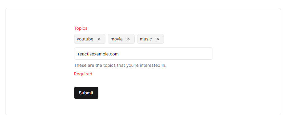
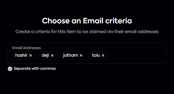
React Tags Input
Concise and efficient solution for creating tags input with option to style with react inline CSS or with css⚡
Installation
Install dependencies:
$ yarn add @enipx/react-tags-input

# or

$ npm i @enipx/react-tags-input
Usage
import { TagsInput } from "@enipx/react-tags-input"

export default function App() {
  return (
    <TagsInput
      value={selected}
      onChange={onChangeHandler}
      style={{
        border: `1px solid rgba(0,0,0,0.2)`,
        minHeight: '70px',
        borderRadius: '10px',
        padding: '0 1rem',
        fontSize: '0.85rem',
        paddingTop: '1rem',
      }}
      focusStyle={{
        border: `1px solid rgba(0,0,0,0.4)`,
      }}
      tagStyle={{
        border: `1px solid ${borderColor}`,
        borderRadius: '2rem',
        paddingLeft: '0.5rem',
        paddingRight: '0.5rem',
      }}
      {...rest}
    />
  )
}
Props
| Property | Type | Description |
|---|---|---|
| value | string[] |
Controlled value |
| onChange | (arg: string[]) => void |
Return value when input changes |
| onAdd | (arg: string) => void |
callback method when an item is added |
| onRemove | (arg: string) => void |
callback method when an item is remove |
| onExist | (arg: string) => void |
callback method when an item already exists in input |
| hoverStyle | React.CSSProperties |
Add custom input style on hover |
| focusStyle | React.CSSProperties |
Add custom input style on focus |
| tagStyle | React.CSSProperties |
Add custom tag item style |
| separator | string |
input item separator, default is comma (,) |
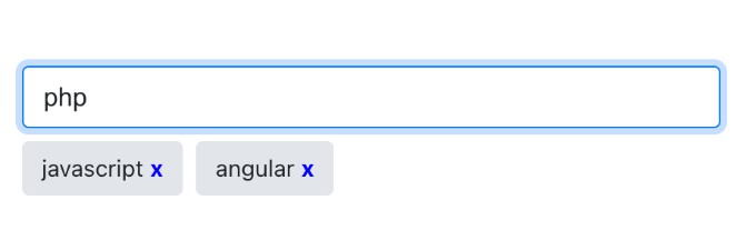
| removeIcon | React.ReactNode |
replace tag remove icon |
| containerProps | HTMLAttribute |
update container div attribute |
License
MIT ©