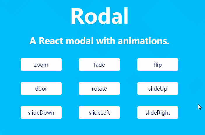
react-aria-modal
A fully accessible and flexible React modal built according WAI-ARIA Authoring Practices.
This module provides a "smart" minimally styled component to wrap you "dumb" fully styled component. It provides the following features, while giving you complete control of the content:
- Focus is trapped within the modal: Tab and Shift+Tab will cycle through the modal's focusable nodes without returning to the main document beneath.
- Escape will close the modal.
- Scrolling is frozen on the main document beneath the modal.
- When the modal closes, focus returns to the element that was focused just before the modal activated.
- The dialog element has an ARIA role of dialog (or alertdialog).
- The dialog element has an ARIA attribute designating its title, either aria-label or aria-labelledby.
- By default, clicking on the modal's underlay (outside the dialog element) will close the modal (this can be disabled).
- The modal is appended to the end of document.body instead of its taking up its source-order position within the React component tree.
"Flexible" mostly means that this module provides absolutely minimal inline styles — just enough to get the thing working — but does not provide "complete" modal styling that would get in your way. You get to (have to) style the dialog yourself. (Maybe make a fancy-looking modal module that others could use, which depends on this one behind the scenes?)