block-code
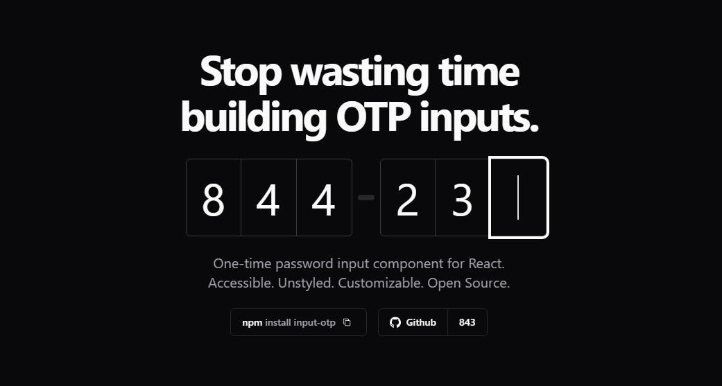
A fully customizable, one-time password input component for the web built with React
Highlights
- Easy to use
- Fully customizable
- React hook first
- Separate logic and ui
Installation and usage
yarn add block-otp
Here is a quick example to get you started:
import { FC } from 'react'
import { BlockCode, IBlockCodeProps } from 'block-code'
import 'block-code/style.css'

export const YourComponent: FC<IBlockCodeProps> = props => (
  <BlockCode className="block-code-default" {...props} />
)
BlockCode provides 3 themes built-in: block-code-default, block-code-circular, block-code-underline
import { FC } from 'react'
import { BlockCode, IBlockCodeProps } from 'block-code'
import 'block-code/style.css'

export const YourComponent: FC<IBlockCodeProps> = ({
  children,
  ...restProps
}) => (
  <section>
    <BlockCode className="block-code-circular" {...restProps} />
    {children}
  </section>
)
or custom your style:
import { FC } from 'react'
import { BlockCode, IBlockCodeProps } from 'block-code'
import 'custom.css'

export const YourComponent: FC<IBlockCodeProps> = ({
  children,
  ...restProps
}) => (
  <section>
    <BlockCode className="custom" {...restProps} />
    {children}
  </section>
)
How to catch your data?
import { FC } from 'react'
import { BlockCode, IBlockCodeProps } from 'block-code'
import 'block-code/style.css'

export const YourComponent: FC<IBlockCodeProps> = props => {
  /**
   * @param data - { value, raw, onReset }
   *
   * value: The value after joining: `123456`
   *
   * raw: The raw value: ['1', '2', '3', '4', '5', '6']
   *
   * onReset: A function to reset the state, set value to empty, and set focus index to 0.
   */
  const onComplete = data => {
    // TODO:
    // Use your data here
  }

  return (
    <BlockCode
      className="block-code-default"
      onComplete={onComplete}
      {...props}
    />
  )
}
How to allow only number, or validate your data before adding into the state?
import { FC } from 'react'
import { BlockCode, IBlockCodeProps, isNumber } from 'block-code'
import 'block-code/style.css'

export const YourComponent: FC<IBlockCodeProps> = props => {
  const onValidateBeforeChange = async data => {
    /**
     * If `isNumeric` returns true, then the value will be added into the state
     *
     * You can use any condition here, `onValidateBeforeChange` asks for `Promise<boolean>`
     */
    return isNumeric(data.value)
  }

  return (
    <BlockCode
      className="block-code-default"
      onValidateBeforeChange={onValidateBeforeChange}
      {...props}
    />
  )
}
How to disable inputs?
BlockCode allows you to pass down input props
import { FC } from 'react'
import { BlockCode, IBlockCodeProps, isNumber } from 'block-code'
import 'block-code/style.css'

export const YourComponent: FC<IBlockCodeProps> = props => {
  return (
    <BlockCode
      className="block-code-default"
      inputProps={{
        disabled: true
      }}
      {...props}
    />
  )
}
How to custom my component?
BlockCode separates logic into hook useBlockCode. You can use it to custom your component
import { VFC } from 'react'
import { IBlockCodeProps, useBlockCode } from 'block-code'

export const YourComponent: VFC<IBlockCodeProps> = props => {
  const { className, ...restProps } = props
  const { ids, onCreateInputProps } = useBlockCode(restProps)

  return (
    <div className={className}>
      {ids.map((id, index) => (
        <input key={id} {...onCreateInputProps(index)} />
      ))}
    </div>
  )
}
The useBlockCode hook accept props same as BlockCode component which is IBlockCodeProps. It returns:
values,
setValues,
setActiveIndex,
refs,
onSetValueAtIndex,
onSetActiveIndex,
onResetValues,
onReset,
onPaste,
onNextFocusAfterChangingValue,
onKeyDown,
onInput,
onEnoughData,
onCreateRef,
onCreateInputProps,
onCheckValue,
onAfterAddingValue,
onAddValue,
initState,
initActiveIndex,
ids,
activeIndex
API
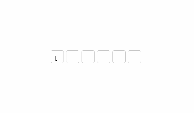
maxInputs– Number of inputs to be rendered.Default: 6
inputProps– Input props will be passed into<input />Default:{ "maxLength": 1, "className": "input" }
autoFocus– Auto focus on the first inputDefault: true
onValuesChange– A function will be called when the value got changedDefault: none
onInputChange– A function will be called whenonInputandonKeyDowngot triggeredDefault: none
onValidateBeforeChange– A function will be called to validate the value before adding into state. If you don’t provide validate function, all values will be allowedDefault: none
onComplete– A function will be called only when the data is enough. It will pass the data to you. The data is enough when fits the condition below:maxInputs*inputProps.maxLength. For examplemaxnInputsis6andinputProps.maxLengthis1. TheonCompletewill be triggered if the value has length is6Default: none
License
This project is licensed under the terms of the
MIT license.