In this project, let’s build a Github Popular Repos by applying the concepts we have learned till now.
Refer to the images below:
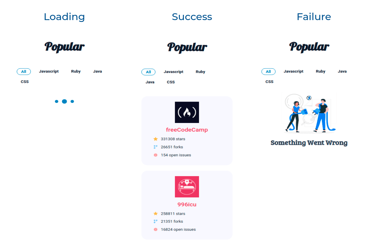
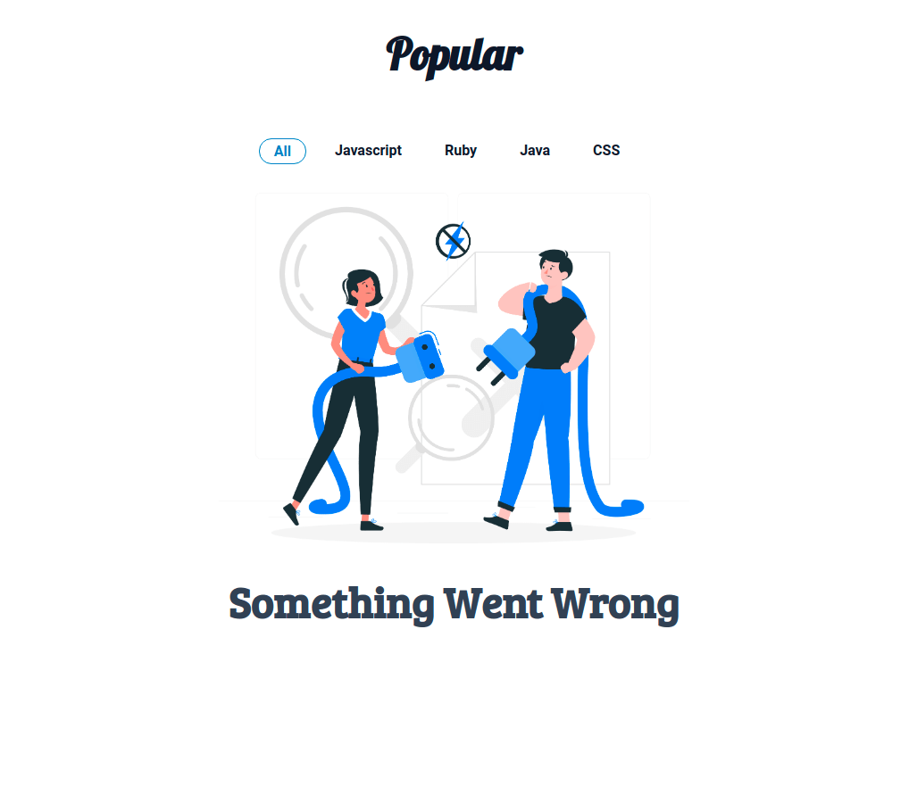
Failure View
Design Files
Click to view
- Extra Small (Size < 576px) and Small (Size >= 576px)
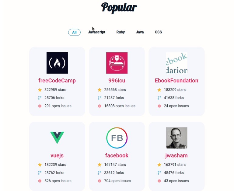
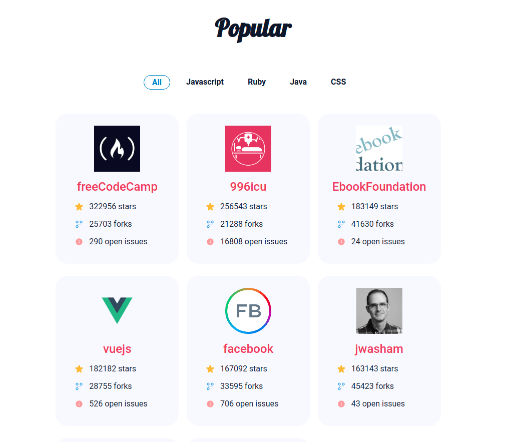
- Medium (Size >= 768px), Large (Size >= 992px) and Extra Large (Size >= 1200px) – Success
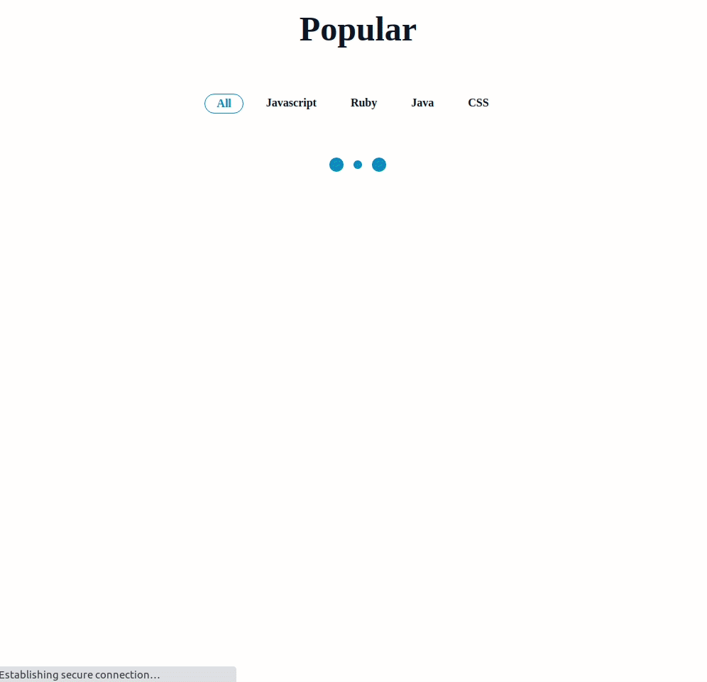
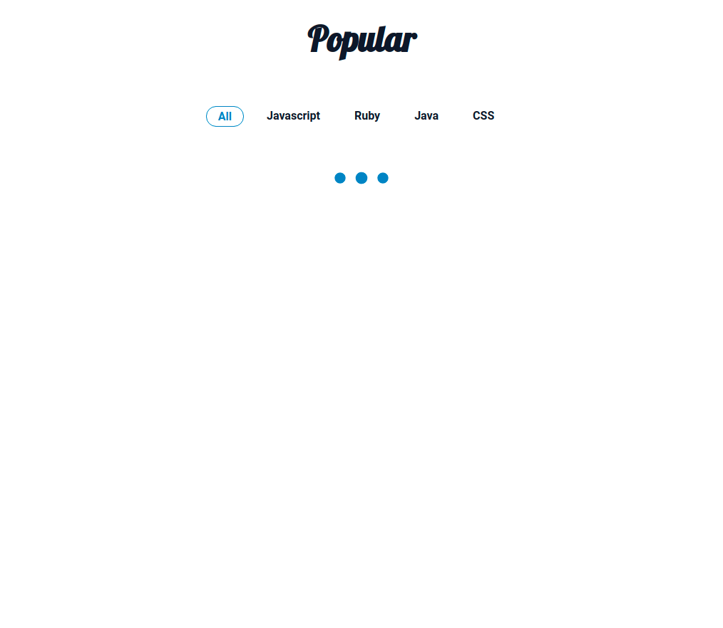
- Medium (Size >= 768px), Large (Size >= 992px) and Extra Large (Size >= 1200px) – Loading
- Medium (Size >= 768px), Large (Size >= 992px) and Extra Large (Size >= 1200px) – Failure
Set Up Instructions
Click to view
- Download dependencies by running
npm install - Start up the app using
npm start
Completion Instructions
Functionality to be added
The app must have the following functionalities
-
When the app is opened initially,
- An HTTP GET request should be made to githubReposApiUrl with query parameter as
languageand its initial value asALL - loader should be displayed while fetching the data
- After the data is fetched successfully, display the repositories list received in the response
- An HTTP GET request should be made to githubReposApiUrl with query parameter as
-
When a language filter is active
- An HTTP GET request should be made to the above-mentioned URL with the
idof the active language - loader should be displayed while fetching the data
- After the data is fetched successfully, display the repositories list received in the response
- An HTTP GET request should be made to the above-mentioned URL with the
-
The
GithubPopularReposcomponent is provided withlanguageFiltersData. It consists of a list of language filter objects with the following properties in each language filter objectKey Data Type id String language String
API Requests & Responses
githubReposApiUrl
API: https://apis.ccbp.in/popular-repos
Example: https://apis.ccbp.in/popular-repos?language=ALL
Method: GET
Description:
Returns a response containing the list of repositories
Response
{
  "popular_repos": [
    {
	  "name": "freeCodeCamp",
      "id": 28457823,
      "issues_count": 154,
      "forks_count": 26651,
      "stars_count": 331304,
      "avatar_url": "https://avatars.githubusercontent.com/u/9892522?v=4"
    },
      ...
  ],
}
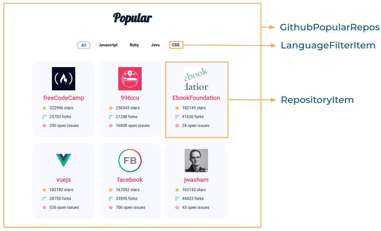
Components Structure
Implementation Files
Use these files to complete the implementation:
src/components/GithubPopularRepos/index.jssrc/components/GithubPopularRepos/index.csssrc/components/LanguageFilterItem/index.jssrc/components/LanguageFilterItem/index.csssrc/components/RepositoryItem/index.jssrc/components/RepositoryItem/index.css
Quick Tips
Click to view
-
To display the animated loader, we need to import the
Loadercomponent using the below statementimport Loader from 'react-loader-spinner'
-
In order to display the given animated loader, pass the
typeandcolorprops to theLoadercomponent with values as ThreeDots and #0284c7, respectively<Loader type="ThreeDots" color="#0284c7" height={80} width={80} />
Important Note
Click to view
The following instructions are required for the tests to pass
-
Wrap the
Loadercomponent with an HTML container element and add thetestidattribute value as loader to it<div testid="loader"> <Loader type="ThreeDots" color="#0284c7" height={80} width={80} /> </div>
Resources
Image URLs
- https://assets.ccbp.in/frontend/react-js/stars-count-img.png alt should be stars
- https://assets.ccbp.in/frontend/react-js/forks-count-img.png alt should be forks
- https://assets.ccbp.in/frontend/react-js/issues-count-img.png alt should be open issues
- https://assets.ccbp.in/frontend/react-js/api-failure-view.png alt should be failure view
Colors
Font-families
- Roboto
- Lobster
Things to Keep in Mind
- All components you implement should go in the
src/componentsdirectory.- Don’t change the component folder names as those are the files being imported into the tests.
- Do not remove the pre-filled code
- Want to quickly review some of the concepts you’ve been learning? Take a look at the Cheat Sheets.

