react-mui-multiselect-dropdown
It is simple and light weight single/multiselect searchable dropdown library. This package is built using popular react UI library which is material UI.
Dependencies
react: v-16.13.1,
material-ui/core: v-4.11.0,
material-ui/icons: v-4.9.1,
classnames: "^2.2.6"
Install
npm install --save react-mui-multiselect-dropdown
Usage
class Component
import React, { Component } from 'react'
import Dropdown from 'react-mui-multiselect-dropdown'

class Example extends Component {

state = {
    employees: [],
    selectedEmployees: []
}

componentDidMount() {
    const employeesData = [
      { id: 1, name: 'John' },
      { id: 2, name: 'Roy' },
      { id: 3, name: 'Albert' }
    ]
    this.setState({
        employees: employeesData
    });
}
render(){
    return (
            <Dropdown
                data={this.state.employees}
                fullWidth
                searchable
                searchPlaceHolder='search employee...'
                itemId='id'
                itemLabel='name'
                simpleValue
                searchByValue='name'
                itemValue='id'
                selectedValues={this.state.selectedEmployees}
                errorText='error'
                onItemClick={(records) => {
                  this.setState({
                  selectedEmployees: records
                  })
                }}
                onDeleteItem={(deleted) => {
                  console.log('deleted', deleted)
                }}
              />
        )
  }
}

export default Example;
Functional Component
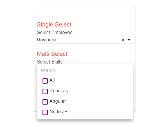
Single select
import React, { useState, useEffect } from 'react'
import Dropdown from 'react-mui-multiselect-dropdown'

function Example() {
  const [selectedEmployees, setSelectedEmployees] = useState([])
  const [employees, setEmployees] = useState([])

  const populateData = () => {
    const employeesData = [
      { id: 1, name: 'Klaus' },
      { id: 2, name: 'Elijah' },
      { id: 3, name: 'Marcel' }
    ]
    setEmployees(employeesData)
  }

  useEffect(() => {
    populateData()
  }, [])

  return (
    <Dropdown
      data={employees}
      fullWidth
      searchable
      searchPlaceHolder='search employee...'
      itemId='id'
      itemLabel='name'
      simpleValue
      searchByValue='name'
      itemValue='id'
      selectedValues={selectedEmployees}
      errorText='error'
      onItemClick={(emp) => {
        setSelectedEmployees(emp)
      }}
      onDeleteItem={(deleted) => {
        console.log('deleted', deleted)
      }}
    />
  )
}

export default Example
Multi select
import React, { useState, useEffect } from 'react'
import Dropdown from 'react-mui-multiselect-dropdown'
import { makeStyles } from '@material-ui/core'

import purple from '@material-ui/core/colors/purple'

const useStyles = makeStyles((theme) => ({
  error: {
    color: theme.palette.error.dark,
    fontSize: '1em'
  },
  checkBox: {
    color: purple['700']
  }
}))

function Example() {
  const [skills, setSkills] = useState([])
  const [selectedSkills, setSelectedSkills] = useState([])

  const classes = useStyles()

  const populateData = () => {
    const skillsData = [
      { id: 1, name: 'React Js' },
      { id: 2, name: 'Angular' },
      { id: 3, name: 'Node JS' }
    ]
    setSkills(skillsData)
  }

  useEffect(() => {
    populateData()
  }, [])

  return (
    <Dropdown
      data={skills}
      fullWidth
      searchable
      searchPlaceHolder='search...'
      itemId='id'
      itemLabel='name'
      multiple
      simpleValue
      searchByValue='name'
      itemValue='id'
      selectedValues={selectedSkills}
      customStyles={{
        error: classes.error,
        checkBox: classes.checkBox
      }}
      errorText='error'
      onItemClick={(skill) => {
        setSelectedSkills(skill)
      }}
      onDeleteItem={(deleted) => {
        console.log('deleted', deleted)
      }}
    />
  )
}

export default Example
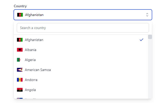
Dropdown with images
import React, { useState, useEffect } from 'react'
import Dropdown from 'react-mui-multiselect-dropdown'

function Example() {
  const [cities, setCities] = useState([])
  const [selectedCities, setSelectedCities] = useState([])

  const populateData = () => {
    const cities = [
      { id: 1, city: 'MUMBAI' },
      { id: 2, city: 'PUNE' },
      { id: 3, city: 'NAGPUR' }
    ]
    cities.forEach((v, i) => {
      v['path'] = `https://source.unsplash.com/random/${i}`
    })
    setCities(cities)
  }

  useEffect(() => {
    populateData()
  }, [])
  return (
    <Dropdown
      data={cities}
      fullWidth
      searchable
      searchPlaceHolder='search cities...'
      itemId='id'
      itemLabel='city'
      imageLabel='path'
      title='Select City'
      searchByValue='city'
      showImage
      selectedValues={selectedCities}
      errorText='error'
      onItemClick={(city) => {
        setSelectedCities(city)
      }}
      onDeleteItem={(deleted) => {
        console.log('deleted', deleted)
      }}
    />
  )
}

export default Example
Props
| Attribute | Type | Is Required | Description | Default Value |
|---|---|---|---|---|
| data | array | Yes | List of options to display | |
| selectedValues | array | No | List of pre selected options. This can be use while edit functionality | |
| searchable | boolean | No | By setting this to true dropdown will be searchable. | false |
| searchPlaceHolder | string | No | Placeholder for the search input | Search result |
| searchByValue | string | No | The parameter from the data you want to saerch with. for instance your data has name and id fields and you want to search data with id then set it as id | name |
| itemLabel | string | Yes | Label of the dropdown values eg. name | |
| itemId | number/ string | Yes | Unique id from to data which will use as unique key for the list it ca be id from the list of data. | |
| simpleValue | boolean | No | If true then provided itemValue will be return in respose from the selected options else whole selected object will return. eg: If item value is 'id' and simple value is true then we will get selected option as list of id from the data.Else will get whole object. | |
| itemValue | number/string | No | It will only work if the simple value is true it can be any property from the data for instance id you will get list of id's on item select. | |
| multiple | boolean | No | If true then you can select multiple options | false |
| showAllButton | boolean | No | If true there there is option "All" to select/deselect all option o one click. | true |
| showImage | boolean | No | You can add imgae at the start of all options, the image url should be in the data list for each object. Name of the parameter should be url if you have diffenet name then specify in the imageLabel prop. | false |
| imageLabel | string | No | Parameter use for the image url it can be image parameter from the data list. | url |
| title | string | No | Title display above dropdown | Dropdown |
| notFoundText | string | No | Text to display when no item found on search | No records found |
| disabled | boolean | No | Disabled the dropdown if true | False |
| error | boolean | No | Display the error when true | False |
| errorText | string | No | Text to display when there is an error(error message) | Error |
| customStyles | makeStyle Instance | No | Custom styles for the checkbox below there is list of custom classes which you can modified. | {} |
Events
| Event | Return | Description |
|---|---|---|
| onItemClick | SeletedItem(s) | Once you click the option in dropdown this method get called It will return the slected item(s). If the simple value is true then it will return the itemId else whole object or array of object if multiple. |
| onDeleteItem | Deleted item | It will get trigger when you deSelect the selected item.return value is itemId in case of simple value else whole object. |
Custom styles
You can modified the styles of the checkbox or error message
You only need to do something like this
customStyles={{
error: classes.error,
checkBox: classes.checkBox
}}
classes.error and classses.checkbox is your predefined style which you can add in makeStyles.