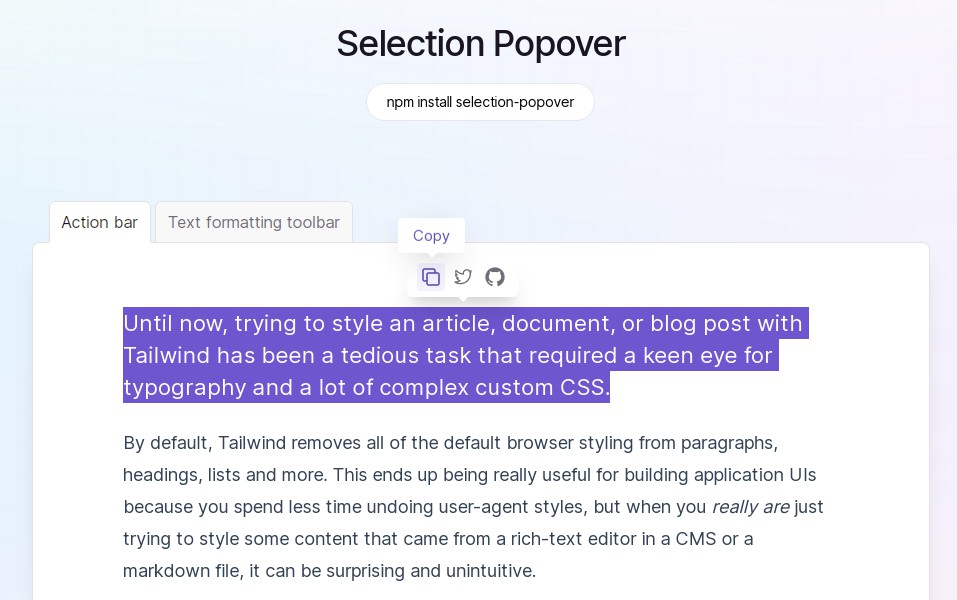

Install
npm install selection-popover
Anatomy
Import all parts and piece them together.
import * as Selection from 'selection-popover';

export default () => (
  <Selection.Root>
    <Selection.Trigger />
    <Selection.Portal>
      <Selection.Content>
        <Selection.Arrow />
      </Selection.Content>
    </Selection.Portal>
  </Selection.Root>
);
API Reference
Root
Contains all the parts of a selection.
| Prop | Type | Default | Description |
|---|---|---|---|
defaultOpen |
boolean |
– | The open state of the hover card when it is initially rendered. Use when you do not need to control its open state. |
open |
boolean |
– | The controlled open state of the popover. Must be used in conjunction with onOpenChange. |
onOpenChange |
(open: boolean) => void |
– | Event handler called when the open state of the popover changes. |
whileSelect |
boolean |
false |
When true, the popover will open while the text is selected, otherwise only when the mouse up. |
disabled |
boolean |
false |
When true, the popover won’t open when text is selected. |
Trigger
The area that opens the popover. Wrap it around the target you want the popover to open when a text is selected.
| Prop | Type | Default | Description |
|---|---|---|---|
asChild |
boolean |
false |
Change the component to the HTML tag or custom component of the only child. This will merge the original component props with the props of the supplied element/component and change the underlying DOM node. |
Portal
When used, portals the content part into the body.
| Prop | Type | Default | Description |
|---|---|---|---|
forceMount |
boolean |
– | Used to force mounting when more control is needed. Useful when controlling animation with React animation libraries. If used on this part, it will be inherited by Selection.Content. |
container |
HTMLElement |
document.body |
Specify a container element to portal the content into. |
Content
The component that pops out when a text is selected.
| Prop | Type | Default | Description |
|---|---|---|---|
asChild |
boolean |
false | Change the component to the HTML tag or custom component of the only child. This will merge the original component props with the props of the supplied element/component and change the underlying DOM node. |
forceMount |
boolean |
– | Used to force mounting when more control is needed. Useful when controlling animation with React animation libraries. It inherits from Selection.Portal. |
side |
"top" | "right" | "bottom" | "left" |
top |
The preferred side of the selection to render against when open. Will be reversed when collisions occur and avoidCollisions is enabled. |
sideOffset |
number |
0 |
The distance in pixels from the selection. |
align |
"start" | "center" | "end" |
center |
The preferred alignment against the selection. May change when collisions occur. |
alignOffset |
number |
0 |
An offset in pixels from the "start" or "end" alignment options. |
avoidCollisions |
boolean |
true |
When true, overrides the side and align preferences to prevent collisions with boundary edges. |
collisionBoundary |
Element | null | Array<Element | null> |
[] |
The element used as the collision boundary. By default this is the viewport, though you can provide additional element(s) to be included in this check. |
collisionPadding |
number | Partial<Record<Side, number>> |
0 |
The distance in pixels from the boundary edges where collision detection should occur. Accepts a number (same for all sides), or a partial padding object, for example: { top: 20, left: 20 }. |
arrowPadding |
number |
0 |
The padding between the arrow and the edges of the content. If your content has border-radius, this will prevent it from overflowing the corners. |
sticky |
"partial" | "always" |
partial |
The sticky behavior on the align axis. "partial" will keep the content in the boundary as long as the trigger is at least partially in the boundary whilst "always" will keep the content in the boundary regardless. |
hideWhenDetached |
boolean |
false |
Whether to hide the content when the text becomes fully occluded. |
| Data Attribute | Values |
|---|---|
[data-state] |
"open" | "closed" |
[data-side] |
"left" | "right" | "bottom" | "top" |
[data-align] |
"start" | "end" | "center" |
| CSS Variable | Description |
|---|---|
--selection-popover-content-transform-origin |
The transform-origin computed from the content and arrow positions/offsets. |
--selection-popover-select-width |
The width of the select. |
--selection-popover-select-height |
The height of the select. |
Arrow
An optional arrow element to render alongside the popover. This can be used to help visually link the selected text with the Selection.Content. Must be rendered inside Selection.Content.
| Prop | Type | Default | Description |
|---|---|---|---|
asChild |
boolean |
false |
Change the component to the HTML tag or custom component of the only child. This will merge the original component props with the props of the supplied element/component and change the underlying DOM node. |
width |
number |
10 |
The width of the arrow in pixels. |
height |
number |
5 |
The height of the arrow in pixels. |
Examples
Unmount animations
// index.jsx
import * as Selection from 'selection-popover';
import './styles.css';

export default () => (
  <Selection.Root>
    <Selection.Trigger>...</Selection.Trigger>
    <Selection.Portal>
      <Selection.Content className="SelectionContent">...</Selection.Content>
    </Selection.Portal>
  </Selection.Root>
);
/* styles.css */
.SelectionContent {
  animation-duration: 400ms;
  animation-timing-function: cubic-bezier(0.16, 1, 0.3, 1);
}
.SelectionContent[data-state='open'] {
  animation-name: slideDownAndFade;
}
.SelectionContent[data-state='closed'] {
  animation-name: slideUpAndFade;
}

@keyframes slideDownAndFade {
  from {
    opacity: 0;
    transform: translateY(-2px);
  }
  to {
    opacity: 1;
    transform: translateY(0);
  }
}

@keyframes slideUpAndFade {
  from {
    opacity: 1;
    transform: translateY(0));
  }
  to {
    opacity: 0;
    transform: translateY(-2px);
  }
}
Origin-aware animations
// index.jsx
import * as Selection from 'selection-popover';
import './styles.css';

export default () => (
  <Selection.Root>
    <Selection.Trigger>...</Selection.Trigger>
    <Selection.Portal>
      <Selection.Content className="SelectionContent">...</Selection.Content>
    </Selection.Portal>
  </Selection.Root>
);
/* styles.css */
.SelectionContent {
  transform-origin: var(--selection-popover-content-transform-origin);
  animation: scaleIn 500ms cubic-bezier(0.16, 1, 0.3, 1);
}

@keyframes scaleIn {
  from {
    opacity: 0;
    transform: scale(0);
  }
  to {
    opacity: 1;
    transform: scale(1);
  }
}
Collision-aware animations
// index.jsx
import * as Selection from 'selection-popover';
import './styles.css';

export default () => (
  <Selection.Root>
    <Selection.Trigger>...</Selection.Trigger>
    <Selection.Portal>
      <Selection.Content className="SelectionContent">...</Selection.Content>
    </Selection.Portal>
  </Selection.Root>
);
/* styles.css */
.SelectionContent {
  animation-duration: 400ms;
  animation-timing-function: cubic-bezier(0.16, 1, 0.3, 1);
}
.SelectionContent[data-state='open'][data-side='top'] {
  animation-name: slideDownAndFade;
}
.SelectionContent[data-state='open'][data-side='bottom'] {
  animation-name: slideUpAndFade;
}

@keyframes slideDownAndFade {
  from {
    opacity: 0;
    transform: translateY(-2px);
  }
  to {
    opacity: 1;
    transform: translateY(0);
  }
}

@keyframes slideUpAndFade {
  from {
    opacity: 0;
    transform: translateY(2px));
  }
  to {
    opacity: 1;
    transform: translateY(0);
  }
}
Use with Radix Toolbar
import * as Selection from 'selection-popover';
import * as Toolbar from '@radix-ui/react-toolbar';

export default () => (
  <Selection.Root>
    <Selection.Trigger>...</Selection.Trigger>
    <Selection.Portal>
      <Selection.Content asChild>
        <Toolbar.Root>...</Toolbar.Root>
        <Selection.Arrow />
      </Selection.Content>
    </Selection.Portal>
  </Selection.Root>
);
Acknowledge
- API heavily inspired on Radix UI
- Inspired by this tweet from Tobias Whetton